The success of a flyer often comes down to one critical, yet frequently overlooked, element: typography. The right font doesn't just convey information; it captures attention, establishes your brand’s personality, and persuades your audience to act. A poorly chosen font can render a brilliant design invisible, while the best font for flyers can transform a simple message into a powerful marketing tool.
This guide is designed to move beyond generic advice, offering a curated roundup of 8 exceptional fonts. Each is selected for specific marketing goals, from establishing corporate authority to announcing a can't-miss sale. We will dive into the practical details: ideal use cases, professional pairing suggestions, and specific print production tips to ensure your message lands with clarity and impact. Understanding how your font choice contributes to the overall design is crucial. Mastering principles like visual hierarchy is essential to ensure your chosen fonts effectively guide the reader's eye and convey your message with maximum impact.
Whether you're designing marketing collateral for a law firm, a promotional piece for a new café, or an event announcement, this breakdown will help you make a strategic choice that gets results. For businesses in New York's Capital Region and Hudson Valley, we'll also include actionable advice on how to get the perfect print finish with Camelot Print & Copy Centers, ensuring your final product is as effective in hand as it is on screen.
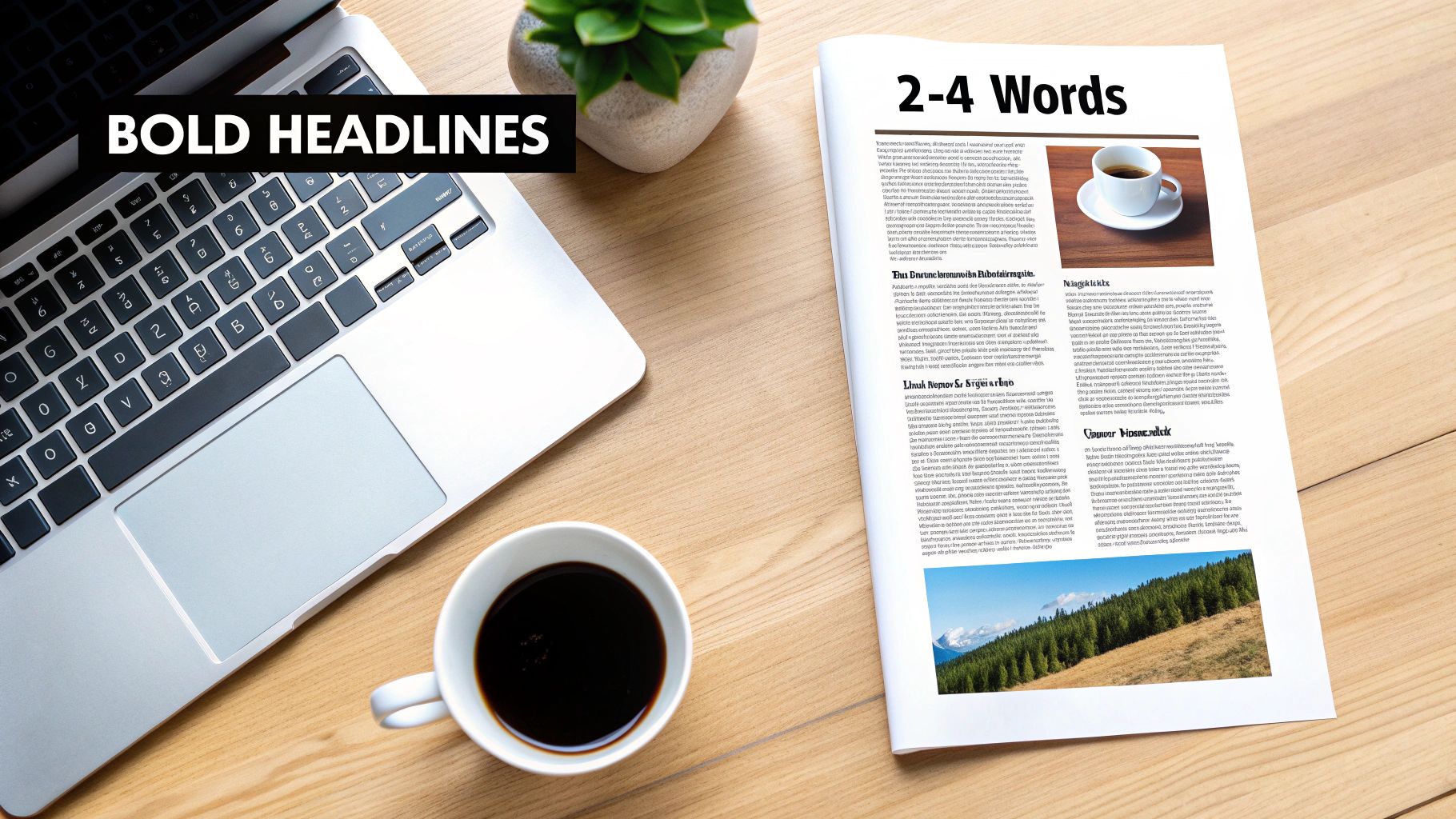
1. Montserrat: Bold Headlines & Professional Marketing Materials
Montserrat is a modern geometric sans-serif font family that strikes a perfect balance between professionalism and contemporary style. Inspired by the old posters and signs in the traditional Montserrat neighborhood of Buenos Aires, this font was created by Julieta Ulanovsky. Its clean lines, open letterforms, and wide range of weights make it an incredibly versatile and one of the best font choices for flyers aiming to convey clarity, confidence, and modernity.
This font family excels in creating a strong visual hierarchy, which is crucial for effective flyer design. The heavier weights, like Bold and Black, are perfect for grabbing attention with powerful headlines, while the lighter weights (Regular, Light) ensure body text remains crisp and highly legible, even at smaller print sizes. This makes Montserrat a go-to for corporate announcements, tech startup promotions, and real estate flyers where a polished, trustworthy image is essential.
Why Montserrat is a Top Choice for Flyers
The core strength of Montserrat lies in its exceptional readability across various applications. Its geometric structure ensures that characters are distinct and easy to process, preventing reader fatigue. For businesses, this translates to a flyer that communicates its message quickly and effectively, from a high-impact headline to the fine print of a call-to-action.
Key Insight: Montserrat’s clean, open design allows it to work seamlessly on both glossy and matte paper stocks, ensuring your message remains sharp and professional regardless of the final print finish you choose at Camelot Print & Copy Centers.
Actionable Tips for Using Montserrat on Flyers
- Create High-Impact Headlines: Use Montserrat Bold or Black for your main headline. A font size of 30-50 pt is a great starting point for a standard 8.5" x 11" flyer, ensuring it can be read from a distance.
- Establish Clear Hierarchy: Pair a bold headline with Montserrat Regular or Medium for subheadings (18-24 pt) and body copy (10-12 pt). This contrast guides the reader’s eye through the flyer's content logically.
- Optimize Spacing for Legibility: For body text blocks, set the line height (leading) to approximately 1.5 times the font size. This added white space significantly improves readability in printed materials.
- Test Before You Print: Always print a test sample at the intended final size. What looks great on a screen can appear different on paper. This step is vital for checking legibility and overall visual balance.
For businesses looking to create a cohesive and professional look for their marketing materials but need expert assistance, exploring professional graphic design services can ensure your flyers are perfectly optimized for print.
2. Helvetica Neue: Timeless Authority & Corporate Credibility
Helvetica Neue is a refined and expanded version of the iconic Helvetica typeface, representing the gold standard for professional print communications. Its neutrality, unparalleled legibility, and timeless design make it the quintessential choice for corporate flyers, legal announcements, and formal business communications where clarity and authority are paramount. This font exudes an aura of stability and competence, making it an indispensable tool for businesses aiming to build trust and credibility.
Popularized by countless Fortune 500 companies like American Airlines, BMW, and Target, Helvetica Neue has become synonymous with reliability. Its strength lies in its ability to communicate a message directly without stylistic distractions. For law firms, medical practices, and financial institutions, this font ensures that the information on a flyer is presented with professional gravity. It’s a workhorse that performs exceptionally well for both headlines and dense body copy, ensuring consistent professionalism across the entire document.
Why Helvetica Neue is a Top Choice for Flyers
Helvetica Neue’s primary advantage is its objective clarity. The characters are designed with tight spacing and clean, crisp lines that make text highly readable in print. This objective tone prevents any misinterpretation of the message, which is critical for flyers containing important dates, legal disclaimers, or official company information. Its extensive family of weights and widths provides the flexibility to create a strong visual hierarchy while maintaining a cohesive and polished brand image.
Key Insight: For documents printed on standard office paper or premium letterhead stock, Helvetica Neue maintains its sharp, professional appearance. When printing official announcements or corporate materials at Camelot Print & Copy Centers, this font guarantees a clean, authoritative finish that reinforces your company’s credibility.
Actionable Tips for Using Helvetica Neue on Flyers
- Project Confidence with Bold Weights: Use Helvetica Neue Bold or Black for headlines to command attention. For a standard flyer, a headline size between 28-48 pt establishes a clear, authoritative entry point for the reader.
- Maintain a Professional Tone: Keep body copy legible and professional with Helvetica Neue Regular or Light at 9-11 pt. This is especially effective for flyers that mimic a letterhead format for official communications.
- Leverage White Space: The structured nature of Helvetica Neue can feel dense if not properly spaced. Ensure ample white space (margins and line spacing) around text blocks to enhance readability and avoid a stale, overly corporate look. Set line height to at least 1.4 times the font size.
- Use Sparingly for Accents: To add a touch of traditional sophistication without undermining the font’s modern authority, consider pairing a Helvetica Neue headline with a classic serif font like Garamond for small blocks of text or quotes.
3. Franklin Gothic: Heavy Impact & Attention-Grabbing Promotions
Franklin Gothic is a heavy-weight sans-serif typeface with a commanding presence and exceptional visibility. Originally designed in 1902 and later modernized, it excels at grabbing attention on crowded bulletin boards, promotional displays, and high-impact marketing flyers. Its compact, sturdy letterforms deliver a message with unapologetic force, making it one of the best font for flyers when you need to stand out in a competitive environment.

This font is the workhorse of classic American advertising and retail promotions for a reason. Its bold, condensed structure allows for large, impactful text without consuming excessive horizontal space. For small businesses launching sales promotions, event announcements, or grand opening campaigns, Franklin Gothic delivers the visual punch necessary to make passersby stop and read your message.
Why Franklin Gothic is a Top Choice for Flyers
Franklin Gothic’s primary strength is its sheer visual weight and no-nonsense attitude. It was designed for headlines and commands immediate attention, making it perfect for flyers that need to convey urgent and important information quickly. Its timeless, utilitarian aesthetic lends credibility and a sense of establishment, making it ideal for promotional materials that need to feel both urgent and trustworthy.
Key Insight: Franklin Gothic maintains its powerful impact even in single-color printing, which can help reduce production costs. When working with Camelot Print & Copy Centers, this font ensures your message is bold and clear without requiring a full-color budget.
Actionable Tips for Using Franklin Gothic on Flyers
- Reserve for Headlines Only: Franklin Gothic is designed for impact, not long-form reading. Use it exclusively for your primary message, such as "SALE" or "GRAND OPENING."
- Maximize Impact with All Caps: Set your key promotional words in all caps to leverage the font's full power. Limit these high-impact phrases to a maximum of one to three words for the best effect.
- Embrace Negative Space: The font is dense, so give it room to breathe. Generous negative space around your Franklin Gothic headline will prevent visual clutter and draw the eye directly to your main message.
- Test on Colored Paper: If you plan to print on colored stock, do a test print to ensure the contrast is high enough for easy readability. This is a crucial step in our professional print and copy services to guarantee a perfect final product.
4. Garamond: Elegant Sophistication & Premium Brand Positioning
Garamond is a classic old-style serif typeface that embodies elegance, tradition, and intellectual weight. With roots tracing back to 16th-century Parisian punch-cutter Claude Garamond, its modern digital versions (like Adobe Garamond and EB Garamond) retain a timeless sophistication. This makes it one of the best font choices for flyers designed to communicate authority, prestige, and a legacy of quality.

This font family is distinguished by its graceful, flowing letterforms and organic structure, which provide a comfortable reading experience in printed materials. Its inherent refinement is ideal for industries like legal services, fine arts, high-end retail, and prestigious universities. Using Garamond on a flyer instantly elevates the brand perception, suggesting a commitment to excellence and attention to detail that will resonate with a discerning audience.
Why Garamond is a Top Choice for Flyers
Garamond’s primary strength is its unparalleled readability in long-form text, a quality honed over centuries of use in book publishing. For flyers that contain more detailed information, such as event programs, art gallery descriptions, or professional service outlines, Garamond ensures the body copy is not just legible but also inviting. It projects an image of established credibility that builds trust with the reader before they even process the specific message.
Key Insight: The refined character of Garamond is significantly enhanced by the paper it's printed on. For maximum impact, consider using premium paper stocks like textured linen or a heavy matte cardstock from Camelot Print & Copy Centers to give your flyers a tactile quality that reinforces the sophisticated message.
Actionable Tips for Using Garamond on Flyers
- Prioritize Body Text Legibility: Garamond shines in body copy. Use a minimum font size of 11-12 pt to ensure its delicate details are crisp and clear in print.
- Create a Modern-Classic Pairing: For a contemporary yet elegant look, pair Garamond body text with a clean, modern sans-serif headline font like Montserrat or Lato. This contrast creates a dynamic and sophisticated visual hierarchy.
- Optimize Line Spacing: Proper spacing is crucial. Set the line height (leading) to at least 1.4-1.5 times the font size. This prevents the text from feeling cramped and enhances the overall reading experience on a physical flyer.
- Embrace White Space: Avoid cluttering your design. A generous use of white space around Garamond text blocks will amplify its elegance and make the flyer feel more luxurious and approachable.
- Avoid All Caps for Emphasis: Garamond's grace is lost in all-caps settings. Instead of shouting, use italics or a slightly bolder weight to create emphasis while maintaining a refined and professional tone.
5. Gotham: Contemporary Cool & Modern Brand Innovation
Gotham is a celebrated humanist sans-serif typeface designed by Tobias Frere-Jones that exudes a feeling of contemporary warmth and geometric precision. Famously popularized by Barack Obama's 2008 presidential campaign, its character is both authoritative and approachable. This makes it an exceptional choice for innovative brands, tech companies, and forward-thinking organizations aiming to project confidence and modern sophistication on their flyers.
This font family’s strength lies in its wide range of weights, from the delicate Thin and Light to the powerful Bold and Ultra. This versatility allows for the creation of a dynamic and cohesive visual hierarchy. For businesses in creative, tech, or modern sectors, Gotham communicates cutting-edge solutions and a trustworthy brand personality, making it one of the best font for flyers that need to feel both current and credible.
Why Gotham is a Top Choice for Flyers
Gotham's core appeal is its unique blend of a modern, geometric structure with a friendly, humanist touch. This balance prevents it from feeling cold or impersonal, a common pitfall of other geometric sans-serifs. Its letterforms are highly legible and maintain their clarity across different sizes and print finishes, ensuring your message is communicated effectively whether it's a headline or fine-print details.
Key Insight: Gotham's clean, American-inspired design pairs exceptionally well with a minimalist aesthetic. When printing at Camelot Print & Copy Centers, consider using a high-quality, uncoated paper stock to enhance its sophisticated and tactile feel.
Actionable Tips for Using Gotham on Flyers
- Leverage Its Distinctive Character: Use Gotham Bold or Medium for headlines (32-55 pt). This will establish a confident, modern tone right away. Its strong presence doesn't require extra flair to make an impact.
- Embrace Minimalist Design: Gotham shines brightest in clean, uncluttered layouts. Use generous white space and minimal graphic elements to let the typography do the talking, creating a sleek and professional appearance.
- Maintain Readability: For body copy, stick with Gotham Regular or Book at a font size of 10-12 pt. Ensure line height is set to around 1.4-1.6 times the font size to keep paragraphs airy and easy to read.
- Test on Color Backgrounds: Gotham is highly versatile, but its thinner weights can sometimes lose impact on busy or dark-colored backgrounds. Always print a proof to check for sufficient contrast and visual punch.
To extend your brand's modern feel beyond flyers, consider how Gotham's confident style can be applied to other marketing materials. Explore our promotional items services to create a cohesive and innovative brand identity.
6. Century Gothic: Futuristic Accessibility & Tech-Forward Solutions
Century Gothic is a geometric sans-serif typeface with a clean, circular, and distinctly modern character. Its wide letterforms and single-story "a" give it an open and airy feel, often associated with futuristic and tech-forward aesthetics. This font communicates innovation, efficiency, and clarity, making it a strong choice for flyers promoting digital services, tech startups, or STEM-focused educational programs.
This font family excels at creating an approachable yet sophisticated tone. Its geometric precision and spacious design make headlines feel both cutting-edge and highly readable. It’s particularly effective for businesses that want to project a forward-thinking image, such as healthcare organizations promoting new digital patient portals, architectural firms showcasing sustainable building technology, or tech companies launching a new app.
Why Century Gothic is a Top Choice for Flyers
Century Gothic's primary strength is its ability to convey a sense of modern simplicity and accessibility. Its clean lines and rounded shapes are easy on the eyes, which is crucial for flyers that need to communicate complex information, like tech specs or program details, in a digestible way. The font's inherent spaciousness prevents text from feeling cramped, ensuring the message is clear and inviting.
Key Insight: Century Gothic’s wide character set can sometimes consume more horizontal space. When designing your flyer at Camelot Print & Copy Centers, consider a slightly narrower column width or adjusted letter spacing (tracking) to ensure your text fits comfortably without compromising its clean look.
Actionable Tips for Using Century Gothic on Flyers
- Highlight Innovation in Headlines: Use Century Gothic Bold for headlines to make a strong, modern statement. A font size between 28-48 pt works well for an 8.5" x 11" flyer, capturing attention with its clean geometry.
- Pair for Optimal Readability: While excellent for headlines, Century Gothic's wide structure can be less ideal for dense body paragraphs. Pair it with a more conventional sans-serif like Arial or Helvetica for body text (9-11 pt) to maintain superb legibility.
- Embrace Minimalist Layouts: This font shines in clean, uncluttered designs. Use ample white space around text blocks to emphasize its modern aesthetic and prevent the flyer from looking busy.
- Check Print Legibility: Century Gothic’s lighter weight can sometimes appear thin in print, especially on certain paper stocks. Always run a test print to confirm that your text is crisp and readable at its final size before committing to a full print run.
For organizations aiming to create marketing materials that reflect innovation and technological prowess, utilizing professional design services can help balance Century Gothic's unique style with practical print considerations.
7. Proxima Nova: Modern Versatility & Multi-Purpose Professional Applications
Proxima Nova is a widely acclaimed sans-serif font family that bridges the gap between geometric precision and humanist warmth. Designed by Mark Simonson, it has become a staple in modern design for its clean, open, and friendly appearance. Its incredible range of weights and widths makes it one of the most versatile and best font for flyers, suitable for everything from corporate brochures and tech startups to retail promotions and educational materials.
This font family is a workhorse, offering a sophisticated yet approachable tone that works across countless applications. Heavier weights like Bold and Black deliver impactful headlines, while the Regular and Light weights maintain excellent legibility for body text. This makes Proxima Nova a perfect choice for businesses like law firms, medical practices, and architects who need to convey professionalism and clarity without appearing cold or impersonal.
Why Proxima Nova is a Top Choice for Flyers
Proxima Nova's key strength is its comprehensive family, which allows for creating a detailed and consistent visual hierarchy using a single font. This is invaluable for brands that produce various types of flyers and marketing collateral, ensuring a cohesive look across all communications. Its balanced proportions and generous x-height make it exceptionally readable in print, ensuring every detail on your flyer is clear and easy to digest.
Key Insight: The extensive weight options in Proxima Nova allow you to create subtle yet effective distinctions in your flyer's design. This is particularly useful for complex information, like spec sheets or event schedules, where clarity is paramount.
Actionable Tips for Using Proxima Nova on Flyers
- Build a Cohesive Hierarchy: Use Proxima Nova Bold or Extra Bold for your main headline (32-50 pt) and pair it with Proxima Nova Regular for body copy (10-12 pt). Use a Semibold or Medium weight for subheadings to create a smooth transition.
- Leverage Light Weights for Elegance: For luxury brands or high-end service flyers, use Proxima Nova Light or Thin for headlines. Combine it with generous white space to create a sophisticated and minimalist aesthetic.
- Maintain Brand Consistency: For businesses with diverse flyer needs, stick to a consistent set of 2-3 weights from the Proxima Nova family across all materials. This builds strong brand recognition and a professional image.
- Check Print Legibility: While Proxima Nova is highly legible, the very thin weights can be challenging to read on certain paper stocks. Always run a print test at Camelot Print & Copy Centers to ensure your chosen weights are crisp and clear on the final paper.
8. ITC Franklin Gothic: Aggressive Promotion & Sales-Driven Impact
ITC Franklin Gothic is a bold, heavyweight sans-serif designed for one primary purpose: to command attention. As a more forceful interpretation of the original Franklin Gothic, its condensed and impactful letterforms are engineered for aggressive marketing and sales-driven promotions. For flyers announcing a sale, a grand opening, or a limited-time offer, this font delivers an undeniable sense of urgency and importance.
This typeface is the quintessential choice for retail advertising, point-of-sale displays, and any scenario where the message must be seen and processed instantly. Its thick strokes and tight spacing create a dominant visual block that is almost impossible to ignore. For businesses in retail, food service, or event promotion, ITC Franklin Gothic is a powerful tool for creating flyers that drive immediate customer action.
Why ITC Franklin Gothic is a Top Choice for Flyers
The strength of ITC Franklin Gothic is its unapologetic visual weight and high-impact legibility from a distance. It was popularized by vintage American advertising for its ability to cut through visual noise and deliver a clear, powerful message. This makes it one of the best font choices for flyers that need to compete for attention in a crowded space, like a community bulletin board or a busy storefront window.
Key Insight: The robust nature of ITC Franklin Gothic makes it highly effective for single-color printing. When you print at Camelot Print & Copy Centers, using this font in black ink on a vibrant, colored paper stock can create a high-impact, professional-looking flyer while keeping printing costs low.
Actionable Tips for Using ITC Franklin Gothic on Flyers
- Reserve for High-Impact Headlines: Use this font exclusively for your primary message, like "SALE," "GRAND OPENING," or "50% OFF." Limit these headlines to 1-5 words for maximum effectiveness.
- Embrace All-Caps: Set your headline in all-caps or title case to maximize its commanding presence. Aim for a font size of 40-70 pt on a standard flyer to ensure it’s the first thing people see.
- Give It Space: Surround your ITC Franklin Gothic headline with generous negative space. This prevents the design from feeling cluttered and allows the aggressive typography to have an even greater impact.
- Pair with a Neutral Font: Combine it with a clean, simple sans-serif like Helvetica or Arial for any secondary information. This creates a clear hierarchy and ensures smaller details remain legible without competing with the headline.
Top 8 Flyer Fonts Comparison
From Screen to Street: Turning Your Font Choice into a Flawless Flyer
Choosing the best font for flyers is a foundational decision, but it's only the first step in a larger process. As we've explored, the path from selecting a typeface like the commanding Franklin Gothic or the elegant Garamond to holding a finished, impactful flyer is paved with crucial technical and material choices. The true measure of success isn't just how a font looks on your monitor; it's how it performs in the real world, under real-world lighting, and in the hands of your target audience. Mastering this transition from digital design to physical print is what separates a forgettable handout from a powerful marketing tool that generates leads, builds brand recognition, and drives action.
Key Takeaways: From Typeface to Tangible Impact
The fonts detailed in this guide, from the modern versatility of Proxima Nova to the timeless authority of Helvetica Neue, each offer a distinct voice for your brand. However, their effectiveness is amplified or diminished by the final production quality. A sophisticated font can appear cheap on flimsy paper, and a bold, modern typeface can lose its punch with inaccurate color reproduction.
Your final checklist before heading to print should always include these three pillars:
- Legibility is Paramount: Re-evaluate your font size, leading (line spacing), and kerning (space between characters) for print. What looks perfect on a backlit screen can often appear crowded on paper. A font like Century Gothic, known for its accessibility, still requires careful spacing to maintain readability in a physical format.
- Context is King: The choice of paper stock and finish is as important as the font itself. A premium, textured paper can elevate the classic serifs of Garamond for a law firm's announcement, while a high-gloss finish will make the heavy weights of Montserrat pop for a retail promotion.
- File Preparation is Final: The most brilliant design can be ruined by a poorly prepared file. Ensure all your fonts are embedded or converted to outlines, your images are high-resolution (300 DPI), and your colors are set to the correct CMYK profile for professional printing. This prevents unexpected font substitutions and ensures color fidelity.
Actionable Next Steps: Bringing Your Vision to Life
With your newfound knowledge of typography, it's time to put these principles into practice. Start by experimenting with font pairings and layout hierarchies in your design software. For organizations that need powerful yet accessible tools, it's worth exploring the best free graphic design software for churches, as many of these platforms offer robust features suitable for any small business or non-profit.
Once you have a draft, don't skip the proofing stage. Print a test copy on a standard office printer, even if it's just in black and white. This simple step helps you spot spacing issues and assess the overall visual balance of your flyer at its intended physical size. This is your last chance to catch errors before committing to a full print run, saving you both time and money.
Ultimately, selecting the best font for your flyers is an exercise in strategic communication. It's about aligning your visual voice with your brand's message and ensuring that voice is heard clearly and professionally. By combining a strong typographic choice with thoughtful consideration for the final printed product, you create a piece of marketing collateral that not only captures attention but also conveys credibility and drives tangible results for your business, practice, or institution.
Ready to ensure your carefully chosen fonts look flawless in print? The team at Camelot Print & Copy Centers specializes in transforming your digital designs into high-quality, professional flyers that make an impact. Visit us online to get a quote or consult with our experts on the perfect paper and finish to bring your vision to life.