A professionally printed brochure does more than just share information—it turns a simple piece of paper into a powerful marketing tool. It’s about creating a tangible, compelling experience that lands your brand's message directly in a potential customer's hands, something a digital ad just can't match.
Your Essential Brochure Printing Roadmap
Before you even think about design, it's crucial to lay a solid foundation. Think of it like building a house; you need a blueprint before you start picking out paint colors. A great brochure isn't just about looking good—it's about making smart, deliberate choices that connect back to your business goals.
This means we need to think beyond the ink and paper for a moment and focus on the "why." By figuring out your purpose, who you're talking to, and what your budget looks like, you create a clear path forward. Getting this right from the start saves headaches and ensures the final product actually gets you the results you're after.
Core Planning Pillars
To get started, let's nail down the answers to three fundamental questions:
- What is the primary goal? Are you trying to generate new leads? Announce a product launch? Drive people to an event? The answer will shape everything from the words you use to the layout.
- Who is your audience? A brochure designed for tech investors will have a completely different look and feel than one aimed at new homeowners. You have to know who you're talking to before you can create something that resonates.
- What is your budget? Your budget is a major factor, influencing everything from the paper stock to the number of brochures you can print. Setting this number early on prevents surprises down the line.
Even with everything going digital, the power of print is undeniable. The global commercial printing market, which includes brochures, is valued at a staggering $774.5 billion in 2024 and is set to keep growing. You can dig into some fascinating print industry trends and projections at mmitiowa.com to see just how relevant it remains.
A well-planned brochure acts as a silent salesperson. It communicates value, builds credibility, and gives your audience something tangible to remember you by long after the initial interaction.
Before we dive into the specifics of paper, folds, and finishes, let's summarize these foundational steps. Getting these right is the key to a successful project.
Key Decisions for Your Brochure Project
| Planning Step | Key Consideration | Why It Matters |
|---|
| Define Your Goal | What specific action do you want the reader to take? (e.g., call, visit website, attend event) | A clear goal ensures your content, design, and call-to-action all work together to get results. |
| Identify Your Audience | Who are you trying to reach? (e.g., existing clients, potential leads, industry partners) | This dictates the tone, language, and visual style that will be most effective. |
| Establish a Budget | How much can you invest in the project, including design, printing, and distribution? | Knowing your budget upfront helps guide decisions on paper, finishes, and quantity, preventing overspending. |
Getting these big-picture items sorted out first makes all the subsequent technical decisions much easier.
Working with an experienced local partner like Camelot Print & Copy Centers can be a huge help here. We can help you think through these critical early-stage decisions to make sure your investment pays off.
Choosing a Fold That Tells a Story
The fold you choose for your brochure does more than just make it compact; it’s a storytelling tool. Think of it as choreographing the reader's journey. How you reveal information—panel by panel—can build curiosity, create a big reveal, or walk someone through a logical argument. The right fold turns a simple sheet of paper into an interactive experience.
Consider the classic bi-fold. It’s basically a greeting card. It opens to one large, impactful interior, making it fantastic for powerful images and clear, straightforward messages. This is a solid choice for product showcases or event invitations where you need to make a quick, strong impression.
Common Folds and Their Strategic Uses
If you want to guide your reader through a bit more information, the tri-fold and Z-fold are workhorses for a reason. A standard tri-fold gives you six panels (three on each side), which is perfect for organizing your content into neat, bite-sized sections. It's the go-to for service menus, company overviews, or any time you need to break down a lot of details.
The Z-fold, however, opens up like a little accordion. This layout is brilliant for telling a story in sequence, like a timeline or a step-by-step process. It's also great for showcasing a wide, panoramic image that stretches across the panels. Each section builds on the last, pulling the reader through your narrative.
Before you get locked into a specific fold, it’s helpful to map out your core decisions. This flowchart walks you through a simple decision tree, connecting your goals and audience to the best final format.
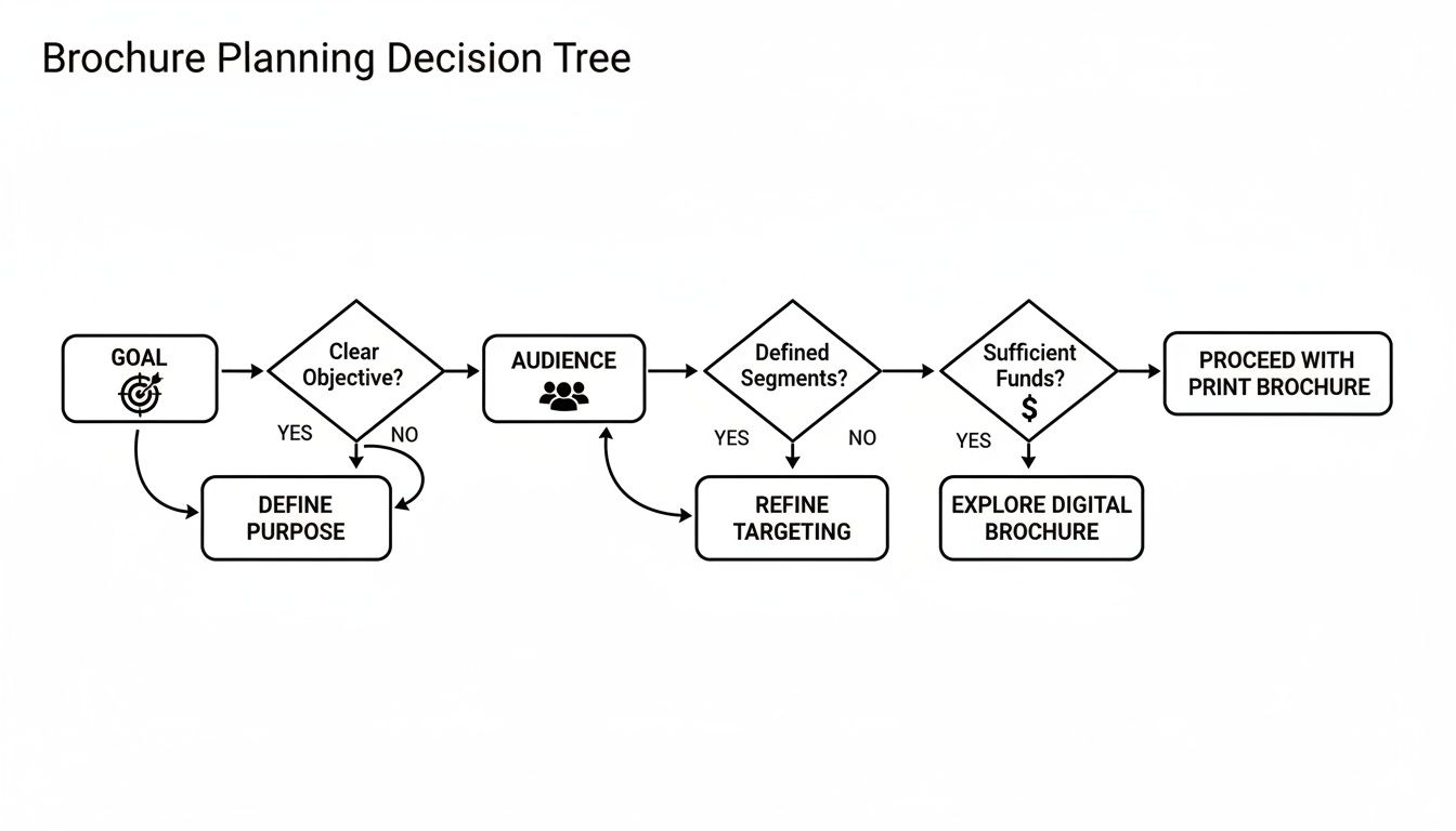
As you can see, every choice in brochure printing should start with a clear purpose, not just what looks good.
More Creative Folding Options
When you really want to stand out and create something memorable, more complex folds can make all the difference. They might take a bit more planning from a design perspective, but the "wow" factor is often worth it.
- Gate Fold: This is a dramatic one. Two front panels open like double doors to reveal a large interior spread. It’s perfect for building anticipation and is a popular choice for high-end real estate, luxury product launches, or special event programs.
- Roll Fold: Think of this as a tri-fold with an extra panel (or more). Each panel rolls into the next, creating a tidy, compact package that can hold a surprising amount of information. It’s great for detailed guides or extensive schedules.
- Accordion Fold: With multiple panels zig-zagging back and forth, this fold is ideal for maps, historical timelines, or any design that needs to present a lot of sequential information in an easy-to-expand format.
The fold is not an afterthought; it’s the architecture of your message. A well-chosen fold doesn't just hold your content—it enhances it, creating a tactile experience that makes your message more engaging and memorable.
At the end of the day, the right fold for your brochure is the one that best supports your content and helps you hit your marketing goals.
Selecting Paper That Makes an Impression
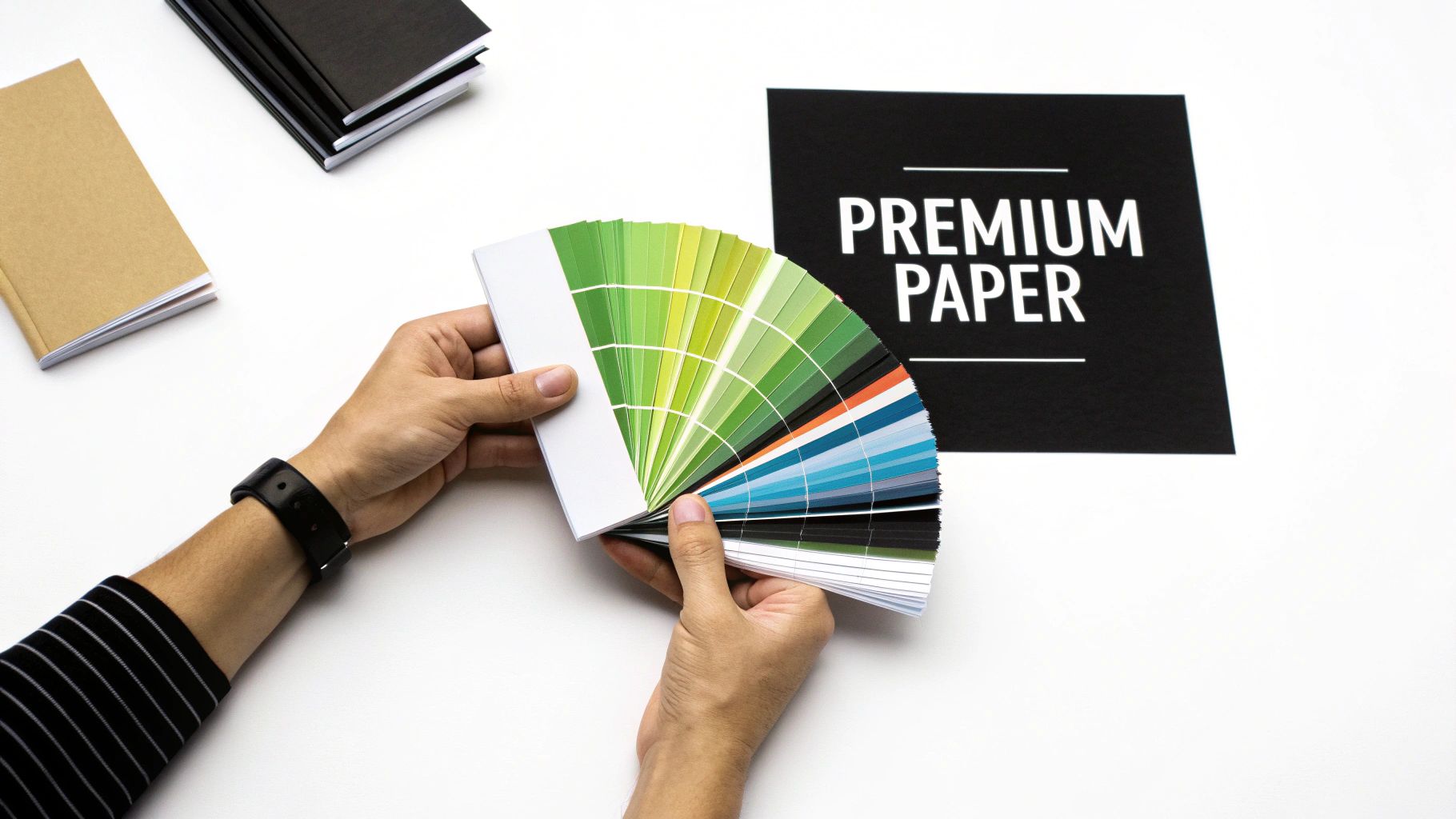
Long before someone reads the first word, your brochure has already made an impression. The moment it's in their hands, the weight and feel of the paper are sending a message about your brand's quality and attention to detail. Choosing the right paper is the difference between a brochure that gets tossed and one that feels important enough to keep.
This is why understanding paper stock is so critical. The right weight and finish can make your brand feel accessible and efficient or luxurious and established. It’s a subtle but powerful part of your overall message.
Understanding Paper Weight
Think of paper weight as the backbone of your brochure—it’s all about thickness and sturdiness. In the print world, you'll often hear terms like points (pt) or grams per square meter (gsm). Don't let the jargon intimidate you; a higher number simply means thicker, more durable paper.
- Lightweight Stock (e.g., 100 gsm / 70 lb Text): This is the thin, flexible paper you’d find in a high-quality magazine. It’s a great, budget-friendly option for mass mail-outs or informational handouts where you're trying to keep bulk and shipping costs down.
- Heavyweight Stock (e.g., 250+ gsm / 100 lb Cover): This is sturdy cardstock that stands up on its own and feels substantial. It's the go-to for high-end marketing pieces, presentation folders, or any brochure designed to communicate quality and permanence.
The weight you choose helps set the right expectation. A flimsy paper works for a quick takeaway, but a heavier stock tells your audience, "This is something you'll want to hold onto."
Choosing the Right Finish
The finish is the coating applied to the paper after printing, and it completely changes the final look and feel. The two most popular choices sit on opposite ends of the spectrum, each with its own strengths.
A glossy finish is like a fresh coat of wax on a car—it's shiny, vibrant, and makes colors leap off the page. If your brochure is packed with bold photography, like a travel guide or a real estate listing, gloss is your best friend. It grabs attention and makes those images pop.
On the other hand, a matte finish is more like frosted glass. It has a smooth, non-reflective surface that feels modern and elegant. Matte is fantastic for designs with a lot of text because it cuts down on glare, making everything easier to read. It doesn't shout; it whispers sophistication, which is why it's a favorite for luxury brands and corporate communications.
The right paper and finish do more than just carry your design; they complete the sensory experience. A thoughtful choice demonstrates professionalism and reinforces the value of your brand in a way that resonates with customers.
These finishing touches are a huge part of the commercial printing process. In fact, the industry is projected to hit a staggering USD 842.39 billion by 2034, with finishing and post-press services playing a major role in that growth. You can read more about the growth of the commercial printing market at towardspackaging.com.
Getting Your Design Ready for a Flawless Print Run
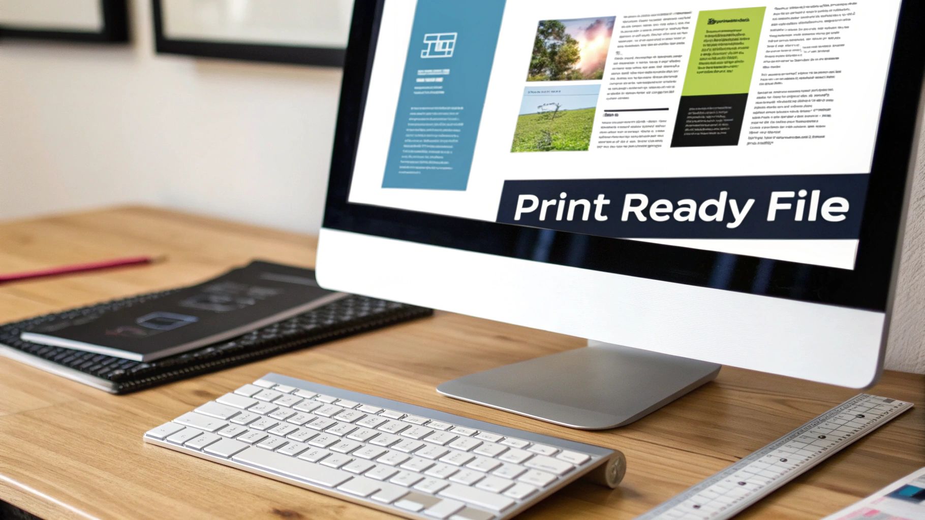
This is where the rubber meets the road. It’s the critical moment your digital vision gets translated into a physical, tangible object. A stunning design on screen can easily become a printing disappointment if the file isn’t prepared correctly, so getting these technical details right is key to making sure your final brochure looks as sharp as you imagined.
The first concept you absolutely need to understand is the difference between screen color and print color. Your monitor creates color by mixing light using a model called RGB (Red, Green, Blue). Commercial printers, on the other hand, mix physical inks on paper using a model called CMYK (Cyan, Magenta, Yellow, Black).
Think of it like this: RGB is an additive process, adding light together to get brighter colors until you reach pure white. CMYK is a subtractive process, layering ink on paper to absorb light, making things darker until you get to black. If you send a file in RGB, the printer’s software has to guess at the conversion, and that often leads to dull, washed-out colors. For predictable, vibrant results, always set up your design file in CMYK from the start.
Your Print-Ready File Checklist
To sidestep common headaches and make sure everything goes smoothly, run through this checklist before you send your files over. These small steps can prevent some pretty big problems down the line.
Set Up Your Bleeds: A bleed is a small safety margin—usually 1/8th of an inch—where your background color or image extends past the final trim line. This is absolutely essential. It gives the cutting machine a tiny bit of wiggle room, ensuring your design goes right to the edge without any ugly white slivers showing up.
Use High-Resolution Images: For an image to look crisp in print, it needs a resolution of at least 300 DPI (dots per inch). Images you pull from a website are typically only 72 DPI and will look blurry and pixelated when printed. Always start with original, high-quality photos and graphics for that truly professional look.
Embed or Outline Your Fonts: If we don't have the exact font you used, our system will swap it for a default one, which can completely wreck your layout. To stop this from happening, you can either embed the fonts into your final PDF or convert all your text to outlines (which turns them into shapes). This locks your typography in place for good.
"A print-ready file isn't just a suggestion; it's the blueprint for success. Taking the time to properly set up bleeds, resolution, and color profiles is the single most important factor in achieving a predictable, professional outcome and avoiding costly reprints."
When you master these technical steps, you’re not just designing a brochure anymore—you’re engineering it for perfect production. This attention to detail is what separates an amateur handout from a polished piece of marketing that truly represents your brand. A clean file is the final handshake between your design and our press, setting everyone up for a fantastic result.
Understanding the Printing and Proofing Process
So, you've submitted your design file. What happens next? Your digital design is about to start its journey into the physical world, and the first fork in the road is deciding how it gets printed. This choice really boils down to your quantity, timeline, and budget, and it leads to two main paths: digital or offset printing.
Think of digital printing as a super-powered version of the best office printer you've ever seen. It takes your file and prints it directly onto paper. Because there’s very little setup involved, it's incredibly fast and perfect for smaller runs—whether you need 50, 100, or even 500 brochures.
This speed and flexibility are why digital printing has become such a big deal. The market hit a value of US$ 33.5 billion in 2024 and is still climbing, all because it's the perfect solution for jobs that need to be done now. You can read more about the rapid growth of digital printing at thecannatareport.com.
On the other hand, offset printing is the classic, heavy-duty method for big jobs. This process involves creating custom metal plates from your design to transfer the ink. The initial setup takes more time and money, but once the press is running, the cost per brochure plummets. This makes it the only logical choice for large orders of 1,000 pieces or more.
The Critical Proofing Checkpoint
No matter which printing method we use, there's one step that is absolutely non-negotiable: proofing. This is your last chance to catch a mistake—a tiny typo, a wrong phone number, anything—before we run hundreds or thousands of copies.
A proof is your final safety net. Taking just ten extra minutes to carefully review a digital proof can save you from the significant cost and frustration of having to reprint an entire order due to a preventable mistake.
When you work with a printer like Camelot, we'll send you a digital proof. This is simply a PDF that shows you exactly how your file is set up to print. It’s your job to give it a final, eagle-eyed review.
Here’s what to look for:
- Typos and Grammatical Errors: Read every single word. It’s amazing what you might miss.
- Correct Contact Information: Triple-check phone numbers, addresses, and websites.
- Image Quality: Do your photos look sharp? Or are they blurry and pixelated?
- Layout and Margins: Make sure no important text or logos are about to be trimmed off or lost in a fold.
Once you give us the thumbs-up on that proof, your job officially heads to production. Understanding this whole process, from the print method to that final proofing check, takes all the guesswork out of it and ensures the brochures you get are exactly what you had in mind.
The Advantage of a Local Printing Partner
In a world of faceless online vendors, it’s easy to think of printing as just another digital transaction. You upload a file, click a few buttons, and hope for the best. But when it comes to something as important as your company's brochure, choosing a local partner offers something an algorithm never will: a real, human connection.
A local printer isn't just a supplier; they're an extension of your marketing team. When you work with a provider like Camelot Print & Copy Centers, you're not just a number in a queue. You can actually talk to the person handling your project, someone who understands the nuances of printing and is invested in getting it right for you.
The Power of a Personal Connection
Ever tried to describe the feel of a paper stock over email? It's impossible. One of the biggest wins of working locally is the ability to see and touch the materials yourself. You can hold different paper stocks, see how a gloss finish catches the light, and look at actual printed samples to make sure the colors on paper match what you saw on screen.
This hands-on experience removes all the guesswork. It gives you confidence that the final product will be exactly what you envisioned.
Choosing a local printer transforms the transaction into a relationship. It’s the difference between clicking a button and shaking a hand—one is a command, the other is a partnership built on trust and mutual success.
Better yet, a local team can offer invaluable advice on the spot. They can catch a design flaw before it goes to press, suggest a different fold that might save you money, or help troubleshoot a file issue in minutes. That kind of proactive guidance is something you just don't get from a chatbot.
Tangible Benefits of a Local Partnership
Beyond the personal touch, working with a local expert brings some serious practical advantages that lead to a better brochure and a smoother process.
- Faster Turnarounds: Proximity is a huge deal. Local production and delivery options can shave days off your timeline, which is a lifesaver when you're up against a tight deadline.
- Expert Troubleshooting: If there's a problem with your file, a local pro can spot it and work with you directly to fix it. This avoids the frustrating, time-consuming back-and-forth email chains that are common with online-only services.
- Supporting Your Community: When you invest in a local business like Camelot Print & Copy Centers, that money stays right here in the community. You're not just getting a great product; you're strengthening the local business network you're a part of.
At the end of the day, a local printing partner provides a level of service, accountability, and expertise that makes the whole process more reliable and successful. You're not just buying prints; you're gaining a partner.
Got Questions? We've Got Answers
Even with the best plan, you're bound to have a few specific questions as you get ready to print. It’s completely normal. Getting these details ironed out beforehand is the key to a smooth process and a final product you'll be proud of.
Let's walk through some of the questions we hear most often.
What's the "Magic Number" for a Cost-Effective Print Run?
This really comes down to a balancing act between your needs and the technology we're using. There isn't one perfect number, but there's definitely a sweet spot.
For smaller, more targeted projects, digital printing is your best friend. The setup is minimal, which makes it incredibly economical for runs between 50 and 500 pieces. You get exactly what you need without a big upfront cost.
But when you're going big, offset printing is the way to go. The initial setup is more involved, but once the presses are running, the cost per brochure plummets. If you need 1,000 brochures or more, offset printing almost always delivers the best bang for your buck. We can easily quote a few different quantities so you can see the price breaks for yourself.
How Do I Choose Between a Glossy and Matte Finish?
Think about the story you want your brochure to tell and the feeling you want to evoke. The finish is a huge part of that.
- Go with glossy when your photos need to do the heavy lifting. If you're selling a tropical vacation or showing off stunning architectural photography, a glossy finish makes those colors leap off the page. The shine grabs your attention and screams vibrancy.
- Pick matte for a more refined, sophisticated vibe. It’s modern, elegant, and has no glare, which makes brochures with a lot of text much easier to read. This is the go-to choice for high-end brands, financial institutions, or anyone wanting to project an air of quiet confidence.
What Is a "Bleed" and Why Do I Keep Hearing About It?
A "bleed" is one of the most important concepts in professional printing, but it's pretty simple. It’s just a little extra bit of your background image or color—typically 1/8th of an inch—that extends past the edge of where the paper will be cut.
Think of it as an insurance policy. Paper can shift by a tiny fraction of a millimeter during the final trimming stage. Without a bleed, that tiny shift could leave an ugly, unprofessional white sliver along the edge of your beautiful design. Adding a bleed ensures your graphics run all the way to the very edge, giving you that clean, polished look.
At Camelot Print & Copy Centers, our job is to make this process easy and guide you through every decision, from paper stock to final delivery. Get in touch with our experts today to start your next project.