A good business card is a handshake you can hold onto. It’s all about creating a professional and memorable first impression. You’ve got to nail the layout, choose type that’s easy to read, use color wisely, and pick a quality paper that feels substantial in someone's hand. All these little details come together to show people what your brand is all about, right from the first glance.
Why Great Business Card Design Still Matters

Even with all our digital profiles and online connections, a physical business card still packs a serious punch in the networking world. It’s more than just a slip of paper with your name and number; it’s the very first piece of your brand that a potential client actually gets to touch and feel. That tangible interaction creates a personal connection that a simple LinkedIn request just can't match.
A thoughtfully designed card is a silent ambassador for your business. It immediately speaks volumes about your professionalism and your eye for detail, all while reinforcing your brand identity. Think of it as a pocket-sized billboard for your business—it makes sure you leave a real, lasting impression long after the initial handshake.
The Psychology of a Powerful First Impression
Don't just take my word for it—the data backs this up. A staggering 72% of people form an opinion about a company or a professional based on the quality of their business card. What's even more revealing is that 39% of people said they would flat-out choose not to do business with someone who handed them a cheap, flimsy card.
This tells us that a card is far more than just informational; it's incredibly influential. It sets the stage and manages expectations about the quality you deliver. If you hand someone a flimsy, poorly designed card, you're subconsciously telling them you don't invest in your own brand. Why should they invest in you?
A great business card is a conversation starter. It should be memorable enough that when someone finds it in their wallet weeks later, they remember not just your name, but the value you offer.
More Than Just Contact Information
Your business card isn't just a static piece of contact info; it's a dynamic marketing tool. It can be a direct line to your portfolio, a shortcut to booking a consultation, or even a vehicle for a special offer. I've seen architects use clever die-cut shapes that echo their creative style, while a consultant might go for a clean, minimalist design on heavy-duty stock to project authority and trust.
You can also get creative and bridge the gap between the physical and digital worlds by using a QR code on your business card. A quick scan can send people directly to your website, portfolio, or social media pages. When it comes down to it, the real power of a business card versus a billboard is its personal, one-to-one delivery. You’re handing someone a direct invitation to connect, making it an essential tool for any business looking to grow.
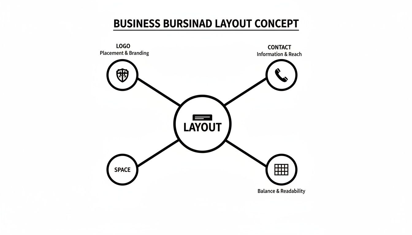
Building a Clear and Effective Layout
Long before you get to picking fonts and colors, you need a solid layout. Think of it as the foundation of your business card. A good layout isn't just about making things look nice; it's about guiding someone's eye exactly where you want it to go, making your name, title, and contact info pop.
A cluttered card is a dead card. It’s like a tiny billboard, and every single element needs a reason to be there. This is where white space—the empty space around your text and logo—becomes your secret weapon. Without it, your design feels cramped, busy, and just plain overwhelming.
Using white space well gives your card a clean, professional, and confident feel. It creates breathing room, which naturally draws attention to what matters most: your name and how to reach you. A card with enough negative space is instantly easier to read and looks far more sophisticated.
Establishing Visual Hierarchy
Visual hierarchy is just a fancy way of saying you need to decide what’s most important and make it look that way. Not everything on your card is created equal. Your name and company logo should always be the stars of the show.
Here’s a simple way to think about structuring that hierarchy:
- Your Name and Logo: These are the headliners. Make them the largest and most visually dominant elements. Your logo often looks best at the top or in a prominent corner.
- Your Job Title: This should live right under your name, but maybe in a slightly smaller font or a lighter weight to show it’s secondary.
- Contact Information: Group your phone number, email, and website together. Keep the font clean and legible—smaller than your name, but not so small that people have to squint.
The most common mistake I see is making every bit of text the same size. That creates visual chaos and makes the other person work way too hard to find what they need. Your job is to guide their eye.
Choosing a Layout Orientation
The orientation of your card—whether it's horizontal or vertical—can completely change its vibe. The standard horizontal layout is a classic for a reason, but a vertical card can feel fresh and modern.
A horizontal layout is the traditional choice, and it's incredibly effective. It’s what people expect, which makes it a safe bet for professionals in fields like law, finance, or real estate. This format gives you plenty of room to place a logo on one side and your contact details neatly on the other.
On the other hand, a vertical layout can really make a statement and help you stand out in a stack of cards. It’s a popular choice for designers, photographers, and other creative pros. This orientation is perfect for designs that put the logo front and center at the top, with all the information flowing down naturally.
Before you get too deep into the details, brushing up on some fundamental graphic design basics can make all the difference. It will help you make smarter layout choices that truly reflect your brand.
Choosing Your Brand's Voice with Typography and Color
Long before anyone reads a single word on your business card, its fonts and colors have already made an impression. Think of these design choices as your brand’s visual tone of voice—they instantly signal whether you're modern and edgy, classic and reliable, or creative and friendly. Nailing this combination is one of the most important parts of designing a card that works.
Typography is so much more than just the letters on the page; it's pure personality. For the most part, you’ll be working with two main font families: serif and sans-serif.
Serif fonts have those little "feet" or decorative lines at the ends of the letters. They tend to feel traditional, established, and authoritative. Imagine a high-end law firm or a trusted financial advisor—that’s serif territory.
Sans-serif fonts, on the other hand, are clean and minimalist. Without those extra lines, they come across as modern, straightforward, and incredibly easy to read. This makes them a go-to choice for headlines and, crucially, for the small print of your contact details where you can't afford any confusion.
Selecting Your Fonts
Here’s a piece of advice I always give: stick to two fonts, max. Any more than that, and your card starts to look cluttered and amateurish. A popular and effective approach is to pair a bold, attention-grabbing font for your name with a simple, clean font for your contact information. This creates an instant sense of order.
- Primary Font: This is for your name and your company’s name. It should be distinctive and really capture the essence of your brand.
- Secondary Font: Use this for your phone number, email, and website. Readability is everything here. It has to be crystal clear, even at a tiny size.
The goal isn't just to look pretty—it's to communicate instantly. If someone has to squint to make out your email address, you've created a barrier. Good typography should feel effortless.
The Power of a Strong Color Palette
Color is a heavy hitter in design. It triggers emotions and builds brand recognition faster than almost any other element. In fact, studies show that using a signature color can boost brand recognition by up to 80%. Your business card is a prime opportunity to reinforce your brand identity, so be sure to use your established brand colors consistently.
It’s all about creating a balanced, professional layout where your logo, text, and colors work together without overwhelming the viewer.
This kind of visual planning shows how important it is to balance your core information with enough negative space to let the design breathe.
Now for a crucial technical tip: you have to understand the difference between color modes. Your computer screen displays colors using the RGB (Red, Green, Blue) model, but professional printers use CMYK (Cyan, Magenta, Yellow, Black). Always set up your design file in CMYK from the start. If you don't, you risk your vibrant on-screen colors turning out dull and muddy on the final printed card—a disappointing outcome for an otherwise great design.
To help you decide, I’ve put together a quick guide to common font styles and the brand personalities they often represent.
Choosing the Right Typography for Your Brand
| Font Style | Common Characteristics | Best For Brands That Are... | Example Use Case |
|---|
| Serif | Traditional, classic, elegant, authoritative | Established, trustworthy, academic, luxurious | A law firm, a financial consultant, a university, a high-end tailor |
| Sans-Serif | Modern, clean, minimalist, approachable | Tech-focused, innovative, straightforward, casual | A software startup, a graphic design studio, a modern cafe |
| Script | Personal, decorative, artistic, elegant | Creative, bespoke, personal, feminine | A wedding photographer, a boutique bakery, a calligrapher, a beauty brand |
| Slab Serif | Bold, strong, confident, retro | Sturdy, impactful, vintage-inspired, industrial | A craft brewery, a men's grooming brand, a construction company |
Ultimately, the right font is one that not only looks good but also feels authentic to your brand’s mission and values.
Making a Memorable Impression with Paper and Finishes
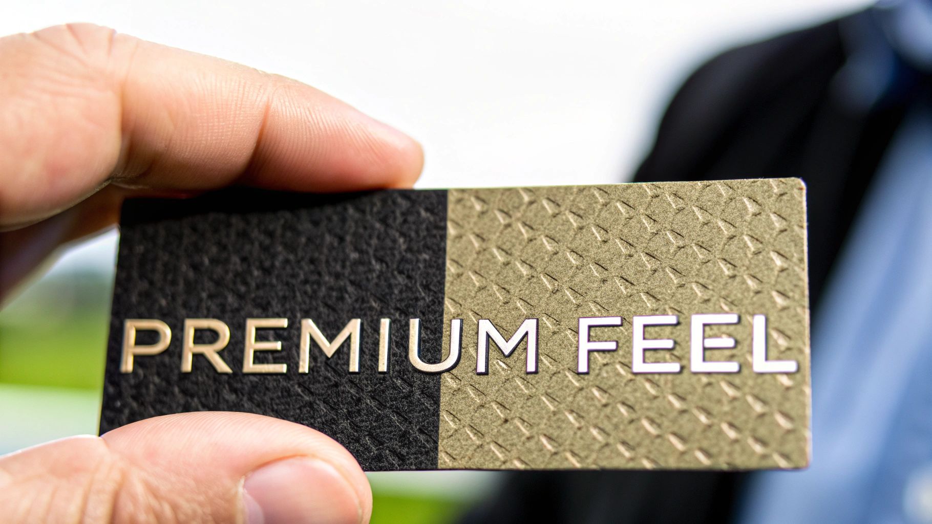
While the visual design catches the eye, the physical feel of a business card is what truly sticks with someone. The weight and texture of the paper can instantly signal quality, durability, and attention to detail. A flimsy card feels cheap and disposable, but a thick, substantial one commands respect before a single word is read.
This is where understanding paper stock becomes a game-changer. The thickness, measured in "points" (pt), makes all the difference. Most standard cards are printed on 14pt stock, which is perfectly fine. But upgrading to a 16pt or 18pt stock gives your card a noticeably more premium and sturdy feel that people remember.
Think about it—a thicker card subtly suggests you invest in quality and don't cut corners. It's a small detail, but it reinforces your brand's value in a powerful, tangible way.
Choosing the Right Finish for Your Brand
The finish is the coating applied to the paper, and it completely changes the final look and feel. Each one has a distinct personality, so you’ll want to pick the one that best reflects your brand.
Here are the three most common options you'll encounter:
- Glossy: This finish has a high-shine, reflective surface that makes colors explode off the card. It's a fantastic choice for photographers, artists, or any brand where vibrant imagery is key. Photos just look richer and more dynamic.
- Matte: With its smooth, non-reflective surface, a matte finish offers a modern, understated elegance. It’s perfect for text-heavy designs because it cuts down on glare and is easy to read. This is a go-to for consultants, financial advisors, and brands with a minimalist aesthetic.
- Uncoated: Uncoated stock has no extra coating, giving it a raw, natural texture. It’s also incredibly easy to write on, which is a huge plus if you like to jot down a personal note for new contacts. This finish works great for projecting an organic, eco-friendly, or rustic vibe.
The tangible experience of a business card is its superpower. A unique texture or a surprising weight makes your card memorable long after the conversation has ended, helping it stand out in a wallet full of standard cards.
If you want to get into the nitty-gritty, learning about paper weight points and what that all means will help you have a much more productive conversation with your printer.
Elevating Your Design with Special Finishes
Ready to really make an impact? Special finishes add visual and textural flair that can turn a simple card into a memorable keepsake. These premium touches show a deep commitment to detail and craft.
Consider adding one of these popular techniques to your design:
- Spot UV: This is a glossy coating applied to specific parts of your card—like a logo or graphic element—while the rest remains matte. It creates a stunning contrast that catches the light and draws immediate attention to the details you want to highlight.
- Foil Stamping: Using metallic foil in gold, silver, copper, or even holographic colors adds a touch of luxury. It’s perfect for making a company name or logo feel prestigious and high-end.
- Embossing & Debossing: Embossing raises a part of your design up from the surface, while debossing presses it into the cardstock. Both techniques add a 3D texture that people can't help but touch, making your card a far more interactive experience.
Avoiding Common—and Costly—Design Pitfalls
Even the most brilliant business card idea can be completely undone by a few small, entirely avoidable mistakes. I've seen it happen countless times. Knowing what to look out for before you send your design to print is the final, and most critical, hurdle to clear.
One of the most common blunders I see is a low-resolution logo. It might look perfectly fine on your monitor, but once it hits paper, it becomes a blurry, pixelated mess. The only way to guarantee a sharp result is to use a vector file for your logo, like an AI, EPS, or SVG. Anything else is a gamble.
Then there's the text. If people have to squint to read your phone number, you’ve already lost. Fonts that are too small, overly decorative, or don't have enough contrast against the background are a recipe for frustration. As a hard and fast rule, never go smaller than 7pt for your contact information.
Technical Traps to Sidestep
Beyond the purely visual stuff, the technical setup is where a lot of expensive mistakes are made. If you don't prep your file correctly for a professional printer, you’re setting yourself up for disappointment.
Two terms you absolutely need to know are bleed and safe zone.
- Bleed: This is a small border—usually 1/8th of an inch—that you add around your design. Because the final cut can be a fraction of a millimeter off, the bleed ensures you don't end up with a weird, ugly white sliver along the edge of your card.
- Safe Zone: Think of this as the opposite of the bleed. It's an inner margin, also typically 1/8th of an inch from the trim line, where all your critical information (like your name and phone number) must live. This guarantees nothing important gets lopped off.
I always tell my clients to imagine the safe zone as a protective bubble for their most important info. If your email address is touching that edge, it’s in the danger zone and might get sliced away.
Another classic error is working in the wrong color mode. Your computer screen uses RGB (Red, Green, Blue) light, but printers use CMYK (Cyan, Magenta, Yellow, Black) ink. If you design in RGB, the colors on your printed card will look dull and off—a surefire way to get a result that doesn't match your brand.
The Overcrowding Problem
Finally, resist the urge to cram every last detail onto that tiny piece of cardstock. A business card isn't a brochure. Its job is to make a quick, powerful impression and provide a clear path for someone to contact you.
Too much text just creates a cluttered, overwhelming mess. Stick to the absolute essentials:
- Your Name and Title
- Company Name and Logo
- Phone Number
- Email Address
- Website
If you have more to share, that’s what QR codes are for. Link it to your online portfolio, your social media, or a special landing page. Remember, white space isn't wasted space. It’s an active design element that gives your card a clean, sophisticated look and makes it far easier to read. Let your design breathe.
Before you hit "send" on that print order, running through a quick checklist can save you a world of headaches and wasted money. I've put together this simple table to cover the most critical checks I perform on every single business card file.
Pre-Print Design Checklist
| Check Item | Why It's Important | How to Verify |
|---|
| Vector Logo | Ensures the logo prints sharp and crisp, not blurry or pixelated. | Check the file extension. It should be .ai, .eps, or .svg. |
| Minimum Font Size | Guarantees all text, especially contact info, is easily readable. | Select the smallest text on your card and confirm it's 7pt or larger. |
| Bleed Area | Prevents white edges from appearing after the card is trimmed. | Confirm your document size is 3.75" x 2.25" (for a standard 3.5" x 2" card). |
| Safe Zone | Protects essential text and logos from being cut off during printing. | Make sure all important elements are at least 1/8th of an inch inside the trim line. |
| CMYK Color Mode | Ensures the printed colors will be accurate and match your brand expectations. | In your design software (Adobe Illustrator, Canva, etc.), check the document's color mode setting. |
| High-Resolution Output | Ensures the final print quality is professional and not grainy. | Export your final print-ready file (usually a PDF) at 300 DPI (dots per inch). |
Taking just a few minutes to tick off these boxes is the best insurance policy for a perfect print run. Once you’ve confirmed everything is in order, you can send your file to the printer with complete confidence.
Getting Your File Ready for a Professional Printer
You've poured all this effort into designing the perfect business card. Now comes the final, make-or-break step: preparing the file so it actually prints the way you envisioned. Trust me, getting this part right is the difference between a crisp, professional card and a disappointing, amateurish one.
The first thing to check off your list is resolution. Your design file absolutely must be set to 300 DPI (dots per inch). Screen graphics look fine at 72 DPI, but that same file will come out looking blurry and pixelated on paper. If you start your design at 300 DPI from the get-go, you're guaranteeing sharp text and clean lines.
Next up is color mode. Your monitor displays colors using RGB (Red, Green, Blue), but professional printers run on CMYK (Cyan, Magenta, Yellow, Black). You have to design in CMYK mode from the start. If you design in RGB and convert later, you’ll likely see a noticeable and often disappointing color shift. That vibrant blue on your screen could turn into a dull, muddy purple in print.
Don't Forget Bleed and Safe Zones
I can't tell you how many times new designers get tripped up by this. To avoid the most common printing mistakes, you need to get familiar with two critical concepts: bleed and safe zones. These are absolutely essential if any part of your design—a background color, a photo—is meant to go right to the edge of the card.
Bleed: Think of this as a small, extra border of your design that extends past where the card will be cut. This is usually 1/8th of an inch on all sides. Since paper can shift slightly during the trimming process, this "bleed" area ensures you won't end up with a random, ugly white sliver along the edge of your finished card.
Safe Zone: This is the opposite—it's an inner margin where you should keep all your vital information. Make sure your name, logo, phone number, and email address all stay comfortably inside this area. This guarantees that nothing crucial gets accidentally sliced off during trimming.
Think of the safe zone as a protective bubble for your most important content. Anything that creeps too close to the final trim line is at risk. Respecting these boundaries is a hallmark of professional design.
Finally, you need to deliver the file in the right format. While some printers might accept native files like AI or EPS, the gold standard is a high-resolution PDF. It’s a universal format that locks in your fonts, images, and layout, ensuring what you see is what the printer gets.
For a more detailed walkthrough, our guide on creating PDFs for printing has you covered. Taking a few minutes to get these technical details right ensures all your creative work translates into a business card you’re proud to hand out.
Your Business Card Design Questions, Answered
Even when you have a good design direction, questions always pop up. I've been there. Let's tackle some of the most common ones I hear from clients to clear up any confusion.
How Much Information Should I Put on My Card?
It's tempting to cram everything in, but less is almost always more. Stick to the absolute essentials: your name, title, company, phone number, email, and website. That's it.
If you have a whole suite of social media profiles or an online portfolio to show off, use a QR code. This keeps your card looking clean and professional while giving people an easy way to find everything else. The goal is to make your card a starting point, not your entire resume.
What's the Best Size for a Business Card?
In the United States, the standard, can't-go-wrong size is 3.5 x 2 inches. There's a simple reason for this: it's what fits in wallets and cardholders.
While a custom-shaped card might seem like a cool way to stand out, think about the person receiving it. If it’s an awkward size, it's more likely to get tossed. If you're looking for a simple twist, try a vertical orientation or subtle rounded corners. They add a touch of uniqueness without sacrificing convenience.
A business card only works if someone keeps it. Your design choices should be memorable, but never at the expense of practicality.
Should I Use Both Sides of the Card?
Yes, you absolutely should. A two-sided card doubles your real estate, allowing you to create a much stronger, more organized design.
Here’s a pro-tip: use the front for impact and brand recognition—think a bold logo and maybe your company name. Then, put all the contact details neatly on the back. This separation makes the information much easier to scan and digest, and it just looks a lot cleaner.
Ready to create a business card that truly represents your brand? The team at Camelot Print & Copy Centers brings expert design know-how and top-notch printing together. Get started on your professional business cards today.