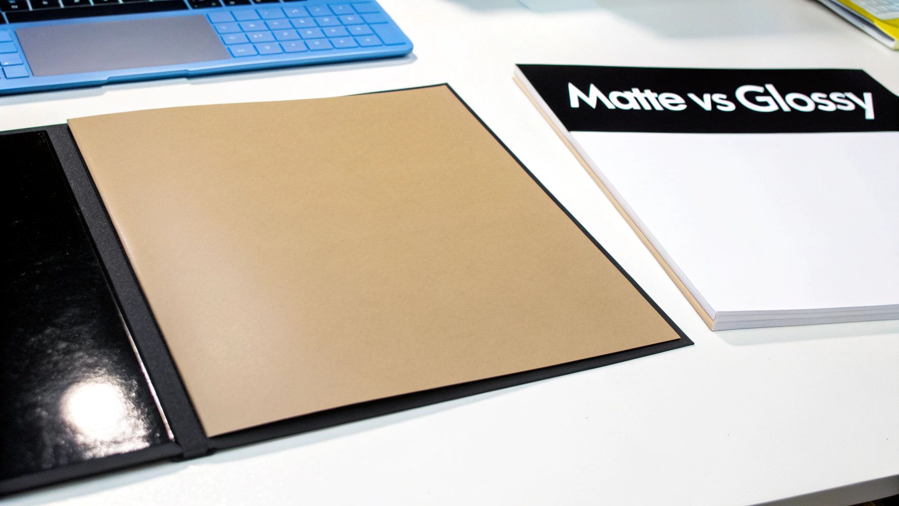
The real difference between matte and glossy paper boils down to two things: how it reflects light and how it feels to the touch. Glossy paper has that classic shiny coating. It makes colors pop with incredible vibrancy, which is why it's a go-to for anything heavy on photography. Matte paper, on the other hand, has a non-reflective, smooth finish that kills glare, making it a fantastic choice for documents with a lot of text or anything you might need to jot a note on.
Understanding the Core Differences
Picking the right paper finish is one of those decisions that can make or break a print project. It’s not just about looks—it directly impacts the final feel and even the functionality of your materials. While both matte and glossy papers can give you a high-quality result, they are built for very different jobs. Getting this choice right is what ensures your design looks as good on paper as it does on your screen.
This choice goes beyond pure aesthetics; it affects readability, durability, and how someone actually interacts with your print. A glossy finish can grab a customer's attention from across the room, but a matte finish offers a more subtle, sophisticated experience for something like a business proposal you hand someone directly.
A Quick Comparison of Matte vs Glossy Paper
Before we get into the nitty-gritty of specific projects, a side-by-side look can be really helpful. This table lays out the main characteristics of each finish to give you a quick snapshot.
Key Differences Between Matte and Glossy Paper
Think of this table as a quick reference guide. It’s designed to help you quickly weigh the pros and cons of each finish for your project's specific needs.
| Attribute | Matte Paper | Glossy Paper |
|---|
| Reflectivity & Glare | Very little to no glare; great for reading in bright light. | Highly reflective; can create harsh glare under lights. |
| Color Saturation | Colors appear softer and more muted. | Colors are vibrant, deep, and pop off the page. |
| Fingerprint Resistance | Excellent; smudges and fingerprints are barely noticeable. | Poor; easily shows fingerprints and smudges. |
| Readability | High; ideal for documents with lots of text. | Lower; glare can make reading long passages difficult. |
| Writability | Excellent; easy to write on with most pens and pencils. | Difficult; pen ink tends to smudge and take time to dry. |
| Tactile Feel | Smooth with a natural, almost velvety texture. | Slick, smooth, and feels modern and coated. |
At the end of the day, each finish has its purpose. Glossy paper is your showstopper. It’s engineered to make images jump off the page with sharp detail and rich color. It's the obvious choice for things like real estate flyers, product catalogs, or professional photos where the image is the star of the show.
On the flip side, matte paper is all about subtlety and function. Its glare-free surface is perfect for anything that needs to be read up close and for a long time, like training manuals, architectural plans, or elegant wedding invitations where you want a refined, professional feel.
Ultimately, the right choice always circles back to your project's goal. Are you trying to make a bold, visual splash? Or do you need to present information in a clear, sophisticated way? Answering that one question will get you most of the way to picking the perfect paper.
Comparing Visual and Tactile Differences
Choosing between matte and glossy paper really boils down to the sensory experience you want to create. The way a print looks under different lighting and how it feels in someone's hands can completely change its impact. This makes the paper choice a crucial step in making sure the final product fits your brand. It’s not just about looks; it’s a practical decision that impacts everything from readability to how people interact with your material.
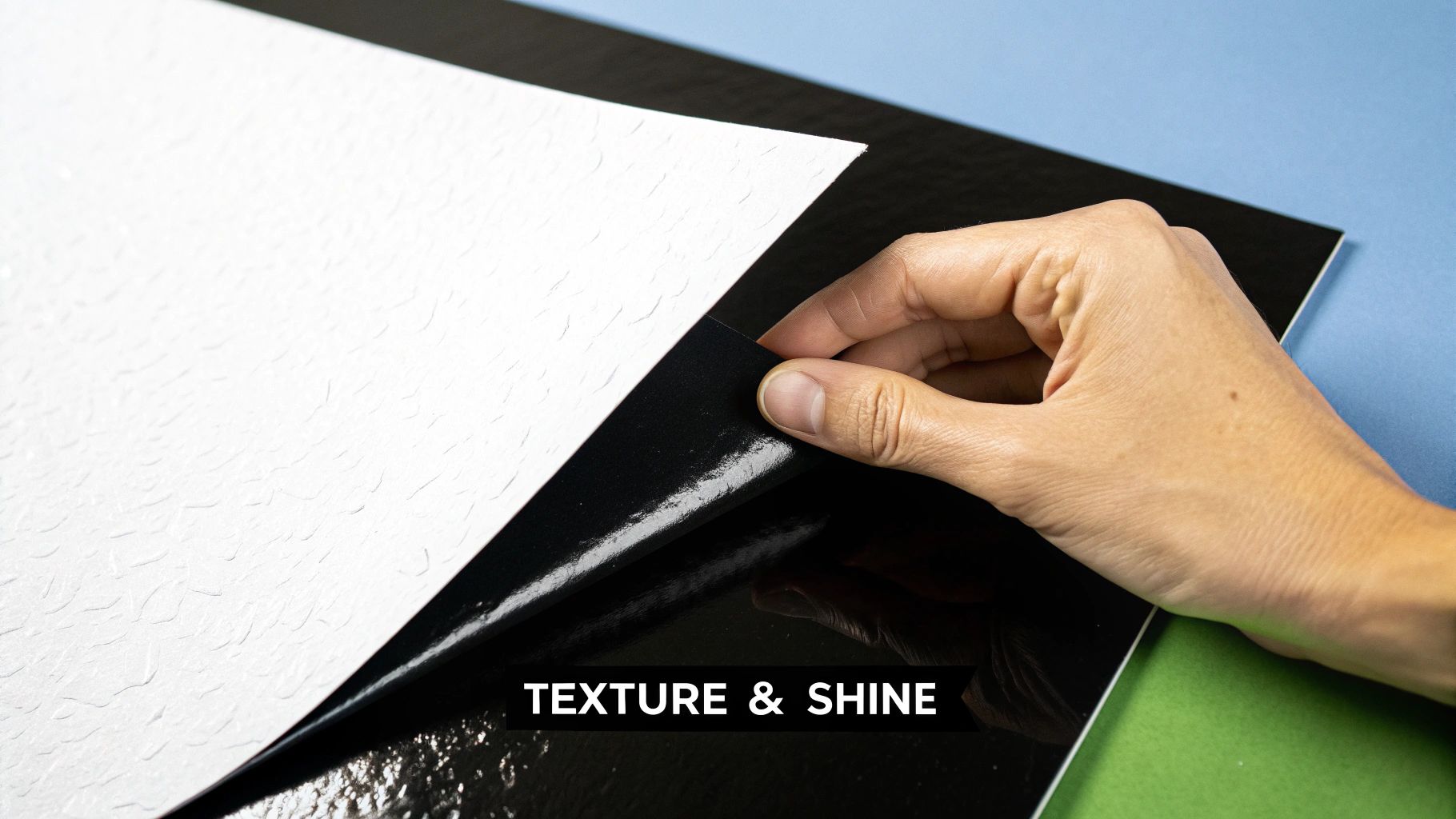
Glossy paper is all about that smooth, coated surface that reflects light. This coating essentially seals the paper, preventing ink from soaking deep into the fibers. The result? Exceptionally sharp images and vibrant, saturated colors that practically pop off the page.
But that reflectivity is also its biggest weakness. Under bright or direct light, glossy paper can create a harsh glare that makes text a real chore to read. It's a classic trade-off: you get a huge visual punch, but you might sacrifice readability depending on the environment.
The Feel and Finish of Each Paper
Beyond the visual pop, the texture of each paper sends a different message. Glossy paper has that slick, modern feel that often implies high-production value. Think of a high-fashion magazine cover or a brochure for a new gadget—that’s the vibe.
Matte paper, on the other hand, has a more natural, uncoated or lightly coated surface. It gives off a subtle, almost velvety texture that feels professional and classic. Because it diffuses light instead of reflecting it, you get a soft, glare-free look that's much easier on the eyes.
The way these papers are made directly ties into their best uses. Research on graphic paper highlights that uncoated stocks (which have a matte finish) are more porous, so they absorb ink more deeply. This is a huge win for text readability and minimizing glare—perfect for things like legal documents or training manuals that people have to read for a long time.
In contrast, the coating on glossy paper holds ink right at the surface, giving you that high color density and image sharpness. This is why it’s the go-to for photo-heavy marketing materials. An architect might save hours of squinting in the sun with matte blueprints, while a retailer could boost a product’s perceived value just by using glossy shelf talkers. For a deeper dive into these trends, you can explore a full analysis of graphic paper.
Color Reproduction and Detail
When it comes to color in the matte vs. glossy paper debate, the difference is night and day. Glossy paper is the hands-down winner for color depth and vibrancy.
- Glossy Paper: You’ll get deeper blacks and a broader range of colors. Details in high-resolution photos look incredibly crisp and defined, making it ideal for product catalogs or professional photo prints.
- Matte Paper: Colors come out softer and more muted. The quality is still excellent, but they won’t have that same intense punch. This can actually be a plus for designs going for a more elegant or vintage feel.
The choice often comes down to your main goal. If you need to show off a product with stunning, true-to-life photography, nothing beats glossy paper's ability to render sharp details and brilliant color.
For documents heavy on text or designs with a more minimalist, sophisticated style, the understated elegance of matte paper is perfect. Its excellent readability ensures your message gets across without the distraction of glare, making it a reliable choice for corporate reports, educational materials, and formal invitations. The key is to picture your project in its final setting—that will almost always point you to the right paper.
Durability and Cost: The Practical Side of Paper
Looks aren't everything. Once you get past the visual appeal, you have to think about the real-world life of your printed piece. How will it hold up? And what’s it going to cost? These practical factors often make the final decision for you when choosing between matte and glossy paper.
It's a common myth that one paper type is flat-out tougher than the other. The truth is, their strengths are just different. Glossy paper, with its smooth, heavy coating, has a clear edge in certain situations.
That shiny coating isn't just for looks; it's a protective layer. This gives it a bit of a defense against moisture and fading. Think about a restaurant menu that has to survive minor spills or a flyer sitting in a sunny window—that glossy coat can make it last a whole lot longer.
You're looking at the tightly woven cellulose fibers that make up the paper. A glossy coating seals these fibers, which keeps ink from bleeding and creates that protective surface.
But here’s the flip side: that same protective coating is a magnet for fingerprints, smudges, and even minor scratches. For anything that gets handled a lot, like a business card or a presentation folder, a glossy finish can start to look tired and messy pretty quickly. The very shine that makes your images look great also highlights every single imperfection on its surface.
How Matte Paper Handles Wear and Tear
Matte paper brings a different kind of durability to the table, and it really shines in high-touch scenarios. Its non-reflective surface is fantastic at hiding fingerprints and small scuffs, which keeps it looking clean and professional even after it’s been passed around a conference room.
Without that slick, heavy coating, matte paper just feels more organic and is far less likely to show smudges. This makes it a go-to choice for:
- Business cards: Especially if you want to leave room for someone to jot a note on the back.
- Booklets and manuals: These are meant to be handled, and a matte finish won't show its age as quickly.
- Folders and portfolios: They keep their sophisticated look without becoming a gallery of fingerprints.
The trade-off? A standard matte paper can be a bit more susceptible to moisture and friction if you don't add a protective finish. However, simply choosing a heavier paper weight can make a huge difference, boosting its sturdiness and making it less likely to crease or tear.
Breaking Down the Cost Differences
When it comes to matte vs glossy paper, cost is always part of the conversation, but the difference might not be as big as you think. As a general rule, glossy paper costs a little more. This is because applying that shiny coating requires extra materials and a more involved manufacturing process.
You'll really only notice this price difference on very large print runs, where that tiny per-sheet cost starts to add up. For smaller projects, the gap is often so small that you can make your decision based on what looks best, not what fits the budget.
It’s also crucial to remember that the finish is just one piece of the pricing puzzle. Other factors usually have a much bigger impact on your final bill:
- Paper Weight: Heavier paper stock is always more expensive, regardless of the finish.
- Order Quantity: The price per piece almost always drops as your order size increases.
- Specialty Finishes: Adding things like lamination or UV coatings will increase the cost but will also dramatically boost the durability of either paper type.
In the end, it’s all about balancing what your project needs with what your budget allows. If the vibrant, punchy colors of glossy paper are a must-have for your marketing flyer, that small extra cost is probably a smart investment. But for a text-heavy report where you need great readability and a clean, smudge-free finish, the more practical and cost-effective matte paper is the obvious winner.
Choosing the Right Paper for Your Project
So, how do you take all the technical details about matte and glossy paper and make the right call for your project? It’s all about matching the finish to how your printed piece will actually be used. The right choice makes your message sing; the wrong one can completely undermine it.
Let's move past simple looks. The single most important question is: where and how will people interact with this? A glossy, high-impact flyer has a totally different job to do than a set of architectural plans that will be unrolled on a sunny construction site.
High-Impact Marketing Materials
When you need to grab someone's attention instantly and show off stunning visuals, glossy paper is almost always the way to go. Its reflective coating makes colors look richer and more saturated, making details pop with an incredible sharpness. It's designed to create a powerful first impression.
Think about these common marketing projects:
- Real Estate Flyers: A glossy finish makes property photos look vibrant and inviting. It helps potential buyers feel the quality of the home before they even step inside by making the colors deep and the details crisp.
- Product Catalogs: When you're selling a product, the image is everything. A glossy finish ensures every photo is sharp and true to life, which can make or break a sale.
- Retail Promotions: For in-store signs or promotional mailers, the goal is to stop people in their tracks. That sheen and color pop from glossy paper are perfect for creating visuals that stand out in a crowded, busy environment.
This quick guide helps visualize how durability factors, like fingerprint resistance, should influence your choice.
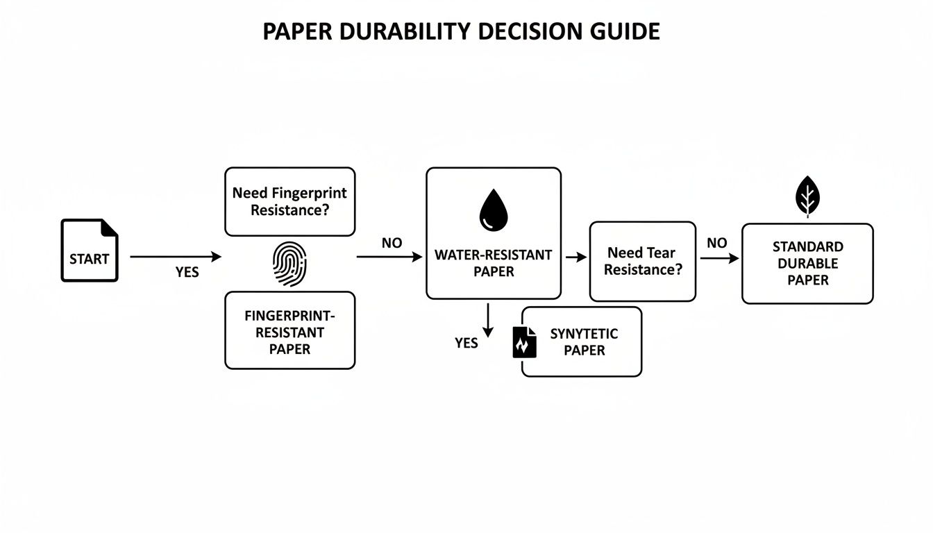
As you can see, if your project will be handled a lot and needs to look clean, the path points straight to a matte finish to avoid smudges.
Projects Prioritizing Readability and Function
On the flip side, when your main goal is to communicate information clearly and without distraction, matte paper is the undisputed champion. Its non-reflective surface cuts out glare, making text easy and comfortable to read for long stretches, no matter the lighting.
Matte paper’s sophisticated, understated feel lends an air of professionalism to documents where substance is more important than flash. Its ability to be easily written on also adds a crucial layer of functionality.
Here’s where matte really shines:
- Architectural Plans & Spec Books: On a construction site or in a bright office, glare from a glossy sheet would make blueprints nearly impossible to read. Matte ensures every line and measurement is perfectly clear, which helps prevent costly mistakes.
- Legal Documents: For contracts, briefs, or exhibits, readability is everything. Matte paper provides a clean, professional look that’s easy on the eyes during long review sessions.
- Restaurant Menus: While lamination is an option, a heavy matte stock feels more premium, hides fingerprints from constant handling, and is easy to read in the dimmer, ambient lighting common in restaurants.
- Business Cards: A matte finish gives off a modern, elegant vibe and is perfect for jotting down a quick note—a huge plus when you're networking.
The broader paper printing market, valued at around USD 331.54 billion, reflects these practical uses. Uncoated woodfree paper (which has a matte appearance) held the largest revenue share at 26.7%, largely because it's the go-to for business documents and educational materials where writability and glare reduction are critical. Meanwhile, high-value commercial jobs—like marketing collateral—often justify the extra cost for glossy paper because clients consistently report higher engagement when images look sharper and more vibrant. For a deeper dive into these trends, you can explore the full paper printing market report.
Recommended Paper Finish by Project Type
Still not sure? This table is a quick guide to help you select the best paper finish and specifications for some of the most common business printing projects we see.
| Project Type | Recommended Finish | Key Considerations |
|---|
| Professional Photos | Glossy | Maximizes color vibrancy and image sharpness for the highest visual impact. |
| Business Reports | Matte | Ensures excellent text readability and provides a professional, non-distracting look. |
| Event Invitations | Matte | Offers an elegant, sophisticated feel and prevents smudges from handling. |
| Marketing Brochures | Glossy | Creates eye-catching visuals and makes product photos pop off the page. |
| Training Manuals | Matte | Reduces glare for comfortable reading over long periods. |
| Headshots | Glossy | Delivers deep blacks and crisp details, essential for high-quality portraits. |
| Art Prints | Matte | Provides a fine-art feel, minimizes reflections, and looks great under display lighting. |
Ultimately, choosing between matte vs glossy paper isn't just about looks—it's a strategic decision. By aligning the paper’s natural characteristics with the specific goals and environment of your project, you ensure the final product connects with your audience in the most effective way possible.
5. Technical Tips for Flawless Print Results
Choosing between matte and glossy is a big decision, but it's the technical prep of your design files that truly makes or breaks the final product. The paper you pick changes everything about how ink sits and how color looks, so a few small tweaks are necessary to get it right. If you skip this part, you risk colors looking dull, washed out, or just plain wrong compared to what you designed on screen.
Think of file prep as the bridge between your digital vision and the physical printed piece. It’s what ensures the punchy, vibrant look you wanted for a glossy flyer actually shows up, or that the understated elegance of a matte invitation comes through perfectly.
Calibrating Color for Your Paper Choice
Here's the most important technical detail: the color profile. Your screen glows using an RGB (Red, Green, Blue) light-based color model. Commercial printers, however, use ink—a CMYK (Cyan, Magenta, Yellow, Key/Black) model. They're fundamentally different.
You should always design and save your final print files in CMYK. If you hand over an RGB file, the printer's software has to convert it, and that automatic conversion can cause some nasty surprises, often muting your brightest colors. This color shift gets even more noticeable depending on the paper.
For Glossy Paper: Glossy stock is pretty forgiving. Its slick surface holds ink right on top, so colors stay bright and blacks look deep and rich. For the most part, your standard CMYK colors will translate beautifully without much adjustment.
For Matte Paper: Matte paper is thirstier and absorbs more ink, which can soften or slightly dull the colors. To get ahead of this, it's a good idea to bump up the color saturation in your design by about 5-10%. That little boost compensates for the paper’s absorbent nature and makes sure your colors pop just right.
The Non-Negotiable Step: Proofing Your Design
Never, ever skip the proofing stage. It's your last line of defense before you commit to a full print run. A digital proof is great for catching typos and checking your layout, but when it comes to color, nothing beats a physical proof.
A hard-copy proof is your only real chance to see how the ink and paper are interacting. Holding that glossy or matte sample in your hands lets you spot any color issues and avoid a very expensive reprint. It’s peace of mind on paper.
Finally, don't forget about paper weight. A heavier paper stock always feels more premium, regardless of the finish. A thick, glossy brochure won’t feel flimsy, and a sturdy matte business card communicates quality and resists creasing. Getting the weight and finish to work together is what creates a truly professional piece.
How to Make the Right Call
Choosing between matte and glossy paper isn't about which one is "better"—it's about which one is right for your project. The best choice always comes down to what you're trying to achieve, who you're trying to reach, and of course, your budget. Get those three things clear, and you'll know exactly which paper will make your design look its best.
Think of it this way: if your design is all about eye-popping color and dynamic images, like a product catalog or a real estate flyer, glossy paper is your go-to. Its reflective surface makes colors pop. But if your piece is meant to be read, handled, or convey a sense of understated elegance—like a corporate report or a high-end menu—matte is the clear winner with its professional, no-glare finish.
When in Doubt, Get a Sample
Honestly, the single best way to decide is to get the paper in your hands. You can read about the differences all day, but nothing beats seeing and feeling them for yourself. A paper sample pack lets you see how the light hits each finish in your own office and feel the difference in texture. It takes all the guesswork out of the equation.
This hands-on step is more important than ever. We're seeing a big shift in the industry; matte paper now makes up about a third of the inkjet paper market. It's no longer just for art prints—it's a staple in business. The entire inkjet photo paper market is expected to grow from USD 1.2 billion to USD 2.3 billion by 2032, showing just how vital both finishes are. If you're interested in the market trends, you can explore the full inkjet paper market analysis for more details.
Ultimately, knowing these details makes you a smarter collaborator. You can walk into any print discussion with confidence, ready to work with the pros to get the exact result you're looking for.
Frequently Asked Questions
You've got the rundown on matte and glossy, but a few questions might still be swirling. It happens. Let's tackle some of the most common ones we hear from clients to help you lock in your final decision.
After all, the small details are what make a project truly successful.
Is Matte or Glossy Better for Business Cards?
Honestly, this comes down to the personality of your brand. If you're a photographer, a graphic designer, or in any creative field where your visuals need to pop, a glossy card can be a showstopper. The high shine makes colors feel super vibrant and instantly grabs attention.
On the other hand, matte business cards have this understated, modern cool about them. They feel sophisticated and are a breeze to write on—a huge plus if you like to jot down a personal note or a direct number for a new contact right on the card.
Does Glossy Paper Cost More Than Matte?
You might think so, but the price difference is usually pretty negligible. That extra coating on glossy paper can add a tiny bit to the cost, but for most standard print jobs, it's not something that's going to blow your budget.
What really moves the needle on price are things like paper weight (the thickness of the stock) and the size of your print run. Choosing a heavier paper or ordering a smaller quantity will have a much bigger impact on the final cost than picking one finish over the other.
Here's the bottom line: Don't let a minor cost difference be the deciding factor. The impact of choosing the right paper for your project's goals is a much better investment.
Can You Write on Glossy Paper?
Technically, yes, but it’s a struggle. Try using a regular pen on a glossy surface, and you’ll see what I mean. The ink just sits on top of that slick coating, refusing to soak in. This means smudges are practically guaranteed and it takes forever to dry.
If your project needs to be written on—think appointment cards, feedback forms, or internal documents—matte is absolutely the way to go. Its surface is porous enough for ink to absorb and dry quickly, leaving you with clean, smudge-free handwriting every time.
Which Paper Is More Eco-Friendly?
This is a great question, but the finish itself isn't the deciding factor. A paper's environmental friendliness comes down to how it's made and where its fibers come from. The key things to look for are the amount of recycled content and whether it's Forest Stewardship Council (FSC) certified, which ensures the wood was sourced responsibly.
The good news is that you can find both matte and glossy papers in eco-friendly versions. When you're ready to order, just let us know you're looking for sustainable stock. We can easily find an option that meets your environmental goals without sacrificing quality.
Ready to see and feel the difference for yourself? The expert team at Camelot Print & Copy Centers can guide you to the perfect paper for your project. Explore our printing services and request a sample today!