You finish a site walk, answer a few pointed questions about schedule and scope, and hand over your card beside a stack of plans. In that moment, the card does a quiet but serious job. It signals whether your company pays attention, whether your brand feels established, and whether the details are likely to be handled well once the project starts.
Construction cards get used harder than cards in many other industries. They ride in truck consoles, shirt pockets, plan folders, and job boxes. That changes the design brief. A card for a GC, remodeler, roofer, architect, or specialty subcontractor should look sharp, but it also needs to survive handling, stay readable under bad light, and reflect the kind of projects you want to win.
Good construction business cards are built, not decorated.
The strongest options balance image with production reality. Thick stock feels better in the hand, but some heavy uncoated papers scuff fast. Soft-touch lamination looks premium, but it can show scratches if the card is handled on active sites. Foil and embossing can add authority, yet both lose value if the logo is already busy or the budget only allows a short run. Choosing the best paper for business cards matters as much as choosing the artwork.
This guide on how to attract more clients online pairs well with that offline piece. Here, the focus stays on cards you can print, hand out, and count on in the field.
The ideas below go past style alone. Each one includes material choices, finishing options, and the production trade-offs that matter before you place an order.
1. Textured and embossed construction material business cards
Texture works especially well for builders because it mirrors the physical nature of the trade. A card that suggests concrete, linen, kraft, wood grain, or brushed material immediately feels more relevant than a slick generic gloss card. When someone touches it, they remember it.
The mistake is pushing texture so far that the card becomes hard to read. Raised effects should support the design, not fight with it. Company name, phone number, and email still need a clean landing zone.
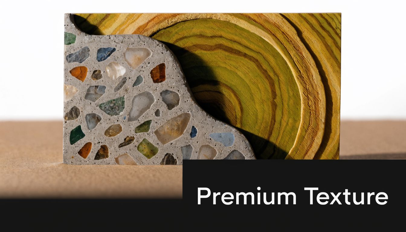
Best uses for texture
Concrete-textured stock fits commercial builders, masons, and firms that want an industrial look. Linen and cotton stocks lean more architectural or design-build. Kraft can work for a rustic builder or a company specializing in timber, cabins, and outdoor structures, but it can also look too informal if your projects are high-end civic or corporate work.
Embossing is strongest when it’s selective. A raised roofline, tool silhouette, grid pattern, or subtle building profile gives the card dimension without turning it into a novelty piece. If the logo is already busy, embossing often makes it worse.
Practical rule: Texture should appear in the background or brand accent areas. Keep the contact panel smooth and easy to scan.
A few production realities matter here:
- Choose stock first: Start with the feel you want, then design around it. This guide to the best paper for business cards is a smart place to compare options.
- Use restrained color: One-color embossing on colored stock often looks more refined than piling on gradients and effects.
- Request a physical sample: Specialty stocks photograph poorly online. What looks rich on screen can feel dusty, flat, or flimsy in hand.
For a remodeler or GC, this style works when you want to signal craftsmanship. It doesn’t work if your logo is small, your contact info is crowded, and your design depends on tiny details.
2. Blueprint and technical drawing business cards
Some themes are obvious because they work. Blueprint styling is one of them. White linework on deep blue stock instantly signals construction, planning, and technical competence. Architects, engineers, surveyors, and construction managers can use that language without forcing it.
The key is restraint. Too many measurement marks, hatch patterns, and schematic lines make the card feel like clip art from a drafting template. You want the mood of a blueprint, not a fake plan set shrunk to wallet size.
Make the blueprint look intentional
A strong version usually keeps one technical motif and one focal element. That could be a floor plan fragment, elevation linework, a grid, or a simplified section drawing. Then it layers branding over it with clear hierarchy.
If you already produce plans and technical documents, there’s a natural connection between your card and your day-to-day documents. Firms that rely on blueprint printing services can carry that same visual language into their business cards for a cohesive brand.
What works best in practice:
- High contrast text: White or very light type on dark blue is classic for a reason.
- Relevant linework: A civil engineer should use different visual references than a custom home builder.
- QR code placement: Tuck the code into the grid or margin so it looks integrated, not pasted on.
Keep the card readable from arm’s length. If the recipient has to study it to find your phone number, the design failed.
This style is especially effective for firms selling process, precision, and planning discipline. It’s less effective for businesses built around warmth, residential trust, or handcrafted personality, unless you soften the palette and typography.
3. Full-color photography business cards
A prospect asks what you build, and before you get through the sentence, they have already looked down at your card. If the photo is strong, the card answers for you. If the photo is weak, blurry, or crowded, it makes the whole company look less disciplined than it is.
Photo-based cards work best for contractors whose finished work sells the job. Custom home builders, remodelers, commercial interiors firms, site development companies, and design-build teams usually have enough visual payoff to justify giving half or even the full card face to one image. Roofing, excavation, and service trades can still use photography, but the bar is higher. The image has to show a result the client values, not just equipment on site.

Choose a photo that still reads at business card size
This is the production mistake I see most often. A beautiful wide project shot gets dropped into a 3.5 by 2 inch layout, then all the useful detail disappears. The best image for a business card usually has one clear focal point, strong lighting, and a clean background area where type can sit without fighting the photo.
Finished spaces usually print better than active jobsite scenes. Mud, scaffolding, mixed materials, and cluttered tools can look honest, but they also turn into visual noise at this scale. If you want to show process, use one controlled detail shot rather than a busy site overview.
A practical approach:
- Use one hero image: Treat the card like a mini portfolio cover, not a collage.
- Print on coated stock: Silk or gloss helps color photography hold detail and contrast better than uncoated paper.
- Control the text area: Leave negative space in the photo, or add a subtle overlay so phone numbers and email addresses stay readable.
- Request a press proof: Full-color cards can shift warmer, darker, or flatter than they look on screen.
- Plan for image updates: If the card features a specific project, expect to refresh the run once your portfolio improves.
Material choice matters here more than many contractors expect. Thick uncoated stock can feel premium in the hand, but it tends to mute photos and soften shadows. A 16 pt or 18 pt coated cover stock usually gives better image reproduction without making the card feel flimsy. If budget allows, soft-touch laminate on one or both sides can add a high-end feel while protecting darker photo areas from scuffing, though it also raises unit cost and can slightly reduce the crispness of very small text if the file is not prepared well.
Use photography for cards that need to sell craftsmanship, finish quality, or design taste quickly. If your work is harder to capture in a single polished image, another direction will usually perform better than forcing a photo onto the card.
4. Metallic ink and foil stamping business cards
Metallic finishes are easy to overdo. Used well, they create a polished card with just enough flash. Used badly, they look like a banquet invitation. Construction brands usually benefit from restraint here.
Foil and metallic ink are best for selective emphasis. A logo in copper foil, a steel-toned line, or a gold mark on deep black stock can feel expensive and controlled. That fits luxury residential builders, boutique architecture firms, and specialty contractors who sell finish quality as much as structural competence.
Where metallic finishes earn their keep
Think about what the finish is saying. Silver and gunmetal feel technical. Copper feels warm and architectural. Gold suggests premium service, but it can also drift into generic luxury branding if the rest of the design doesn’t support it.
Metal cards themselves have gained attention in the category. According to Remitly’s article on construction business cards, metal business cards reached a 92% user satisfaction rate for perceived premium quality and durability, compared with 78% for standard thick card stock in a 2023 survey of 1,200 U.S. contractors and architects. That doesn’t mean every contractor should switch to metal. It does show that premium finishes and materials can shape perception in this market.
Metallic accents should point the eye. They shouldn’t compete with the information someone needs to save your contact.
A few smart applications:
- Logo-only foil: Clean, memorable, and easier to control than full decorative foil patterns.
- Matte plus metallic contrast: A matte background lets the metallic detail stand out.
- Short-run proofing: Always review a proof before committing, because metallic effects can shift under different lighting.
This style works for firms chasing higher-end projects. It’s less convincing for budget-focused service contractors unless the rest of the brand already supports a polished premium position.
5. Die-cut shaped construction business cards
A custom shape can make your card memorable in seconds. Roof outlines, hard hats, building silhouettes, or a subtle tool-inspired profile all stand out from a stack of rectangles. The shape itself becomes the hook.
But practicality is most important. A clever die-cut that tears, bends, or jams into a wallet doesn’t help you. Construction clients appreciate originality, but they also value common sense.
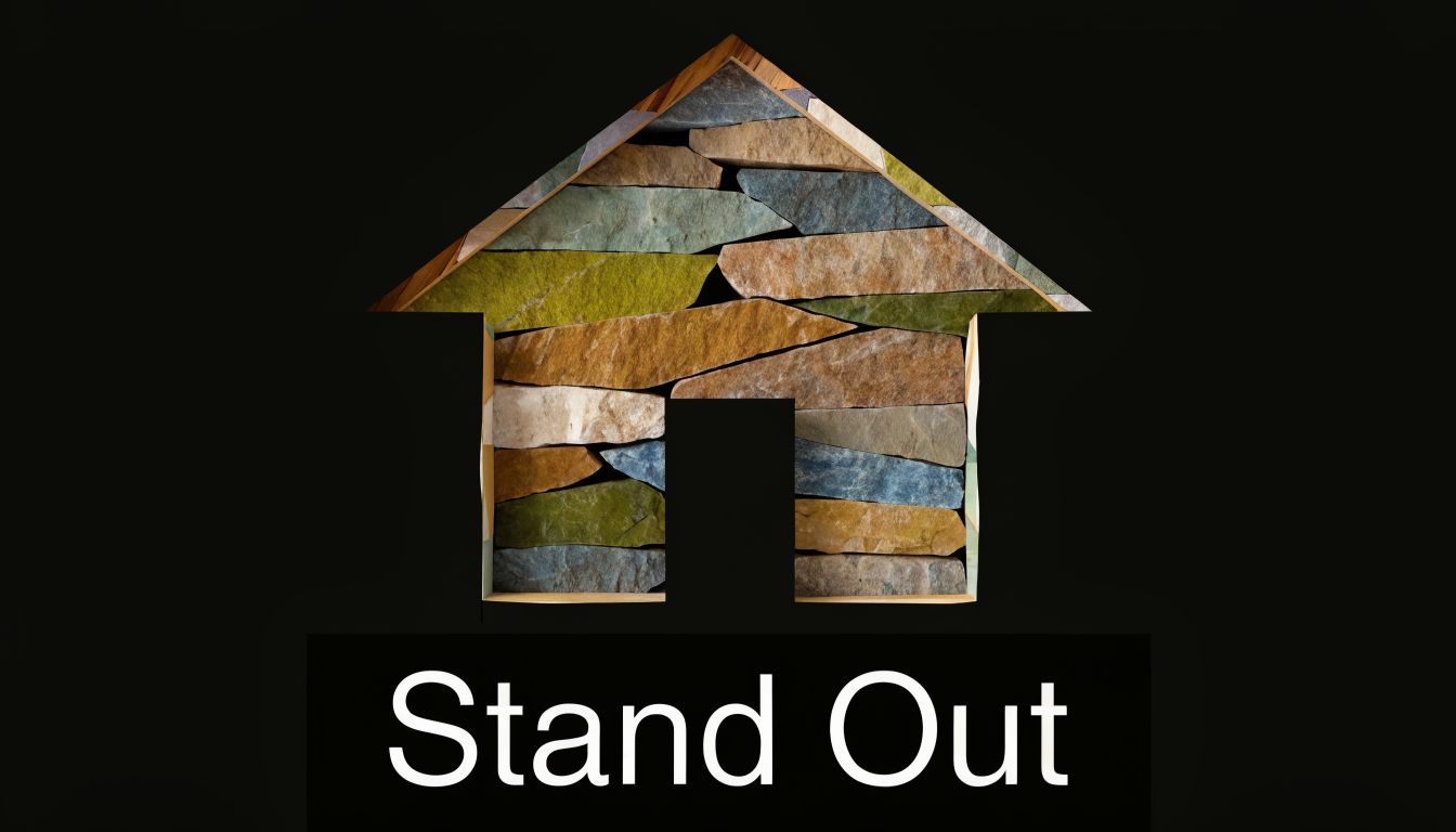
Good die-cuts feel custom, not gimmicky
The best die-cut shapes are simplified. A roofing contractor might use a roof peak profile across the top edge while keeping the lower body of the card rectangular. A home builder might use rounded corners and a subtle house silhouette instead of a fully novelty-shaped card.
If you’re considering custom shapes, this explainer on what die cutting in printing means helps clarify how the process affects design and production.
What usually works:
- Partial custom shape: Easier to carry, easier to print, still memorable.
- Thicker stock: Helps the edges stay clean and durable.
- Simple die line: Intricate cut paths can weaken the card or complicate finishing.
What usually doesn’t:
- Thin protruding parts: Chimneys, handles, blades, and tiny corners bend fast.
- Overly literal shapes: A full hammer card often feels more promotional than professional.
- Crowded layouts: The less standard the shape, the more disciplined the design must be.
For niche trades, die-cuts can start conversations. For architects, engineers, and construction managers, a more restrained custom edge often feels more credible than a novelty silhouette.
6. Two-sided specialty printing business cards
A lot of contractors waste the back of the card. That’s a missed opportunity. If the front establishes the brand, the back can do a specific job. It can list core services, identify project types, show licenses or specialties, or support bilingual communication.
The trick is not treating both sides like front covers. One side leads. The other side supports.
Use the reverse side with intent
A general contractor might put logo, name, title, and direct contact on the front, then list key services on the back. An AEC firm might place a clean brand mark on the front and a cropped project image or concise sector list on the back. A specialty trade contractor can use the reverse side to clarify exactly what they handle, especially if the company name isn’t self-explanatory.
I usually advise clients to answer one practical question on the back: what do you want the recipient to remember when they look at the card a week later?
Good back-side content options include:
- Service categories: Helpful for firms with multiple divisions.
- Geographic service area: Useful if your name doesn’t indicate location.
- Short credential line: Relevant certifications or specialties, kept brief.
- Spanish and English contact prompts: Useful for field relationships and supplier interactions.
If every square inch is filled, neither side works. White space is part of the design, not wasted paper.
This is one of the most flexible construction business cards ideas because it improves utility without forcing a dramatic visual style. It’s especially useful when your work spans residential, commercial, and light industrial, and you need the card to clarify your lane quickly.
7. Sustainable and eco-friendly construction business cards
A superintendent hands over a card after a green building meeting. If the stock looks glossy, plastic-heavy, and disconnected from the company’s sustainability pitch, people notice. In construction, print choices either support the brand story or undercut it.
Sustainable business cards work best for firms already talking about energy performance, responsible sourcing, low-waste construction, or ESG goals in proposals and sales conversations. For those companies, the card becomes a small proof point. For everyone else, it can still be a smart print choice, but it should be framed as durability and good paper selection, not virtue signaling.
Choose eco stocks that fit the type of work you sell
Recycled papers, post-consumer stocks, cotton papers, and uncoated sheets with certified fiber content can all print well. The trade-off is feel. Some recycled sheets look crisp and architectural. Others read soft, pulpy, or handmade, which can hurt if you are bidding commercial work and need a sharper presentation.
I usually guide construction clients toward one of two directions. A design-build firm or sustainable architect often does well with a smooth uncoated stock in the 16pt to 18pt range, printed with restrained color and plenty of white space. An environmental contractor, reclamation firm, or specialty company with a more rugged identity can carry a visible fiber sheet or kraft-toned stock without looking off-brand.
Production matters here.
Soy-based or other low-VOC ink systems help support the sustainability angle, but they also behave differently on uncoated paper than conventional inks do on coated stock. Colors print a little quieter. Fine reverse type can fill in if the file is too delicate. Heavy coverage, especially dark solids, may scuff more easily unless the printer builds the job correctly.
A practical selection process looks like this:
- Match the paper to the client base: Smooth, clean stocks suit commercial contractors and AEC firms better than overly rustic sheets.
- Ask for certified options: FSC-certified or high post-consumer content papers give you a defensible material spec.
- Test ink and readability: Uncoated eco stocks can soften small text and thin rules.
- Keep the sustainability message brief: A short line on the back, such as recycled stock or FSC-certified paper, is enough.
- Skip fake eco cues: Leaf icons, brown paper, and earthy textures only work if they fit the actual brand.
One caution. Sustainable does not have to mean plain. Good typography, a strong mark, and a well-chosen stock will usually do more for credibility than overt green messaging. The best version feels intentional, not performative.
This approach tends to fit LEED-focused builders, public sector contractors, green remodelers, and firms that regularly discuss material stewardship with clients. If sustainability is not part of the sales process, choose an eco stock for its print quality and tactile feel first, then let the material choice speak subtly on its own.
8. Digital-ready hybrid business cards with NFC and QR technology
Digital features work best when they solve a real sales problem. In construction, that usually means giving people faster access to project photos, capabilities decks, plan-room links, prequalification material, or a contact-saving page. A QR code or NFC tap can do that well.
The weak version is adding tech because it sounds modern. If the link goes to a generic homepage, few will bother. If it opens a useful portfolio, service page, or bid qualifications sheet, that’s different.
Build the scan experience around one action
The landing page should be tight. Show the strongest work. Make the phone number tappable. Include a fast summary of services and service area. If you use NFC, still print all your core contact details for people who prefer the old-fashioned route.
Remitly’s article on construction business cards notes that QR codes measuring at least 10x10mm can increase interactivity, and it reports that 68% of recipients scan within 24 hours, driving 22% more leads when the linked experience is useful and immediate. That’s a strong argument for hybrid cards, especially for firms with visual portfolios or detailed qualifications.
Before adding the video, it’s worth seeing how this kind of digital bridge can fit modern networking:
A few no-nonsense rules:
- Test the code repeatedly: Different phones, different lighting, different print finishes.
- Keep contrast high: Fancy QR styling often hurts scan performance.
- Update the destination: The code is only as good as the page it opens.
The technology should shorten the path to trust. If it adds friction, skip it.
For architects, construction tech firms, design-build companies, and contractors with strong project galleries, hybrid cards can connect the handshake to a fuller sales experience without replacing the value of print.
Construction Business Card Ideas: 8-Option Comparison
| Item | Implementation complexity | Resource requirements | Expected outcomes | Ideal use cases | Key advantages |
|---|
| Textured/Embossed Construction Material Business Cards | High, specialized embossing and setup | Specialty cardstock, embossing presses, skilled printer, higher cost | Strong tactile impression, premium craftsmanship signal | High-end builders, architects, custom construction specialists | Distinctive tactile branding; communicates quality and detail |
| Blueprint/Technical Drawing Business Cards | Low–Medium, precise layout and contrast control | Standard printing with careful color/contrast management | Immediate industry recognition, technical/professional aesthetic | Architects, engineers, construction managers | Clear industry signaling; cost-effective compared with specialty finishes |
| Full-Color Photography Business Cards | Medium, photo selection and color management required | High-resolution images, professional editing, full-color printing | Visual portfolio on-card, emotional connection, strong recall | Custom home builders, renovators, design-build firms | Acts as a mini-portfolio; high visual impact |
| Metallic Ink and Foil Stamping Business Cards | Medium–High, foil processes and setup | Metallic foils/inks, specialty press, premium cardstock | Premium, sophisticated look; elevated perceived value | Luxury builders, executive-level professionals, design firms | Shiny reflective accents; conveys prestige and professionalism |
| Die-Cut Shaped Construction Business Cards | High, custom die design and structural planning | Custom dies, heavier stock, longer lead times, higher minimums | Extremely memorable, strong brand recall, conversation starter | Specialty trades, suppliers, firms seeking bold differentiation | Unique shape used as branding; stands out in stacks and displays |
| Two-Sided Specialty Printing Business Cards | Low–Medium, dual-side layout and alignment | Double-sided printing, coordinated design, modest extra cost | More information space, professional presentation, portfolio display | Multi-service construction companies, firms with certifications | Maximizes info without larger size; cost-effective alternative to specialty materials |
| Sustainable/Eco-Friendly Construction Business Cards | Low–Medium, sourcing and verification of materials | Recycled/seed/bamboo stocks, eco inks, certified suppliers | Signals sustainability, appeals to eco-conscious clients | Green builders, LEED-certified firms, eco-focused companies | Demonstrates environmental commitment; marketing differentiator |
| Digital-Ready Hybrid Business Cards with NFC/QR Technology | Medium–High, tech integration and backend setup | NFC chips/QR/AR resources, digital hosting, tracking tools | Instant access to digital portfolio, measurable engagement, modern image | Tech-forward firms, digital-native builders, younger clients | Bridges physical & digital, trackable and updatable without reprint |
From Blueprint to Reality Printing your perfect card
Picking a concept is the easy part. Making it feel right in the hand is where work starts. Stock choice, finish, color control, trimming accuracy, and how the card behaves after a week in a wallet or truck console all affect whether it feels like a serious brand asset or a throwaway.
In construction, the card has to match the company behind it. If you build high-end custom homes, your card should feel considered and premium. If you run a fast, dependable trade service, your card should feel clean, durable, and clear. If you work in AEC, the design should reflect precision and organization. The best card isn’t the fanciest one. It’s the one that fits your market, your budget, and the kind of projects you want more of.
That’s also why production trade-offs matter. Embossing adds tactile character, but not every logo can handle it. Foil can enhance a mark, but too much pushes the design into showpiece territory. Die-cuts grab attention, but they need structural logic. Eco stocks can support your brand story, but only if they still feel substantial. QR codes and NFC features can extend the conversation, but only when the digital destination is worth the tap.
A good print partner helps you sort those choices before you spend money on the wrong combination. They’ll tell you when a textured stock will hurt readability, when a photo won’t reproduce well at card size, or when a custom finish makes sense for your quantity and audience. That guidance saves time and usually saves reprint costs too.
If you’re weighing premium print against basic online ordering, remember what the card is doing in this industry. It’s often your leave-behind after a site walk, vendor introduction, school project meeting, chamber event, or referral conversation. That’s one reason thoughtful print still matters, even as digital tools grow. And if you’re exploring the digital side too, these best digital business card templates can help you think through the companion experience.
Ready to build a card that represents the quality of your work? Camelot Print & Copy Centers can help you get a quote and choose the right mix of stock, finishing, and design support for your brand.
If you want construction business cards ideas turned into something practical, Camelot Print & Copy Centers is a strong partner to bring them into production. Their team can help you narrow down materials, refine the layout, test specialty finishes, and produce a card that fits your brand instead of forcing you into a generic template.