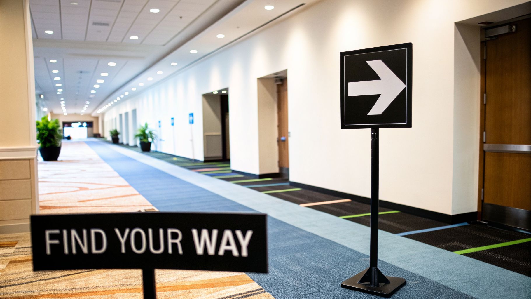
Good directional signs for events are the unsung heroes of a great guest experience. They're what keep people moving smoothly from their cars to their seats, preventing that dreaded feeling of being lost and confused. It’s about more than just pointing the way—it’s about managing crowd flow, heading off frustration before it starts, and setting a professional, organized tone from the moment people arrive.
Crafting the Attendee Journey With Strategic Signage
The attendee experience doesn't start at the check-in desk; it begins the second they turn onto the road leading to your venue. A smart wayfinding plan is the invisible hand guiding them along, turning what could be a confusing scramble into an easy, intuitive path. This lets your guests relax and focus on what they came for: your event.

We’ve all been there—arriving at a huge convention center for the first time, circling the parking garage, and then wandering the halls just trying to find registration. That initial stress can taint the rest of the day.
Now, imagine the opposite. Big, branded signs on the main road point to the right parking area. From there, A-frame signs clearly mark the walkway to the entrance, where another sign immediately directs you to check-in. That’s the power of thinking through the entire journey.
Mapping the Critical Touchpoints
The best way to plan your signage is to put yourself in your attendees' shoes. Literally. Walk the path from the street to the main stage, and identify every single spot where someone might pause and think, "Where do I go now?" These decision points, or touchpoints, are where your signs need to do the heavy lifting.
To get you started, here's a quick look at the major touchpoints you'll want to cover.
Event Wayfinding Strategy at a Glance
This table covers the basics, but remember to walk your specific venue to find its unique quirks and potential confusion spots.
A classic mistake is assuming a venue is easy to get around in. What seems obvious to you as the planner is a maze to a first-timer. When in doubt, add another sign.
It’s More Than Just Arrows
Great event signage doesn't just point left or right; it’s a crucial part of your event's branding and communication strategy. This is your chance to reinforce your event's look and feel, share important info, and create a cohesive atmosphere.
And it doesn't have to be static. To really make an impact, look at what’s happening with the top LED display trends for events for inspiration on using dynamic digital screens to guide and inform your guests. When you treat signage as a key part of the experience, you create a welcoming and stress-free environment from start to finish.
Selecting the Right Materials for Your Event Signs
Choosing the material for your event signs might seem like a minor decision, but I've seen it make or break an event's flow and feel. The right material ensures your signs look professional and hold up, whether they're battling a downpour in a parking lot or just looking sharp in a hotel ballroom.
Get it wrong, and you could end up with soggy, unreadable signs or a look that just doesn't match your event's vibe.
Think about a big outdoor music festival. You need to guide thousands of people from far-flung parking areas, across grassy fields, and toward multiple stages. Here, durability is everything. A flimsy sign is just a liability waiting to be knocked over or ruined by the weather. It's not just about what looks good on a screen; it's about what works in the real world.
The Workhorse: Corrugated Plastic
For most temporary outdoor events, corrugated plastic is your best friend. You probably know it by the brand name Coroplast. It’s essentially a sheet of plastic cardboard—incredibly lightweight, waterproof, and tough enough for the job. This makes it the perfect material for yard signs on H-stakes, which you can just push into the ground to direct traffic or point the way to registration.
Back to that music festival scenario. Corrugated plastic would be our go-to for almost all the outdoor signage:
- Large signs posted along the main road to guide cars toward the entrance.
- Smaller, color-coded signs for specific parking lots (“Red Lot,” “VIP Parking”).
- A-frame "sandwich board" signs for temporary messages.
- Simple pathway markers leading people from parking to the main gates.
It’s budget-friendly, stands up to a weekend of sun and rain, and is easy to produce in large quantities. Its practicality is just unmatched for things like 5k races, community fairs, and festivals. The only real downside? It has a more casual look, so it might feel out of place at a formal indoor gala.
Sleek and Professional: Foam Core
Now, let's switch gears to an indoor corporate conference at a high-end hotel. The entire vibe is polished and professional, and your signs need to reflect that. This is where foam core really shines.
A foam core sign is a simple construction: a lightweight foam center bonded between two smooth sheets of paper. This creates a perfectly rigid, flat surface that’s fantastic for crisp, high-quality printing. The final product looks sharp and clean.
Foam core is the undisputed standard for indoor event signage. It’s what you use for those welcome signs on easels in the lobby, the agenda boards outside of breakout rooms, and the branded backdrops behind your speakers.
For that corporate summit, we’d rely on foam core to create a cohesive, upscale experience. Just remember, it's not waterproof and can dent easily, so it’s strictly an indoor material. If you want to get a better sense of its uses, you can learn more about the benefits of foam board printing for professional settings.
Durable and Versatile: Vinyl Banners
Sometimes you just need to go big. Vinyl banners are your tool for grabbing attention from way across a field or a packed convention hall. Made from a tough, flexible PVC material, they are built to last and can be printed in huge sizes.
They are ideal for:
- Massive welcome signs at the grand entrance.
- Stage backdrops featuring sponsor logos.
- Announcements hung from fences, walls, or between two poles.
Vinyl is completely weatherproof. You can also order banners with grommets (metal eyelets) and reinforced hems, which makes hanging them securely with zip ties or rope a breeze. For an outdoor festival, a huge vinyl banner at the main gate makes an immediate impact. At an indoor trade show, a hanging banner makes sure your booth is seen from every corner of the room.
The Premium Choice: Aluminum
When you need something that will last for years or want a high-end, permanent look, aluminum is the top choice. It’s completely rigid, totally weatherproof, and has a sleek, metallic finish that just exudes quality.
It's definitely overkill for a one-day event because of the higher cost. However, it’s a brilliant investment for recurring annual events or for signs that need to endure the elements year-round.
A country club hosting a yearly golf tournament, for instance, might invest in aluminum signs for their tee box sponsors or permanent directional signs around the course. They can be stored and reused every year, delivering fantastic long-term value.
Where You Put Your Signs Matters Just as Much as What's on Them
You can have the most beautifully designed, perfectly printed sign in the world, but if it’s tucked away in a corner or pointing the wrong way, it’s useless. I’ve seen it happen a hundred times: a simple placement mistake leads to a bottleneck of confused attendees, derailing the smooth flow of an otherwise flawless event.
Strategic sign placement is part art, part science. It’s about getting inside your guests' heads and anticipating their journey, answering their questions visually before they even realize they have them.
The real goal is to make getting around feel so effortless that no one even thinks about it. When navigation is intuitive, your guests feel confident and cared for, which reflects brilliantly on your entire event.
Find Your "What Now?" Moments
The absolute first step is to map out every single "decision point" on the attendee's path. These are the physical spots where a person has to stop and consciously decide where to go next. To do this right, you have to put yourself in the shoes of a first-time visitor.
Walk the path yourself, starting from the moment they pull into the parking lot. Pay close attention to these common trouble spots:
- Moving from the parking area into the building.
- The top and bottom of every escalator and staircase.
- Every elevator lobby.
- Any T-junction or major hallway intersection.
- Entrances to wide-open spaces, like an atrium, where the path forward isn't obvious.
Anywhere you find yourself pausing, even for a split second, to figure out where to go—that’s a "what now?" moment. And that's exactly where you need a sign.
Create a Clear Line of Sight
Once you've mapped your decision points, the next rule is all about line of sight. An attendee should always be able to see the next sign from where they are currently standing. This creates a breadcrumb trail of visual cues, leading them seamlessly from one point to the next.
Think about someone stepping off an elevator. Their eyes should immediately land on a sign telling them which way to go for the main ballroom or registration. If they have to wander down the hall to hunt for the next clue, you've already broken the flow and introduced a moment of friction.
Here's the core principle of great wayfinding: the next step must be obvious from the current one. If you're standing at Sign A and can't see Sign B, you've got a gap in your strategy.
Don't Overwhelm with Information
One of the most common signage mistakes is trying to cram too much information onto a single sign. A sign pointing to ten different rooms at once becomes a cluttered, unreadable mess that people will just ignore.
The pro-level solution is a technique called progressive disclosure. You only reveal information as it becomes relevant to the journey.
- At the main entrance: The first sign should only point to major zones. Think "Registration," "General Session," or "Expo Hall."
- At a hallway junction: A sign might then direct people left for "Breakout Rooms A-D" and right for "Breakout Rooms E-H."
- Outside a block of rooms: A final, more detailed sign can list the specific sessions. "Room A: Marketing Trends," "Room B: Sales Strategy."
This approach breaks the journey into small, digestible chunks. It respects your guests' mental energy and keeps foot traffic moving smoothly.
A Quick Conference Center Walkthrough
Let's imagine you're planning a conference. Registration is in the West Foyer, the keynote is in Ballroom C, and breakout sessions are in the 200-series rooms upstairs. Here's how the progressive disclosure would work in practice:
- Parking Garage: A-frame signs by the elevators simply say "Event Entrance." That's all they need to know right now.
- Lobby Entrance: A large, welcoming sign on an easel points them toward registration: "Registration ->."
- Post-Registration: After getting their badges, they see a new sign. This one might be hanging from the ceiling and says: "Ballroom C (Keynote) <--" and "Breakout Sessions (Second Floor) ^" (using an icon for stairs/elevators).
- Second Floor Landing: As they exit the elevator, a clean wall sign points them down the hall: "Breakout Rooms 201-210 ->."
See how that works? It’s a logical flow that provides just enough information at each step. Planning this out can feel daunting, but getting an expert opinion can make all the difference. When you're ready, get a quote from our team, and we can help you map out a wayfinding strategy that ensures no one ever feels lost.
Designing Signs That Actually Work: Balancing Readability and Brand
Your event signs do more than just point people toward the ballroom. They’re a handshake, a first impression, and a constant reminder of your event's brand and quality. When done well, they guide guests effortlessly while reinforcing a polished, professional atmosphere. The best signs are the ones people barely notice because the information is just there when they need it, clear as day from across a crowded lobby.
But here’s where things often go wrong. I’ve seen countless event planners get so wrapped up in beautiful, creative designs that they forget a sign’s number one job: to be read. A gorgeous sign with delicate script that looks amazing on a computer screen becomes a frustrating, unreadable blur from ten feet away.
The secret? Prioritize readability first. Build a rock-solid, functional framework, and then weave in your brand’s personality.
The Foundation: Can People Read It in a Glance?
Before you even think about your logo or color palette, let’s talk about pure, unadulterated legibility. Your attendees are on the move, scanning a busy environment. They have a split second to absorb the information you’re giving them.
To make that happen, you need to nail three non-negotiables:
- High-Contrast Colors: Our eyes are hardwired to notice contrast. Dark text on a light background (or the reverse) is the single most powerful tool in your design arsenal. That trendy, low-contrast look with light gray text on an off-white background might feel chic, but it’s a functional disaster in a real-world event setting.
- Clean, Bold Fonts: This isn't the place for frilly, decorative, or whisper-thin fonts. They are the enemies of quick comprehension. Stick to sans-serif workhorses like Helvetica, Arial, or Open Sans. They’re designed for clarity at a distance and from an angle.
- Minimalist Icons: Simple, universal symbols communicate faster than words and cut through language barriers. A clean arrow, a restroom icon, or a knife-and-fork symbol requires zero translation.
A sign's primary job is to deliver a message—fast. If your guest has to stop, walk closer, and squint to figure out where to go, the design has failed, no matter how pretty it is.
Weaving in Your Brand Without the Clutter
Once your signs are fundamentally readable, you can start layering in your brand identity. The key is to treat your branding as a supporting actor, not the star of the show. Your logo, for instance, doesn’t need to dominate the sign.
Here’s how to do it without sacrificing that crucial clarity:
- Use Color Strategically: Instead of flooding the entire sign with your main brand color (which can kill contrast), use it as an accent. A simple colored header or footer bar is a fantastic way to brand the sign without interfering with the message.
- Place Your Logo Consistently: Pick a spot—like the top-left or bottom-right corner—and put your event logo there on every single sign. This repetition builds brand recognition without adding clutter.
- Choose Your Typographic Voice: While your main directional text needs to be ultra-clean, you might have room to use a secondary brand font for something less critical, like an event tagline, as long as it’s still very easy to read.
And think beyond just directions. Signs can also be interactive touchpoints that enhance the guest experience. A modern Guest Book Photo Sign, for example, can collect photos and messages from attendees. It's a brilliant way to create a sign that is both functional and engaging, adding another memorable layer to your event.
Accessibility Isn't an Afterthought
Creating an event that’s welcoming for every single guest is the mark of a true professional. While temporary event signs might not always have the same strict legal requirements as permanent building signs, embracing ADA (Americans with Disabilities Act) principles is simply the right thing to do.
For essential locations like restrooms, main entrances, and information desks, incorporating these features is a best practice that shows you care.
- Tactile Text and Braille: For signs identifying rooms, raised (tactile) lettering with corresponding Braille is the gold standard.
- Non-Glare Finish: Always opt for a matte or non-glare finish. Glossy surfaces catch light and create reflections, making signs a nightmare to read for people with visual impairments.
- Proper Mounting Height: The rule of thumb is to mount signs so the baseline of the tactile text is between 48 and 60 inches from the floor. This keeps them in a consistent and reachable zone for everyone.
Navigating all these design details, from font choices to ADA guidelines, can be a lot. If you want to be certain your signs are effective, compliant, and perfectly on-brand, working with professional graphic design services can take the guesswork out of the process.
Getting Your Signs Printed: The Pre-Production Checklist That Saves Headaches
Getting your designs off the screen and into the real world is where the magic happens, but it's also where things can go sideways fast. The key to turning your digital concepts into high-quality physical signs is giving your print partner everything they need in a clear, organized way.
I can’t tell you how many frantic, last-minute calls I’ve seen lead to costly mistakes or signs that just don't hit the mark. A little bit of prep work on your end can save a world of stress and ensure the final product is exactly what you envisioned. This isn't just about sending files; it's about setting the project up for success from the start.
Create Your Master Sign Inventory
Before you even think about picking up the phone, your first move should be to create a master list of every single sign you need. Trust me on this: a detailed spreadsheet is your best friend here. This document becomes the single source of truth for both you and your printer, eliminating any guesswork.
For every sign, make sure your spreadsheet tracks:
- Sign Name: A simple, unique identifier (e.g., "Main Entrance Welcome," "Parking Lot A - Arrow Right").
- Message: The exact text for the sign. Copy and paste it.
- Dimensions: The precise width and height.
- Material: The specific material you’ve chosen (e.g., Coroplast, Foam Core, Vinyl).
- Quantity: How many of each identical sign you need.
- Mounting: How it will be displayed (e.g., H-stake, Easel, Grommets for hanging).
Building this inventory forces you to think through every detail, which makes getting a quote and placing your order incredibly smooth.
As you finalize the details for each sign on your list, keep the fundamentals of good design in mind.
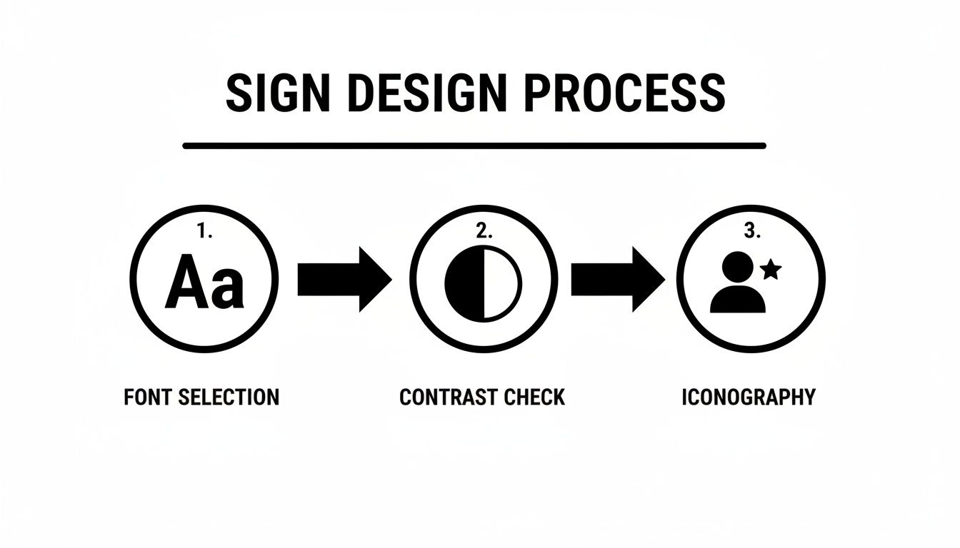
This quick visual reminder is a great gut-check. Clear fonts, strong contrast, and simple icons are the foundation of any sign that actually works.
Prep Your Artwork Like a Pro
With your inventory locked in, it's time to get your artwork files in order. Handing over files that aren't "print-ready" is probably the number one cause of production delays. Your print partner can't work miracles with a low-resolution JPEG you grabbed from a website.
For crisp, professional results, your artwork absolutely must be in a vector format. The best and most common file types for this are:
- .AI (Adobe Illustrator): This is the gold standard for graphics that need to be scaled without losing a drop of quality.
- .EPS (Encapsulated PostScript): A highly versatile vector format that plays nicely with most design software.
- .PDF (Portable Document Format): A high-quality PDF saved directly from a vector program like Illustrator works perfectly, too.
Vector files use math—not pixels—to create images, which means they stay razor-sharp whether you're printing a tiny tabletop sign or a massive banner. This is non-negotiable for professional directional signs for events. If you want to go deeper, our guide explaining why DPI matters for printing is a great resource for understanding how resolution impacts quality.
Don’t Sweat the Small Stuff (Because You’ve Planned for It)
You’ve got your inventory and your print-ready artwork. You're almost there. The last piece of the puzzle is communicating the small-but-critical details. Don't be vague about your mounting needs. Saying you need "yard signs" is okay, but saying you need "yard signs that require H-stakes" is infinitely better. It prevents any surprises when you're trying to set up.
I have a personal rule I stick to: I finalize and place my sign order no later than 3-4 weeks before the event. This builds in a comfortable buffer for proofing, production, and shipping without anyone having to pay for rush fees or stress about delays.
This timeline gives everyone peace of mind. It allows for a proper proofing process, where you get a digital preview of your signs to approve before a single one is printed. This is your final chance to catch a typo or a stray graphic. Follow this simple checklist, and you’ll sail through the production process.
Common Questions About Directional Signs for Events
Even the most meticulously planned event has last-minute questions, and signage is often at the top of the list. Getting clear, straightforward answers can mean the difference between a smooth setup and a frantic, last-minute scramble. Let’s tackle some of the most common questions we hear from event planners.
How Far in Advance Should I Order My Event Signs?
This is the big one. My simple advice? Earlier is always, always better. As a solid rule of thumb, you should aim to get your final sign order into your print partner at least 3 to 4 weeks before your event.
That timeline isn’t just a random number; it’s a realistic buffer. It gives you and your printer enough breathing room for a proper consultation, reviewing design proofs without being rushed, the actual production time, and shipping. Trying to cram all that into a week is a recipe for stress, mistakes, and rush fees.
If you have a more complex order—maybe with custom-cut shapes, a huge quantity of signs, or specialty materials—you’ll want to extend that lead time to 5 to 6 weeks. Trust me, planning ahead is the single best thing you can do to get exactly what you need, on time and on budget.
What Is the Best Material for Outdoor Signs?
For any kind of temporary outdoor event, the go-to material is corrugated plastic, which you probably know by the brand name Coroplast. It’s what you see used for yard signs at festivals, 5k races, and community fairs for a few very good reasons:
- Weatherproof: It’ll hold up just fine against rain or sun for a weekend event.
- Cost-Effective: For producing signs in bulk, it's one of the most budget-friendly materials out there.
- Lightweight & Easy to Install: Pop them onto some simple H-stakes, and you can set them up in minutes.
Honestly, for guiding traffic, marking parking lots, or pointing people to the entrance, its mix of durability and low cost is hard to beat.
How Can I Make My Signs Visible at Night?
If your event runs into the evening, visibility becomes a whole new ballgame. A high-contrast design (like bright white on a dark background) is your starting point, but you’ll often need more than that.
The most effective solution by far is printing your graphics on reflective vinyl. This material is embedded with tiny glass beads that catch and bounce back light from car headlights or other light sources, making your sign light up brilliantly. It’s pretty much impossible to miss, even in very dark conditions. For a simpler, lower-cost approach, you can strategically place small, portable spotlights aimed at your most critical signs.
Pro Tip: When planning for an evening event, always test your sign's visibility from the perspective of an approaching car or attendee. What looks clear up close might completely disappear from 50 feet away in the dark.
Is ADA Compliance Necessary for My Temporary Signs?
While temporary event signs don't always fall under the same strict legal requirements as permanent architectural signs, adopting the principles of accessibility is just good practice. It creates a more inclusive, welcoming experience for every single guest and reflects well on your organization.
At a minimum, focus on using large, clean fonts and high-contrast color combinations. For key locations like restrooms, entrances, and information desks, I strongly recommend following ADA best practices. This means mounting signs at a consistent height—typically so the text baseline is between 48 and 60 inches from the floor—and making sure there's clear floor space in front of them for easy reading.
Feeling more confident about your event signage? The expert team at Camelot Print & Copy Centers is here to help you with everything from material selection to design and production. If you're ready to get started, request a custom quote today and let us ensure your signs are flawless.