Choosing a finish for your prints is one of those final-step decisions that can completely change the impact of your work. It's not just about aesthetics; the choice between matte and glossy affects everything from color perception to how the print holds up to handling. Think of it as the final layer of polish that determines whether your image shouts for attention or speaks in a more measured, sophisticated tone.
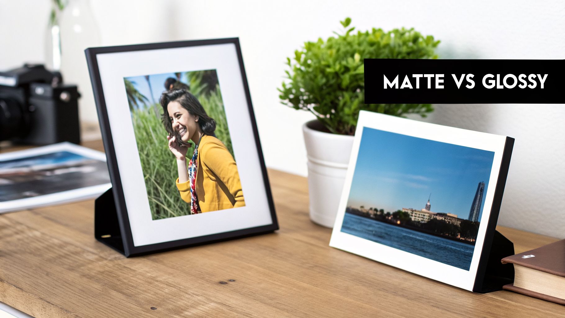
Matte vs Glossy Photos: A Quick Comparison
The right finish is all about context. It’s a strategic choice that needs to account for lighting, the intended viewer, and how the print will be used. The finish interacts with light, color, and even the oils from our fingertips, so getting it right is crucial for the final impression.
A glossy finish brings the drama. Its smooth, highly reflective coating makes colors pop with incredible depth and saturation. This makes photos look tack-sharp and vibrant, which is why it’s a go-to for eye-catching product shots and keepsake photo albums where you want every detail to sing. The trade-off, of course, is that intense reflectivity. Under direct light, you’ll get significant glare, and it’s a magnet for fingerprints.
On the flip side, a matte finish offers a more subdued, fine-art feel. Its surface has a subtle texture that diffuses light instead of reflecting it, which is a lifesaver for any piece you plan to frame and hang in a well-lit space. Glare is practically a non-issue. While colors might seem a bit softer compared to a glossy print, a matte surface provides a timeless, professional look that’s also far more forgiving of smudges and handling. While many online discussions cover these basics, you can read more about these common comparisons on Printify's blog to get another perspective.
At a Glance: Matte vs. Glossy Finishes
To cut through the noise, it helps to see the core differences side-by-side. This table breaks down the essential trade-offs to help you quickly match a finish to what your project truly needs.
| Attribute | Glossy Finish | Matte Finish |
|---|
| Visual Impact | Vibrant, high-contrast, and sharp | Subtle, sophisticated, and soft |
| Glare/Reflection | Highly reflective; prone to glare | Non-reflective; excellent for bright rooms |
| Fingerprints | Shows smudges and fingerprints easily | Hides fingerprints and smudges well |
| Color Saturation | Makes colors appear rich and deep | Mutes colors slightly for a softer look |
| Best For | Attention-grabbing marketing, photo albums | Framed art, black & white photos, documents |
| Durability | Prone to scratching and smudging | More resistant to handling and wear |
Ultimately, neither finish is inherently better than the other. The best choice always comes down to the specific job at hand and the environment where the print will live.
A Closer Look at Visual and Physical Differences
Choosing between a matte and glossy finish might seem simple, but the truth is, the physical surface completely changes how a photo looks and feels. This isn't just about shine; it affects color, detail, and even the emotional response to an image.
Think of a glossy finish as a contrast booster. Its super-smooth, non-porous surface keeps ink sitting right on top instead of soaking in. This simple mechanic is what gives you those deeper blacks, high-impact contrast, and explosive color saturation. If you’ve got a vibrant tropical landscape or a sharp product photo, glossy paper makes it pop with incredible depth.
A matte finish, on the other hand, delivers a more subtle, tactile experience. Because its surface is slightly porous, it absorbs a tiny bit of ink, which has a softening effect on the image and tones down the color intensity. This is by design. It creates an elegant, almost painterly look that’s perfect for professional portraits, black-and-white photography, and anything you want to feel more artistic.
Sharpness and Detail
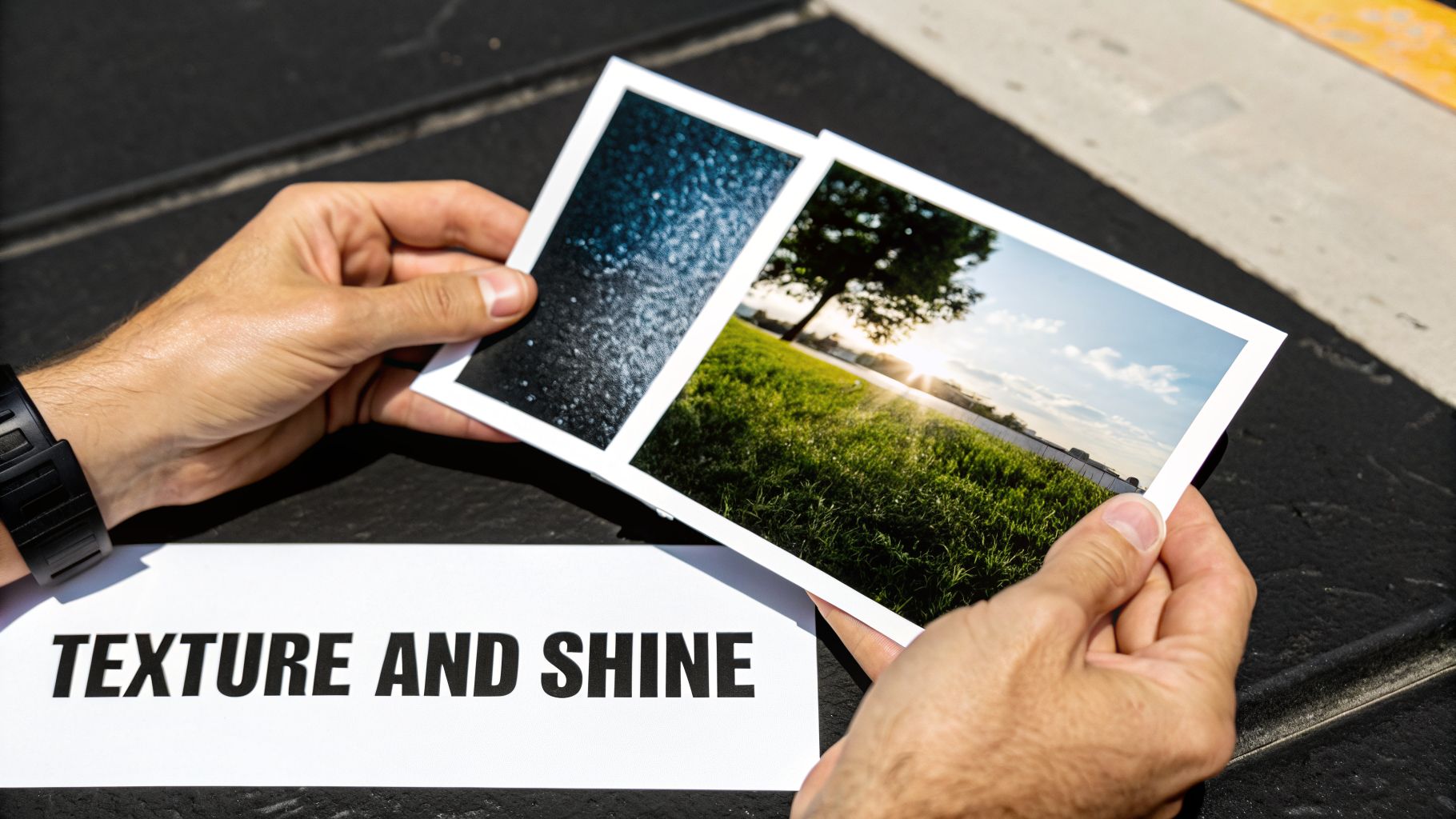
When you put a matte and glossy print side-by-side, one of the first things you'll notice is the difference in perceived sharpness. The slick, reflective surface of a glossy print bounces light back in a uniform way, making edges look incredibly crisp and defined. This makes it a fantastic choice for prints where tiny details matter, like architectural plans or intricate product shots.
Matte paper creates a softer look by design. Its textured surface diffuses light in multiple directions, which softens hard lines and gives the image a more organic feel. This can be a huge advantage for portraits and landscapes, as it reduces that harsh "digital" look and lends a more timeless quality to the print. This choice can be what elevates a standard photograph into the realm of fine art images, where texture and mood are just as important as the subject itself.
Your decision really boils down to intent. Glossy grabs attention with sharp, high-contrast visuals. Matte invites you to come closer and appreciate its subtle character and detail. Neither is flat-out better—they just do different jobs.
Glare, Reflections, and Real-World Use
Where and how the final print will be displayed is probably the single most important factor. Glossy prints are basically mirrors. Under direct sunlight or bright overhead lights, they produce a ton of glare, which can make the image impossible to see from certain angles. That’s a deal-breaker for most framed wall art.
This is where matte finishes truly shine (pun intended). The non-reflective surface scatters light, killing distracting glare and keeping the image clear from any viewpoint, in almost any lighting. This makes matte the obvious go-to for:
- Framed Artwork: Perfect for prints you plan to hang in a home, office, or gallery where you can't control the lighting.
- Business Documents: A must for reports, presentations, or legal documents that need to be clear and readable.
- Handled Items: Great for things like menus or brochures that people will be holding and viewing up close.
The feel of the print matters, too. A glossy photo is perfectly smooth, but it’s a magnet for fingerprints. A matte photo has a slight texture that does a much better job of hiding smudges, making it far more practical for anything that will be handled often. Industry data backs this up; you can discover more about photo printing preferences on My-Picture.co.uk to see how these trends play out.
In the end, it’s a strategic choice. Once you know the viewing environment and how the print will be used, you can pick the finish that doesn't just look good, but actually works for its intended purpose. If you're stuck between needing visual punch and readability, our team can help you find the right balance. Ready to see what we can do? Contact us for a quote and let’s get started.
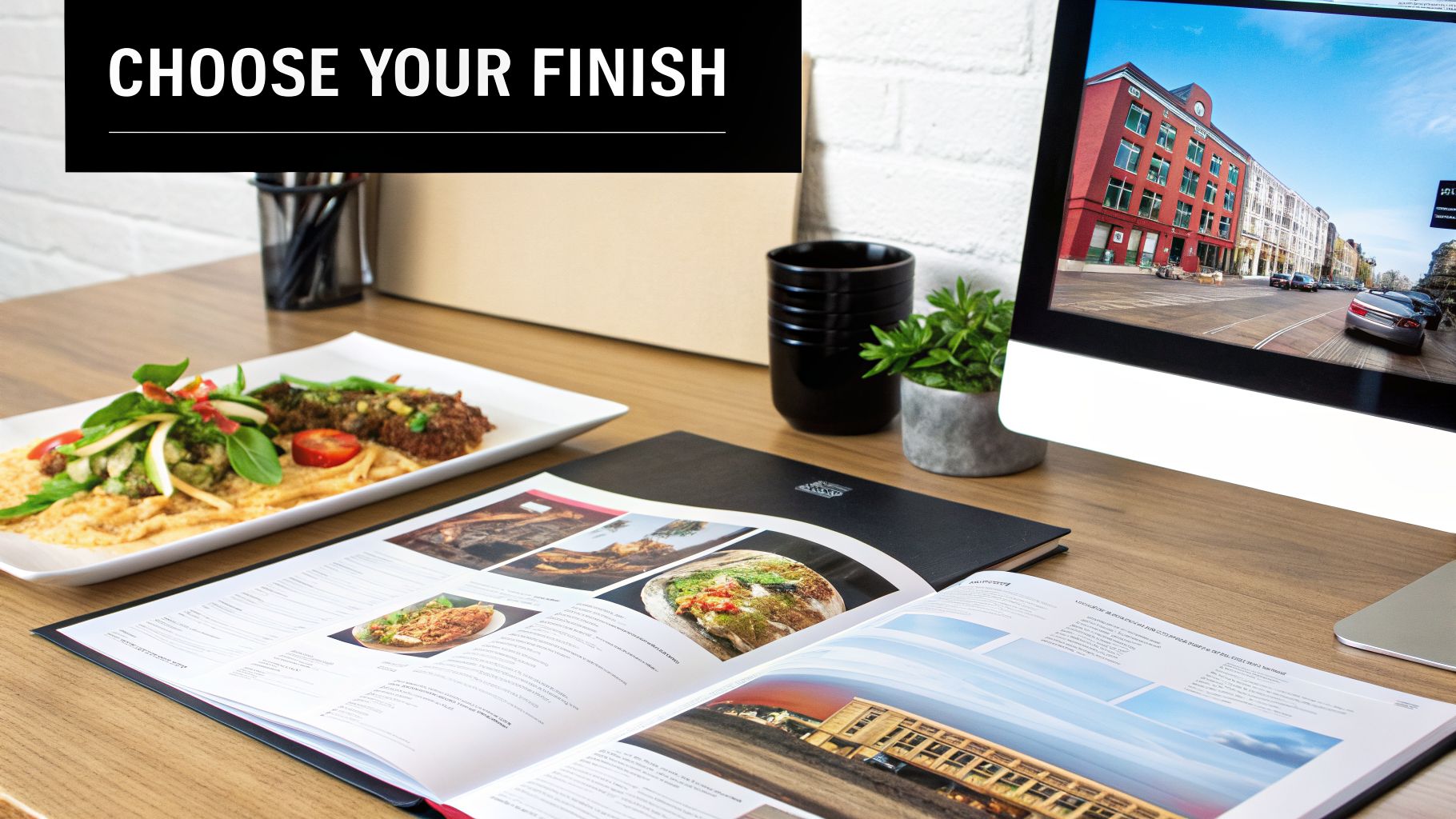
Beyond the Finish: How Paper and Production Shape Your Final Print
Choosing between a matte and glossy finish is a great starting point, but it’s only half the story. The paper you print on and the production steps that follow are just as critical. Think of them as the foundation and framework that support your final design—get them right, and your digital vision translates beautifully into a physical product you can be proud of.
It all starts with the paper itself, or what we in the print world call the substrate. A thick, heavy paper stock just feels more substantial and professional, while a lighter stock works perfectly for items that don't need to last forever. Even the paper's texture makes a difference. A naturally textured, uncoated paper will diffuse light on its own, giving it a matte-like quality before we even apply a finish. If you put a gloss coating on that, you can get some really interesting visual effects, but it'll never be the pure, mirror-like shine you'd get on a completely smooth stock.
Paper Weight and Substrate: The Feel and Function
Paper weight, measured in pounds (lb) or grams per square meter (GSM), is all about sturdiness. You can immediately feel the difference between a standard 20 lb bond paper (think everyday office copies) and a hefty 130 lb cover stock we use for premium business cards and invitations. Heavier stocks hold up against bends and creases, which is exactly what you want for pieces meant to make a lasting impression.
But it’s not just about weight. The material itself opens up a world of possibilities:
- Cardstock: Your workhorse for anything that needs to be durable, from postcards and rack cards to the covers of your booklets.
- Synthetic Papers: These are essentially plastic-based papers. They’re waterproof and almost impossible to tear, making them a brilliant choice for restaurant menus or outdoor signage.
- Specialty Stocks: This is where you can get really creative. Papers with linen, felt, or even metallic textures add a tactile and visual flair that works with either a matte or glossy look.
Getting the combination of paper and finish right is everything, especially for things like custom photo booth prints where you need both great looks and durability. If you want to get into the nitty-gritty of how paper thickness can affect your project, we've put together a guide on choosing the right paper stock weight.
Lamination and Finishing: The Ultimate Control
Lamination is one of our most powerful tools. It's a process where we apply a super-thin layer of plastic film over the top of your printed piece, and it's a game-changer for two reasons: durability and finish control.
Lamination does more than just protect; it gives you the final say on the look and feel. It creates a tough barrier against spills, smudges, and tears while letting you lock in the exact finish you want—whether that’s a brilliant shine or a soft, glare-free matte.
This means you’re never locked into the finish of the paper you started with. We could print your design on a basic matte paper and then apply a high-gloss lamination to make the colors explode off the page and give it a tough, wipeable surface. On the flip side, we can take a standard print and add a matte lamination to kill reflections and give it a sophisticated, almost velvety texture. It’s a fantastic technique for anything that gets handled a lot, like menus, ID badges, or presentation folders.
Cost and Turnaround: What to Expect
For most everyday print jobs, the cost difference between a standard matte and a standard glossy paper is pretty small—almost negligible. The real factors that will move the needle on your budget and timeline are the paper weight, any specialty substrates, and extra finishing steps like lamination.
It’s simple, really: heavier, premium paper stocks cost more than the lighter, standard options. Adding a lamination step also adds a bit to the cost and production time, since it’s another process we perform after the ink is dry. If you’re working against a tight deadline, these are important details to consider. The best thing to do is chat with one of our print experts. We can walk you through the options to find that perfect sweet spot between the quality you want, the budget you have, and the deadline you need to meet.
When to Choose Matte or Glossy for Business Use
When you're printing for your business, the choice between a matte and glossy finish goes way beyond personal preference. It becomes a strategic decision that can make or break how people see your brand. The right finish affects readability, durability, and the overall message your printed materials send.
Think about it this way: a high-end fashion boutique has completely different needs than a busy construction firm. One needs to convey luxury and a certain tactile elegance, while the other needs documents that are tough, clear, and can withstand being on a job site. Let's walk through some real-world examples to help you pick the finish that will actually get the job done.
Marketing Collateral: Flyers, Postcards, and Brochures
If you need to make an immediate, powerful impression, a glossy finish is your best friend. Its reflective quality makes colors look deeper and more vibrant, which is perfect for grabbing attention. Imagine a postcard featuring a breathtaking travel destination or a flyer announcing a grand opening—glossy makes those images pop right off the paper.
But a high-shine finish isn't always the right fit for your brand's voice. A matte finish often speaks a language of sophistication and quality. For a luxury spa, a respected law firm, or a B2B consultant, a brochure with a soft, non-reflective surface feels more understated and professional. It doesn't shout; it confidently invites you to come closer.
Here’s how to think about it for common marketing pieces:
- Go with Glossy for: Promotional mailers, event flyers, and product-heavy brochures where stunning visuals are the main draw. That shine creates a modern, high-quality feel.
- Choose Matte for: Brand-focused collateral, detailed informational pamphlets, and premium lookbooks. The tactile experience suggests an established, confident brand.
Food Service and Restaurant Menus
In the restaurant business, your number one job is making the food look as incredible as it tastes. This is where a glossy finish truly shines. The high contrast and rich saturation can make your food photography look absolutely irresistible, making every color and texture seem more vivid.
The downside? Glossy menus are magnets for fingerprints and can create a lot of glare, especially in a restaurant with mood lighting. This is where a laminated matte finish comes in as a fantastic compromise. While a standard matte paper might soften the colors slightly, a laminated matte menu gives you the best of both worlds. It’s incredibly durable, wipes clean in a second, and cuts out all that distracting glare for customers trying to read under a spotlight.
For restaurant menus, you’re always balancing visual appeal with pure practicality. Glossy makes the food look amazing, but a laminated matte finish is far more durable and readable in a hectic dining room.
AEC, Legal, and Technical Documents
For anyone working in architecture, engineering, construction (AEC), or the legal field, clarity is everything. Documents like blueprints, trial exhibits, or technical reports have to be perfectly readable, whether you’re in a bright courtroom or on a dusty work site. In these fields, a matte finish is the only real choice.
A glossy surface would be a complete nightmare. The glare would make it impossible to read fine print, check detailed schematics, or present evidence clearly to a judge. Matte paper, on the other hand, absorbs light. This ensures every single line, number, and word is crisp and easy to see from any angle.
- Architectural Plans: Must be 100% glare-free for use in the office or on-site.
- Legal Exhibits: Need maximum readability under harsh courtroom lights to be effective.
- Technical Manuals: Have to be easy to read and resist smudging from frequent handling.
This same logic applies to smaller but equally important items. The feel of the paper can make a huge first impression, which is why thinking about the best paper for business cards is a smart move for your brand.
Ultimately, choosing a finish is about matching its physical traits to your project's goals. If you're ever stuck, just ask. We can show you samples and help you find the perfect finish that fits your vision, budget, and brand.
Preparing Your Design Files for a Perfect Finish
A great print job doesn’t just happen at the press; it starts with a well-prepared design file. What you see on your bright, backlit monitor is almost never a perfect match for the final printed piece. This is especially true when deciding between matte and glossy photos, as each finish interacts with color, ink, and light in its own distinct way.
The trick is learning to anticipate how the paper itself will change your image. A glossy finish is designed to make colors feel rich and vibrant, naturally boosting saturation and contrast. On the other hand, a matte finish has a slightly porous surface that absorbs more ink, which can give colors a softer, more muted appearance compared to how they look on your screen.
Compensating for Color and Brightness Shifts
To get the exact look you're after, you need to prep your files with the final paper stock in mind. This means proactively tweaking your design to compensate for the paper's natural tendencies. Without these adjustments, a design intended for a glossy surface can look harsh, while one designed for matte might feel flat and washed out.
Here are a few essential pre-press tips I give to all my clients:
- For Matte Finishes: Because matte paper naturally softens colors, I always recommend giving your images a slight bump in saturation and vibrancy. A good starting point is an increase of 5-10%. This little extra pop will counteract the paper's absorbent quality and ensure your final print looks balanced and rich, not dull.
- For Glossy Finishes: Glossy paper does half the work for you by amplifying color, so you often need less compensation here. Instead, your focus should be on brightness and contrast. Images that look perfect on-screen can sometimes print too dark on a glossy stock, so a small nudge in brightness helps keep important shadow details from getting lost.
Think of it like a chef seasoning a dish. You don’t season for how it tastes in the kitchen; you season for how it will taste at the table. Similarly, you must adjust your digital file not for how it looks on your screen, but for how it will look on the final printed paper.
Resolution and Proofing Best Practices
Beyond color, file resolution is absolutely critical for a sharp, professional-looking print. A low-resolution image will come out looking pixelated and blurry—a flaw that no paper finish can ever fix.
For high-quality results, your images and design files must always be set to 300 DPI (dots per inch) at their final print size. This is the universal industry standard for producing crisp, clear detail. If you want to dive deeper into the technical side, our guide on understanding DPI for printing is an excellent resource.
Finally, never, ever skip the proof. A professionally printed proof is your one and only opportunity to see exactly how your colors, brightness, and overall design will look on your chosen paper and finish. It’s your safety net, allowing you to catch any problems before you’ve committed to a full print run. This step alone can save you from a costly and disappointing outcome, and it’s where having an expert partner really pays off. If you’re unsure how your files will translate, we can help. Get a quote today, and let's make sure your project looks perfect.
So, how do you make the final call? Choosing between matte and glossy isn’t about finding a single “best” finish—it’s about matching the paper to the purpose of your project.
Think of it this way: glossy is for making a statement. Its job is to grab eyeballs with explosive color and crisp, almost electric detail. On the other hand, matte offers a quieter, more sophisticated feel. It’s the go-to for a refined, artistic look where glare is a non-starter and you want a tactile, premium quality.
A Practical Checklist for Your Decision
When a client is stuck, I usually walk them through a few key questions. It almost always clears things up.
- Where will this be seen? If it’s going under bright lights—like in a trade show booth or a well-lit office—glare is your enemy. Matte is the obvious choice here.
- How will people use it? For anything that gets handled a lot, from restaurant menus to portfolio books, matte is a lifesaver. Its resistance to fingerprints and smudges keeps it looking clean.
- What’s the main goal? Do you need to stop someone in their tracks with a dazzling product shot? Go glossy. Or are you trying to convey understated elegance and ensure easy readability? That’s a job for matte.
Your choice also trickles down to how your files should be prepped for the printer. It’s not a one-size-fits-all process, and small adjustments can make a big difference in the final result.
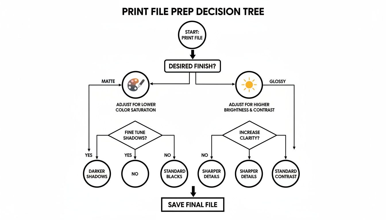
As you can see, the paper finish dictates the prep work. We often find that glossy prints benefit from a slight reduction in brightness to avoid blown-out highlights, while matte prints frequently need a little boost in saturation or contrast to prevent colors from looking too subdued.
The single best piece of advice I can give? If you're on the fence, get a sample. There is no substitute for seeing and feeling the paper for yourself. It’s the most reliable way to know you’re making the right decision for your project.
When you're ready to move forward, our team is here to help. We can provide you with physical samples and walk you through the options to make sure your vision comes out perfectly.
Ready to see your project come to life? Get a custom quote from our experts today.
Common Questions We Get Asked
Even after weighing all the pros and cons, you might still have a few specific questions. We get it. Choosing the right finish is a big deal. Here are the answers to some of the most frequent questions we hear from clients to help you nail down that final decision.
Can You Write on a Glossy Photo?
You can, but you probably shouldn't. The slick, sealed surface of a glossy photo just wasn't made for writing. Most ballpoint pens will fail to leave a mark, and even a permanent marker like a Sharpie can easily smudge if you don't give it ample time to dry. It's a risky move.
If you know your prints will need a signature or a handwritten note, matte is the only way to go. Its slightly textured surface is much more receptive to ink, allowing for clean, smudge-free writing with most pens. This makes it the perfect choice for things like guest books, signed portraits, or just jotting a memory on the back of a print.
Pro Tip: If you absolutely must have a glossy look but need to write on it, consider a gloss lamination over a standard matte paper. This can sometimes offer a bit more "tooth" than a true photo-gloss paper, but always test it first!
Which Finish Works Best for Black and White Photos?
This often comes down to personal taste, but most professional photographers lean toward a matte finish for black and white images. There's just something about the way its non-reflective surface enhances the mood and texture of a monochrome shot.
A matte finish allows the subtle shifts in tone—from deep blacks to delicate greys—to shine without any distracting glare. It draws the viewer's eye to the composition and emotion of the photograph, giving it a timeless, gallery-like quality. While a glossy finish can make the blacks pop, it often feels more commercial and can lose some of that artistic nuance.
Is One Finish More Expensive Than the Other?
When you're comparing a basic matte paper to a basic glossy paper of similar weight, there's no significant price difference. The cost for the paper itself is usually neck and neck.
The factors that will actually drive up your project's final cost have more to do with your other choices, such as:
- Paper Weight: Heavier, more substantial paper stocks will always cost more than their thinner counterparts.
- Specialty Papers: Upgrading to a unique stock like textured linen, metallic, or a durable synthetic paper will increase the price.
- Lamination: Adding a protective layer, whether matte or gloss, is a separate finishing step and comes with an additional cost.
Ultimately, the best way to get a clear picture of the cost is to get a quote based on your exact project specifications.
Ready to find the perfect finish for your project? The team at Camelot Print & Copy Centers can walk you through the options and provide precise pricing. Contact us today to get a quote and let's get started on your next print job.