You're usually not ordering a presentation folder because you love folders. You're ordering one because a meeting matters. A proposal is going out. A sales team needs leave-behinds that don't look improvised. A client packet has to feel organized before anyone reads the first page.
That's where presentation folder design either helps you or undermines your efforts. Good folders make a business look prepared, consistent, and credible. Weak ones do the opposite. They crease too easily, feel generic in the hand, bury the important insert, or turn a polished brand into a stack of disconnected pieces.
Why Your Presentation Folder Is More Than Just Paper
A common first-time mistake is treating the folder as packaging for the “real” material inside. In practice, the folder is the first read. Before someone gets to your pricing sheet, brochure, or proposal, they've already handled your brand.

If the cover feels thin, the finish feels cheap, or the layout looks crowded, that impression lands immediately. If the folder opens cleanly, holds documents securely, and gives the eye a clear path, the whole presentation feels more deliberate.
The Folder Carries Your Brand Before Your Pitch Starts
Presentation folder design didn't appear out of nowhere as a decorative add-on. It grew alongside modern corporate identity systems, especially from the 1930s through the 1960s, when businesses used structured visual systems, logos, and controlled layouts to organize branded print communication, as documented in AIGA's design history resources and archives. That history still matters because it explains what a folder is supposed to do. It isn't just there to hold paper. It's there to organize information and reinforce brand consistency.
A strong folder tells the recipient that the material inside has been thought through, not just assembled.
That's why the smartest folder projects start with the same question used for brochures, catalogs, or proposal decks. What should the recipient feel when they pick this up?
For some businesses, the answer is confidence and formality. For others, it's warmth, clarity, or premium service. If you're mapping out your wider print kit, this mattress marketing collateral guide is useful because it shows how different collateral pieces support a single sales story instead of acting as stand-alone items.
Cheap Signals Are Hard to Hide
A folder doesn't need to be flashy to be effective. It does need to feel intentional. In small business marketing, that distinction matters because the folder often appears next to business cards, brochures, rack cards, and proposal sheets. If those pieces aren't coordinated, the folder exposes the inconsistency instead of hiding it. Camelot has a practical overview of marketing materials for small businesses that's worth reviewing if you're building the whole set at once.
The bottom line is simple. A presentation folder is one of the few print pieces that combines branding, sequencing, protection, and physical experience in a single object. That gives it more influence than people expect.
Laying the Groundwork for Your Folder Design
Most expensive folder mistakes happen before anyone opens InDesign or Illustrator. They start when the project has no clear job to do.
A presentation folder for a construction bid packet shouldn't be designed like a trade show handout. A real estate listing folder shouldn't feel like an HR onboarding packet. If the use case is fuzzy, the design gets cluttered fast because every stakeholder tries to fit one more message onto the cover.
Start With One Primary Use
Pick the main purpose first. Not three purposes. One.
Ask these questions:
- Who receives it: A prospect, existing client, employee, student, donor, or internal team?
- Where they receive it: In a conference room, by mail, at a trade show, in a lobby, or during onboarding?
- What must go inside: Proposal sheets, forms, brochures, welcome letters, pricing pages, or legal documents?
- What action you want next: Sign, call, compare, keep, refer, or remember?
Those answers shape the entire presentation folder design. A folder that carries a formal proposal should feel stable and restrained. A folder handed out at an event can be bolder and more promotional. A recruiting packet may need to feel welcoming rather than corporate.
Practical rule: If you can't describe the folder's job in one sentence, the design will try to do too much.
Build the Cover Around Hierarchy
The front cover isn't a flyer. It doesn't need to explain everything. It needs to identify the brand, create the right tone, and invite the open.
That usually means a short stack of priorities:
Brand identifier first
Your logo or wordmark needs a clean position. Don't bury it in a collage or force it into a busy background.
Message second
A short line can help if the audience needs context. Keep it tight. A folder cover is not the place for a dense value proposition.
Supporting graphic language third
Patterns, imagery, color fields, or illustrations should support recognition, not compete with it.
A lot of first drafts fail because everything is treated as equally important. When every element shouts, the eye has nowhere to land.
Leave More Empty Space Than Feels Comfortable
Clients often worry that a folder will look “too plain.” In print, plain and confident are often close neighbors. Crowded and inexpensive are even closer.
Negative space gives premium brands room to breathe. It also gives your logo more authority than a larger logo jammed into a busy layout.
Use the back cover and interior panels to carry secondary information. Contact details, short service lists, certifications, and supporting copy usually belong there, not all on the front.
Keep the Brand System Consistent
Brand consistency isn't only about using the correct logo file. It's about making the folder feel like it belongs with the inserts that go inside it.
Check these before design starts:
- Typography: Use the same type family logic you use on your brochure or proposal pages.
- Color approach: Decide early whether the brand can print well in process color or whether a spot color conversation is needed later.
- Image style: Don't mix polished studio imagery with informal snapshots unless that contrast is intentional.
- Tone: A conservative financial packet and a creative agency leave-behind should not speak with the same visual voice.
If the folder is carrying multiple documents from different departments, unify them with one visual system. Shared headers, matching margins, and a consistent color rhythm make the entire packet feel more expensive even without adding premium finishes.
Mastering Dielines Bleeds and Color Specs
This is the part that causes reprints. Not because it's difficult, but because people guess.
A dieline is the production blueprint for the folder. It shows where the sheet will be cut, folded, glued, and where pockets form. If you design without the printer's actual dieline, you're designing on assumptions. Assumptions are where logos get trimmed, text lands upside down on pockets, and images break awkwardly at folds.
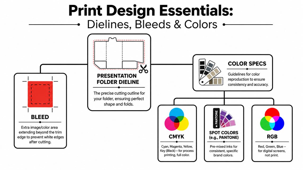
Use the Production Template, Not a Lookalike
For a standard 9" x 12" presentation folder, the common layout uses 4" pockets, and the print file should include 0.125" bleed on each side, according to Printivity's presentation folder design guide. That same guide notes a diagonal die at the center fold that can cut up to 0.625" at the farthest point on each side, which means critical artwork has to stay clear of that area.
Those numbers matter because folders aren't flat brochures. Pockets fold inward, glue areas disappear, and trim paths can remove more artwork than inexperienced designers expect.
A good starting checklist looks like this:
- Get the exact dieline from your printer: Don't reuse an old folder template from another vendor.
- Extend backgrounds fully into the bleed: If color or images stop at the trim line, tiny shifts in cutting can show white edges.
- Respect the safe area: Keep logos, phone numbers, and small type away from fold and die-cut stress points.
- Check pocket orientation carefully: Pocket graphics often appear upside down on the flat file so they read correctly after folding.
For readers who want plain-language terminology before reviewing a template, this guide to eliminate vague design feedback can help teams describe print issues more clearly during review.
Bleed Is Small and Important
A lot of people hear “bleed” and think it's a technical detail that can be fixed later. It can't. If your background photo, color block, or pattern is meant to run to the edge, that artwork must extend beyond the final trim edge in the file.
Camelot has a simple explainer on what a print bleed is if your team needs a quick reference before file setup.
If a designer says “it looks fine on screen,” that tells you almost nothing about whether it's safe for trim.
Know the Color Language Before Approval
Clients often approve color from a laptop screen and expect the printed folder to match exactly. That's not a safe workflow.
Here's the practical distinction:
- CMYK is the standard process-color method used for most full-color print jobs.
- Spot colors, such as Pantone-based selections, are used when a brand needs a very specific, controlled color result.
- RGB is for screens, not print.
If brand color accuracy is critical, ask the printer early whether the folder will run as process color, whether a spot-color option makes sense, and how that choice affects production. This is especially important for logos with sensitive blues, oranges, or neutrals where even a small shift can be noticeable.
Common Technical Misses That Cost Time
The file can look polished and still be wrong for press. Watch for these issues:
Tiny text near folds or pocket edges
It may remain legible in the PDF but look cramped or vulnerable after finishing.
Artwork crossing the center fold carelessly
A face, headline, or logo split across a fold often looks awkward unless designed for that interruption.
Ignoring the diagonal cut zone
That's where clients lose icons, text, or decorative rules and wonder why the finished piece feels “off.”
Mixed color modes in placed graphics
One RGB image can surprise you during output, especially if the rest of the file was built correctly.
The technical part of presentation folder design isn't glamorous, but it's where a professional job separates itself from an expensive guess.
Choosing Materials and Finishes That Impress
Often, clients overspend in the wrong place, asking about foil, embossing, or soft-touch treatments before deciding what the folder needs to communicate.
Finishes work best when they reinforce the brand message. They work worst when they're added because the blank template feels underwhelming.
Start With the Story You Want the Folder to Tell
A matte folder says something different from a glossy one. A textured stock says something different from a smooth coated cover. The right choice depends less on trends and more on how you want the recipient to read the brand.
Industry design guidance points to features like diagonal or vertical pockets, gatefolds, tri-panels, stepped inserts, and tactile finishes as functional tools that improve engagement and create a more memorable experience, as discussed in GDUSA's expert design tips for better presentation folders. That's the key distinction. Structure and finish aren't just decoration. They affect how the folder opens, how the content is revealed, and how much care the recipient assumes went into the presentation.
The Real Trade-Offs
Some finishes make a folder feel premium but also add production steps. Some improve durability. Some mainly change perception.
Here's the decision logic I use with first-time buyers:
- Choose matte or soft-feel surfaces when the brand should feel restrained, upscale, or consultative. These often photograph less aggressively and feel more refined in person.
- Choose gloss or higher-shine coatings when you want color to feel more energetic, high-contrast, or retail-driven.
- Choose texture carefully if your audience responds to tactile cues. Texture can make a simple design feel intentional, but it can also reduce crispness in fine type or small reversed details.
- Use foil or embossing selectively on logos, seals, or small focal elements. If everything is special, nothing is.
Expensive finishing can't rescue weak hierarchy. It can only decorate it.
Folder Finishing Options Compared
| Finish | Best For | Feel & Look | Cost Impact |
|---|
| Matte coating | Professional services, proposals, B2B packets | Calm, understated, low glare | Moderate |
| Gloss coating | Sales kits, colorful branding, event handouts | Brighter color, more visual pop | Moderate |
| Uncoated stock | Brands that want warmth or a more natural feel | Paper-forward, tactile, less slick | Varies by stock |
| Textured stock | Boutique brands, hospitality, premium leave-behinds | Tactile, distinctive, less generic | Moderate to higher |
| Soft-touch style finish | Luxury positioning, welcome kits, premium proposals | Smooth, velvety, high-end feel | Higher |
| Foil stamping | Logos, seals, short premium statements | Reflective highlight, strong emphasis | Higher |
| Embossing or debossing | Identity marks, monograms, subtle premium detail | Dimensional, tactile, elegant | Higher |
| Die-cut features or specialty structures | Kits that need reveal, sampling, or staged storytelling | Interactive, engineered, memorable | Higher and often longer turnaround |
Coating Choice Affects More Than Shine
Clients often compare finishes by appearance alone. That misses the operational side.
A coated folder generally handles repeated use better and resists scuffing more effectively than a bare surface. That matters if the folder will travel to meetings, move through many hands, or sit in a vehicle or field bag. On the other hand, an uncoated or textured stock may support the brand tone better for firms that want a more grounded, human presentation.
Paper choice also influences finishing success. If you're still learning how cover stocks behave, Camelot's overview of paper stock weight is a useful primer before you commit to a finish that may require a sturdier base sheet.
Structural Upgrades Need a Reason
Gatefolds, tri-panels, vertical pockets, and stepped insert systems can be excellent choices. They can also become expensive complexity if there's no content strategy behind them.
Use specialty structure when at least one of these is true:
- The packet includes multiple document types that need a sequence.
- The opening experience is part of the pitch.
- You need the folder to hold more than a standard flat handout set.
- The audience is comparing your materials directly with competitors.
Skip specialty structure when the folder only holds a few sheets and the message is straightforward. In that case, a cleaner standard format often looks more disciplined than an elaborate build that solves no real problem.
Designing Functional Pockets and Inserts
The outside sells the meeting. The inside has to survive it.
A folder can look excellent on the cover and still fail once it's filled. Papers slide out. The business card sits at an odd angle. The recipient opens it and doesn't know what to read first. That's a design problem, not a printing problem.
The Interior Should Control the Reading Order
The most effective presentation folder design treats the inside like a guided path. When the folder opens, the reader should immediately understand where the anchor document is and what supports it.
That's why I usually prefer one of two approaches:
- A clean primary pocket setup when one document matters most, such as a proposal or agreement.
- A layered insert system when the packet includes multiple supporting pieces that need a clear sequence.
A standard two-pocket layout works well when left and right serve different purposes. For example, brand overview on one side, custom proposal on the other. A single right-side pocket can feel cleaner when the insert set is small and the presentation needs less visual noise.
The folder interior should reduce decisions for the reader. If they have to sort the packet themselves, the design has already given up some control.
Pocket Style Changes Perception
Diagonal and vertical pockets can look more contemporary than a basic rectangular pocket. They also reveal more of the insert, which can help if you want a title, tab, or color band visible before the document is removed.
Business card slits deserve the same level of thought. Add them only if the card is likely to be used. If your audience will connect digitally and the packet already includes direct contact details, the slit can become visual clutter. If personal follow-up matters, a neatly placed card still adds value.
After you've reviewed examples, it helps to watch pocket-folder assembly in motion so you can understand how inserts sit and where reveal lines appear.
Stepped Inserts Make the Folder Easier to Use
Stepped inserts are one of the most practical upgrades you can make when a packet includes several sheets. Instead of stacking equal-size pages that disappear into the pocket, you create a visible progression with staggered top edges or clearly differentiated title bands.
That gives you a controlled sequence such as:
- Overview first
- Services or scope next
- Pricing or package details after
- Terms, contact sheet, or next steps last
This approach looks more organized because it is more organized. It also helps the recipient return to a specific sheet later without emptying the whole folder onto a desk.
What doesn't work is stuffing every possible handout into a single pocket because “more information feels more complete.” In practice, that usually makes the folder heavier, less elegant, and harder to use.
Your Final Print-Ready Checklist and Proofing
The last stage is where disciplined teams save themselves from very avoidable reprints. By this point, the design may look approved, the finish may be chosen, and everyone may be tired of reviewing it. That's exactly when details slip.
Treat the final check as production work, not admin work.
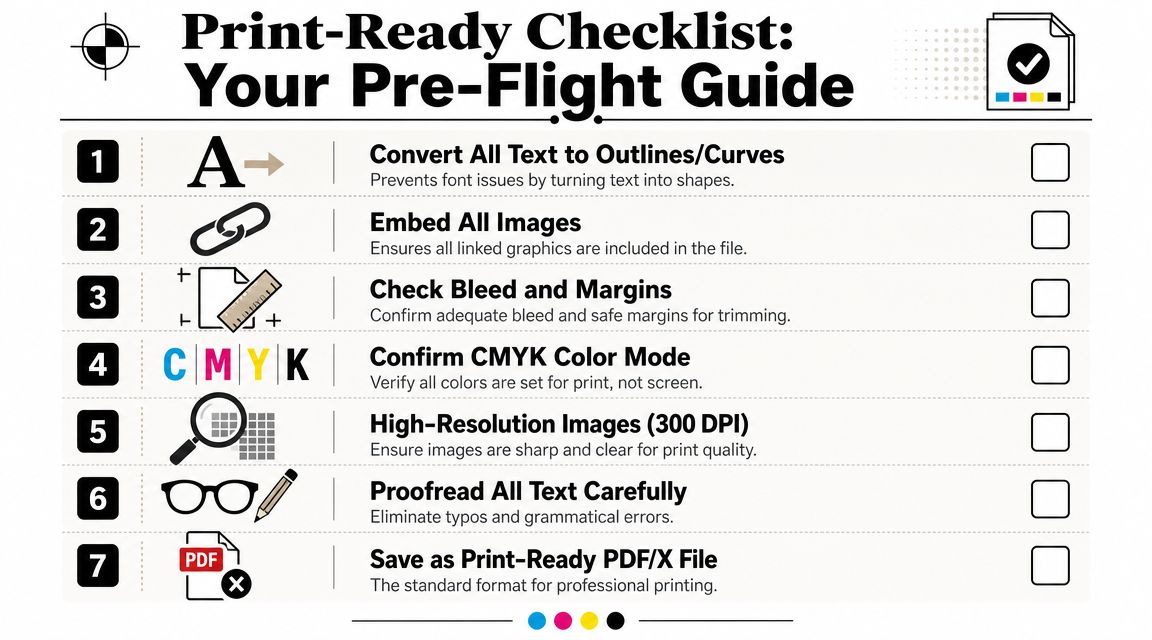
Final File Review
Run through the file slowly and deliberately:
- Text handling: Convert text to outlines or package fonts according to your printer's preference.
- Linked assets: Make sure every placed image is included and current.
- Images: Check that photos and logos are sharp enough for print.
- Color mode: Confirm print-ready color settings throughout the document.
- Dieline layer: Verify it's handled exactly as the printer requests.
- Export: Save a production-quality PDF in the format your print provider prefers.
If your team needs design support at this stage, Camelot Print & Copy Centers offers graphic design and printing services that can be used for folder layout preparation and production.
Proofing Is the Step You Can't Rush
The proof is where you stop admiring the design and start hunting for failure points.
Check for:
Typos and wrong phone numbers
These still happen on expensive projects.
Alignment problems
Look closely at logos near folds, borders near trim, and anything centered on the cover.
Pocket artwork orientation
Make sure what belongs on the pocket will read correctly after folding.
Color expectations
If the brand color is sensitive, ask direct questions before approval.
Approving a proof means you've accepted what will print. It isn't a placeholder step.
For larger runs, premium finishes, or complicated structures, a physical proof can be worth the extra time. Screen proofs are useful for content and placement. They're less reliable for tactile judgment, stock feel, subtle color behavior, and the overall impression in hand.
The Smartest Last Question
Before you send the job, ask one thing: if this folder arrives exactly as approved, will it help the meeting go better?
That question catches a lot. Maybe the cover is handsome but vague. Maybe the pocket style hides the key sheet. Maybe the finish is attractive but wrong for the audience. Print-ready doesn't always mean presentation-ready.
A good presentation folder design does both. It clears production cleanly and performs well in the room.
If you want a second set of eyes before your folder goes to press, or you need help with layout, stock choices, finishing trade-offs, or print production, request a quote from Camelot Print & Copy Centers.