You can feel the problem before you can always name it. The dining room is full enough, guests seem happy, the kitchen is putting out strong food, and service is doing its job. But margins stay tight, certain dishes barely move, and the average check doesn't reflect the quality coming out of the pass.
A lot of owners look first at labor, food cost, or promotion. Those matter. But I've seen the menu itself create friction in ways owners miss because they're too close to it. Prices are hard to scan, profitable items are buried, descriptions are flat, and the printed pieces already look tired from spills, wiping, and constant handling.
That's where professional restaurant menu design services earn their keep. A menu shouldn't just list what you sell. It should help guests choose faster, notice what matters, and feel confident ordering items that fit your concept and support your margins.
Your Menu Is Your Most Important Sales Tool
A new owner usually starts with the food. That makes sense. Recipes, suppliers, staffing, opening checklists, point-of-sale setup, and signage all demand attention. The menu often gets finished late, after the bigger fires are already burning.
That's a mistake because your menu is the only sales tool every guest is almost guaranteed to handle. It sits in front of them right at the decision point. If it's cluttered, inconsistent, or physically worn out, it undercuts the work your kitchen and front-of-house team are doing.
A strong menu doesn't push people. It guides them. It makes signature items easier to spot, makes categories easier to understand, and makes the meal feel easier to order.
A weak menu creates hesitation. A good one creates momentum.
When the food is strong but the menu is weak
I've watched restaurants serve excellent food under menus that looked like they were assembled from three different drafts. One section used short item names. Another used long paragraphs. Prices floated in different places. Add-ons were buried in fine print. The paper stock softened after a few cleanings and corners curled by the end of the week.
Guests may never say, “Your menu design is costing you sales.” They'll just default to the safest option, skip an upsell, or order more slowly than they should.
This is why menu work belongs inside a larger brand system. If you're reviewing how your menu fits into your full guest experience, it helps to also create a winning restaurant marketing strategy that connects your menu, in-store materials, and promotions. The same principle applies to your visual identity, which should stay consistent across menus, packaging, signage, and other pieces of restaurant branding materials.
What owners usually underestimate
Owners often underestimate three things:
- Decision friction: Too many choices, poor grouping, and uneven formatting slow people down.
- Physical wear: Smudged, stained, or flimsy menus change how guests read the quality of the business.
- Sales direction: If profitable items aren't visually supported, guests won't reliably find them.
Restaurant menu design services matter because they solve those business problems together. The work isn't only visual. It's operational.
What Professional Menu Design Actually Includes
Most owners think menu design means choosing fonts, colors, and maybe adding a few photos. That's only the visible layer. Professional restaurant menu design services combine analytics, layout, content, and production planning so the finished menu works in real service conditions.
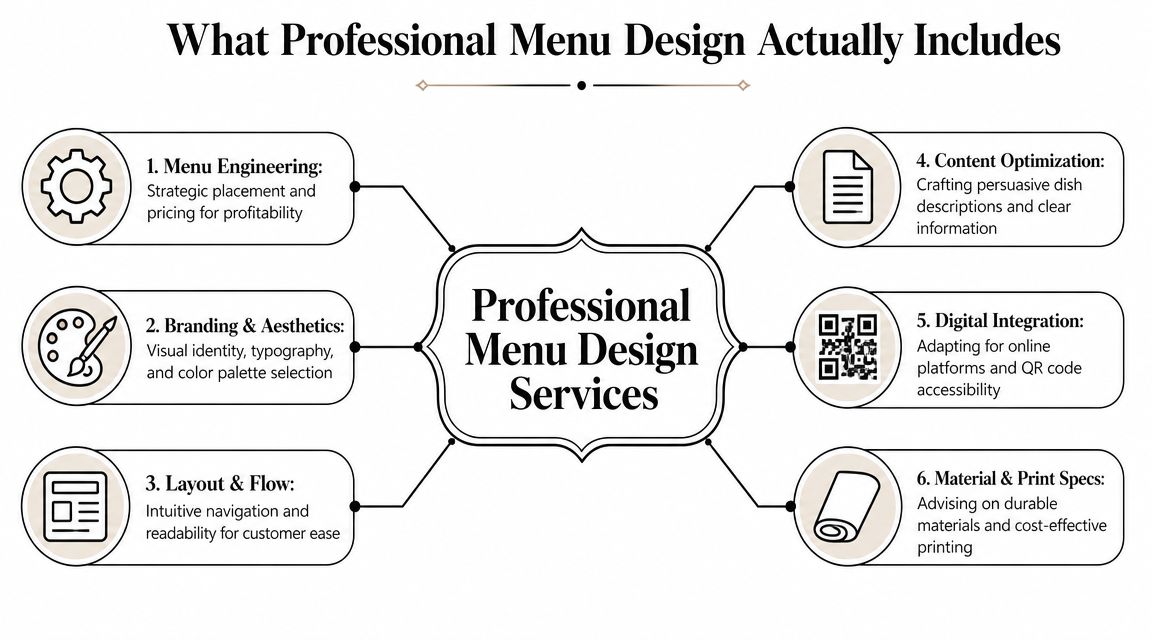
Menu engineering comes first
The serious work starts before anyone picks a typeface. Modern menu design uses a framework that classifies items as Stars, Plowhorses, Puzzles, or Dogs, and one industry source notes that 80% of sales often come from just 16% of menu items. The same guidance recommends menu audits every six to twelve months and keeping roughly 5 to 7 items per category to avoid overwhelming guests, according to Lavu's menu design guidance.
That changes the entire design conversation. If an item is popular and profitable, it deserves stronger placement. If an item sells well but makes weak margin, it may need a pricing or portion review rather than more visual emphasis. If a profitable dish isn't moving, the problem may be its name, description, or position on the page.
Practical rule: Don't ask the design to rescue a bad menu mix. Fix the menu mix, then design around it.
The visible design layer
Once the engineering is clear, the design work has a job to do.
A full service menu project usually includes:
- Brand alignment: The menu has to match the restaurant you run. A polished steakhouse, a busy fast-casual concept, and a family diner shouldn't all look like variations of the same template.
- Layout and flow: Categories must make sense at a glance. Guests shouldn't hunt for sides, modifiers, or beverage options.
- Typography: Readable type beats trendy type. Decorative fonts can work for headings, but body copy and prices need discipline.
- Content editing: Names and descriptions need tightening. Guests should know what the dish is without reading a paragraph.
- Digital adaptation: The same menu often needs a mobile-friendly version, not a shrunk-down PDF.
- Print specification: Size, fold, stock, coating, and replacement cadence all affect cost and durability.
If you need support on the visual execution side, an in-house or outsourced team handling graphic design services for print materials can bridge strategy and final production.
What doesn't work
Owners often lose money on menu projects when they buy only surface-level polish. Common failures include overdesigned layouts, too many callouts, boxes around everything, low-resolution food images, and inconsistent wording from section to section.
A professional service should know when to hold back. Not every item needs a spotlight. In fact, one industry guide recommends highlighting only 2 to 3 items per section and using boxes or shading sparingly while leading each section with the strongest item, as described in GoFoodservice's menu design guide.
That restraint is what makes a menu sell instead of shout.
Choosing Your Menu Materials and Formats
A smart layout can still fail if the physical menu is wrong for the room. Owners often choose based on upfront price alone, subsequently incurring costs later in replacements, cleaning issues, and a menu that looks tired far too quickly.
The right format depends on how often you change items, how many categories you carry, how formal the concept feels, and how much abuse the menu will take during service.
Match the format to the operation
A single-sheet menu works well when the offering is tight and easy to scan. It's fast to update, cheaper to reprint, and ideal for cafes, breakfast spots, lunch counters, and compact beverage lists.
A bifold gives you more room without becoming visually heavy. It fits many casual dining menus because it separates categories cleanly and still feels manageable in the guest's hands. A trifold can work for larger selections, but it often encourages overcrowding if the concept hasn't been edited properly.
Multi-page booklets make sense when the menu is legitimately broad, such as full-service restaurants with distinct sections, wine lists, cocktails, desserts, and seasonal features. But a booklet can also expose a lack of discipline. If guests have to turn pages just to get through a routine lunch order, the format is probably fighting the operation.
Material and finish affect more than looks
Paper choice sends a message before the guest reads a single dish. Thin uncoated stock may be fine for a limited-time insert or daily special. It's a poor choice for a high-touch core menu in a busy dining room.
Heavier cardstock gives you a sturdier feel and cleaner presentation. Laminated stock adds wipeability, which matters in family dining, bars, and fast-casual settings where menus get handled constantly. Synthetic materials can make sense when spill resistance and tear resistance matter more than a traditional paper feel.
Matte and gloss coatings each carry trade-offs. Gloss tends to pop more visually, especially with color and photography, but glare under overhead lighting can make reading harder. Matte usually reads more refined and is easier on the eyes, though it won't hide deep wear forever if the stock underneath is too light.
If your staff has to baby the menu to keep it looking presentable, you chose the wrong material.
Menu Material and Finish Comparison
| Material/Finish | Best For | Durability | Feel & Appearance |
|---|
| Standard cardstock | Short-run menus, seasonal inserts, lower-change concepts with careful handling | Moderate | Familiar paper feel, clean when new, less resistant to spills |
| Heavy cardstock | Core menus that need a sturdier hand feel without moving to synthetic stock | Better than standard cardstock | More substantial, more polished, supports stronger color reproduction |
| Laminated menu stock | Family restaurants, diners, bars, fast-casual operations | High | Easy to wipe down, practical, slightly more rigid |
| Synthetic paper | High-use menus, patios, spill-prone environments, repeated handling | Very high | Durable and flexible, less traditional paper feel |
| Matte finish | Upscale casual, full-service dining, text-heavy layouts | Depends on base stock | Softer, more refined, lower glare |
| Gloss finish | Photo-driven menus, bright casual concepts, promotional inserts | Depends on base stock | More shine and color pop, can reflect overhead light |
Practical buying decisions
When owners ask what to choose, I usually narrow it with a few operational questions:
- How often will you update pricing or items? Frequent changes favor simpler formats and easier reprint cycles.
- How much table-side wear will the menu see? Bars, patios, and family service usually need tougher stocks.
- Does the concept need elegance or pure utility? Fine dining and fast-casual don't need the same finish.
- Will you use inserts for specials? If yes, build the base menu to accommodate them cleanly.
- Who is cleaning them, and how? Real-world cleaning habits matter more than showroom samples.
For owners comparing options before ordering, it helps to review practical examples of restaurant menu printing formats and considerations so design decisions and print decisions stay connected.
How Strategic Menu Design Boosts Profitability
A menu doesn't raise revenue by looking expensive. It raises revenue by making profitable choices easier for the guest.
That's why strategic menu design belongs in the same conversation as margin management. Placement, spacing, wording, and pricing presentation all influence what gets noticed first and what feels worth ordering.
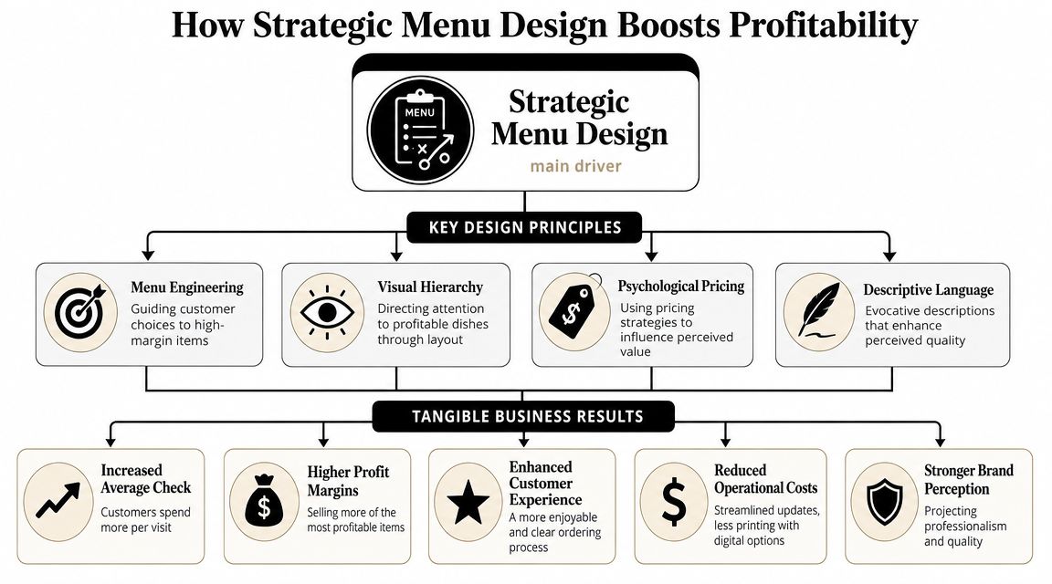
Small layout changes can move real money
Industry guidance reports that thoughtful menu layout changes can increase profitability by 15% to 30%, removing currency symbols can increase guest spending by about 8%, and unique titles and descriptions can boost sales by up to 27%, according to Colloco's restaurant menu design overview.
Those numbers matter because none of them require a recipe overhaul. They come from how the menu frames existing items.
That's the core business case for restaurant menu design services. You're not paying for decoration. You're paying for controlled influence over ordering behavior.
The mechanics behind the lift
Several choices tend to work when they're applied with restraint:
- Visual hierarchy: The most important items need stronger placement, cleaner spacing, and clearer structure than the rest.
- Whitespace: Crowded menus make every dish feel less distinct. Space gives profitable items room to stand out.
- Description quality: Guests respond better when the wording helps them picture flavor, texture, or preparation.
- Price presentation: When prices dominate the layout, guests compare numbers instead of dishes.
One mistake I see often is owners trying to promote everything equally. If every item has an icon, border, photo, badge, or callout, none of it means anything. The page becomes noise.
The menu should tell guests where to look without making that guidance obvious.
Better sales and smoother service
Good menu design also helps the floor and the kitchen. Clear categories reduce repetitive questions. Well-placed modifiers and add-ons help guests build orders more confidently. Tighter item descriptions reduce confusion at the table.
That means the profitability gain isn't only about selling one more appetizer or steering guests to a stronger entrée mix. It can also show up in smoother ordering and fewer small points of friction during service.
In practice, the most effective menus do three things at once. They support margin, protect brand perception, and reduce effort for the guest.
Navigating Digital Menus and QR Codes
Digital menus solve a real operational problem. Prices change, specials rotate, and some restaurants need updates faster than print can reasonably support. That's why QR codes and phone-based menus are now part of normal menu planning, not an extra feature.
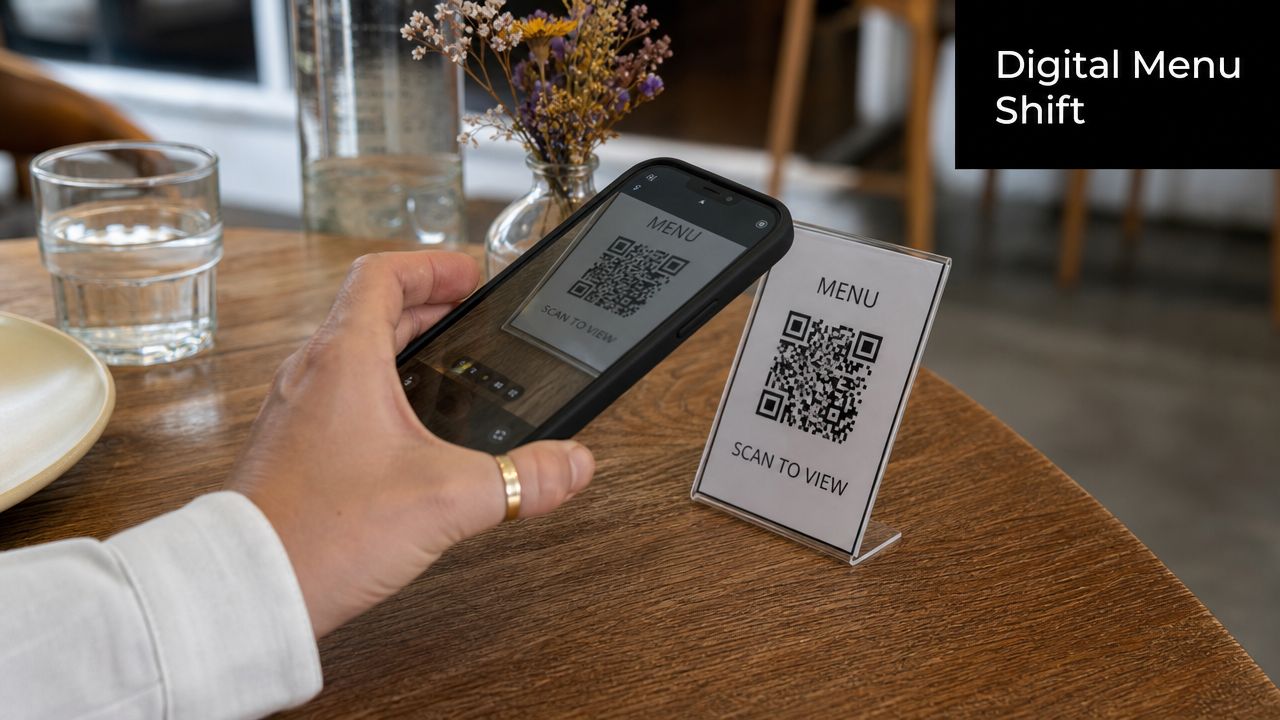
But digital convenience doesn't automatically mean good usability. A lot of QR menus are just poorly exported PDFs pushed onto a phone screen. Tiny text, awkward zooming, and confusing navigation turn what should be simple ordering into work.
The real trade-off
A major gap in menu design guidance is digital and QR-menu accessibility. Many resources still focus on old print-era persuasion tactics, while the operational reality is that menus also need to be readable on small screens and usable for guests who struggle with technology, as noted in Gordon Food Service's menu design discussion.
That gap matters more than many owners think. A guest who can't comfortably use the QR code menu doesn't care that it saves you reprint time. They need to read the menu now, in the light available, on the device they have, with the patience level they brought into the restaurant.
Print, digital, or hybrid
In most cases, a hybrid model works best.
- Print-only works when the menu is stable, the dining room experience is traditional, and guests expect a physical menu.
- Digital-only works when speed of update matters and the customer base is comfortable ordering from screens.
- Hybrid works best for many full-service and mixed-age dining rooms because it protects accessibility while keeping updates flexible.
If you're building a phone-friendly version from scratch, a step-by-step guide on how to create a digital menu can help you think through structure and usability before you hand the job off.
A useful benchmark for digital menu basics is this short walkthrough:
What a usable digital menu needs
A digital menu should be designed as its own format. At minimum, it needs:
- Readable text: No pinching and zooming just to identify entrées.
- Clear category flow: Guests should move through sections without getting lost.
- Fast loading: Heavy files and oversized images slow down the experience.
- Brand consistency: The digital version should still feel like the same restaurant.
- A backup option: Staff should be ready with printed menus when needed.
The practical standard is simple. If a guest can't use the digital menu comfortably in under a minute, the design isn't finished.
Getting Started with Camelot Your Menu Design Partner
By the time an owner is ready to order menus, they usually want speed. That's understandable, but rushed input almost always creates expensive revisions. A clean menu project starts with organized files, clear priorities, and agreement on what the menu needs to do in service.
The process is much smoother when you separate strategic decisions from production decisions. First decide what stays on the menu, what gets highlighted, and what format fits the operation. Then move into artwork, proofing, and print specs.
What to prepare before requesting a quote
Have these items ready before you start the job:
- Your current menu content: Item names, prices, category order, modifier choices, and any required disclaimers.
- Short, final descriptions: Not rough notes. Final wording saves time and avoids layout changes later.
- Your logo files: Vector files are ideal, but any high-resolution brand asset helps.
- Brand direction: Colors, fonts, photo style, and examples of pieces you already use in-store.
- Format preferences: Single sheet, bifold, trifold, booklet, insert system, QR companion, or a hybrid setup.
- Operational notes: Tell the designer how often you update items, how menus are cleaned, and whether the menu is used indoors, outdoors, or both.
If a print provider also handles design, this is the stage where the production realities should enter the conversation. Camelot Print & Copy Centers offers print and design support for menus, which is useful when the same partner needs to coordinate layout, stock choice, and final output without splitting the job across multiple vendors.
Artwork and file standards that save trouble
Restaurants often lose time by supplying the right content in the wrong format. Good production files prevent avoidable delays.
Use this checklist:
- Send a print-ready PDF when the artwork is final. That reduces font substitution and layout drift.
- Keep images high resolution. Food photos, logos, and background textures need to hold up in print.
- Flag variable content clearly. Mark seasonal items, rotating beer lines, or market-price areas early.
- Review one proof carefully. Don't skim. Check spelling, pricing, category order, and alignment.
- Approve with service in mind. Ask whether staff and guests can use it quickly, not just whether it looks good on screen.
The proof is where you catch the cheap mistakes before they become expensive ones.
What a good collaboration looks like
The best menu projects usually move through a simple sequence:
- Discovery: Concept, audience, service style, and menu goals.
- Content review: Item list cleanup, section structure, and wording edits.
- Design development: Layout options, typography, hierarchy, and branding.
- Production planning: Stock, finish, size, folds, quantity, and replacement strategy.
- Proofing and print: Final review, approval, and output.
Owners don't need to speak like designers to get a good result. They just need to be specific. Say which dishes you most want to feature. Say what guests ask about most. Say which menus currently stain, curl, or wear out too fast. Those details are what turn generic design into useful design.
If you're ready to turn your menu into a stronger sales and service tool, request a quote from Camelot Print & Copy Centers. Share your current menu, preferred format, and any branding files you have, and start with a practical conversation about design, materials, and production.