Deciding between glossy and matte photos ultimately comes down to your project's purpose and the final look you're going for. If you need vibrant, high-impact visuals for a space with controlled lighting, glossy is a great choice. But for a print that needs to be glare-free, durable, and easy to handle in bright environments, matte is the way to go.
Choosing Your Finish: Glossy vs. Matte Photos
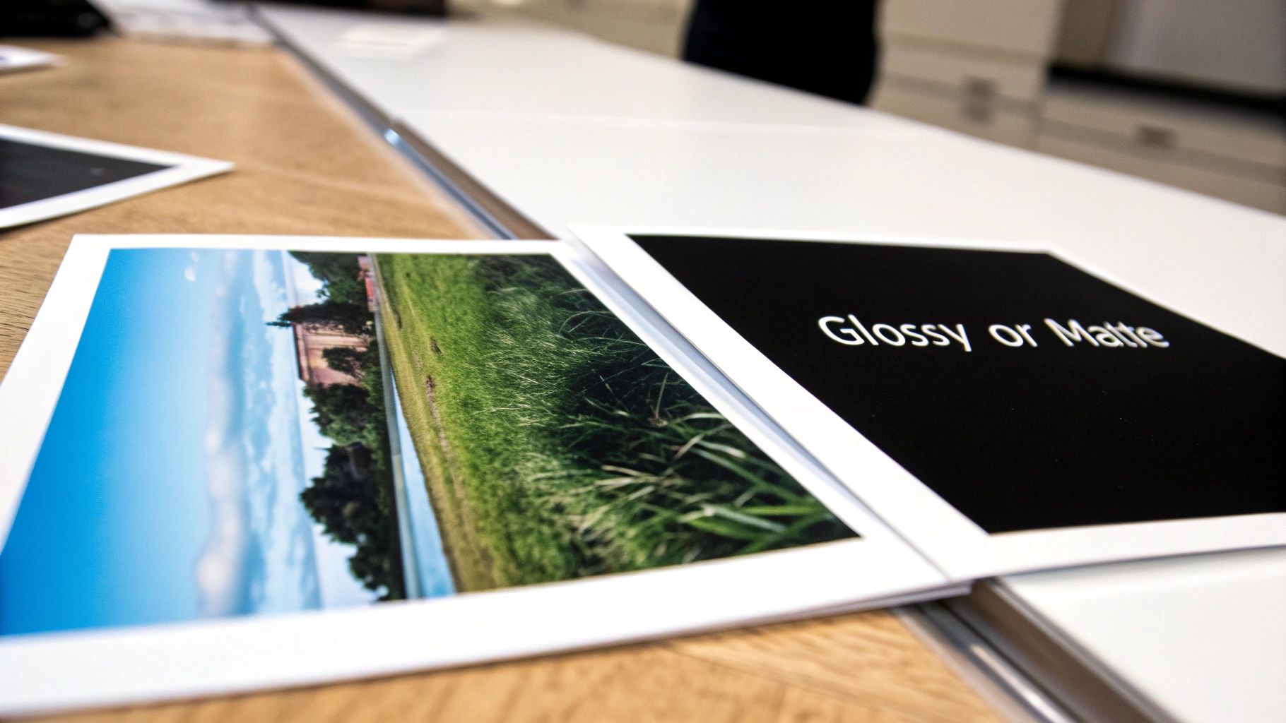
The choice between a glossy or matte photo finish is far more than just a matter of taste. It’s a strategic decision that shapes how your audience will see and interact with your work. The right finish can make a marketing brochure pop, add a touch of class to a legal exhibit, or ensure an architectural plan is crystal clear.
Each finish plays with light, color, and texture in its own unique way, creating a completely different visual and even tactile experience. It's these subtle differences that can make or break a professional project.
For example, a glossy finish can make colors jump off a trade show banner, but that same reflective quality might make your text unreadable under the bright lights of a convention hall. On the other hand, a matte finish offers a more subdued, professional look that resists fingerprints beautifully. This makes it perfect for documents that get passed around, like training manuals or spec books.
This guide will walk you through the specifics of each option, giving you a clear framework to help you choose the finish that perfectly aligns with what you want to achieve.
Glossy vs. Matte At a Glance
Sometimes you just need a quick rundown. This table breaks down the key differences to help you get a sense of which finish might be the right starting point for your project.
Think of this as your starting point. Now, let's dig into the details to see how these attributes play out in real-world applications.
Understanding Core Differences in Photo Finishes
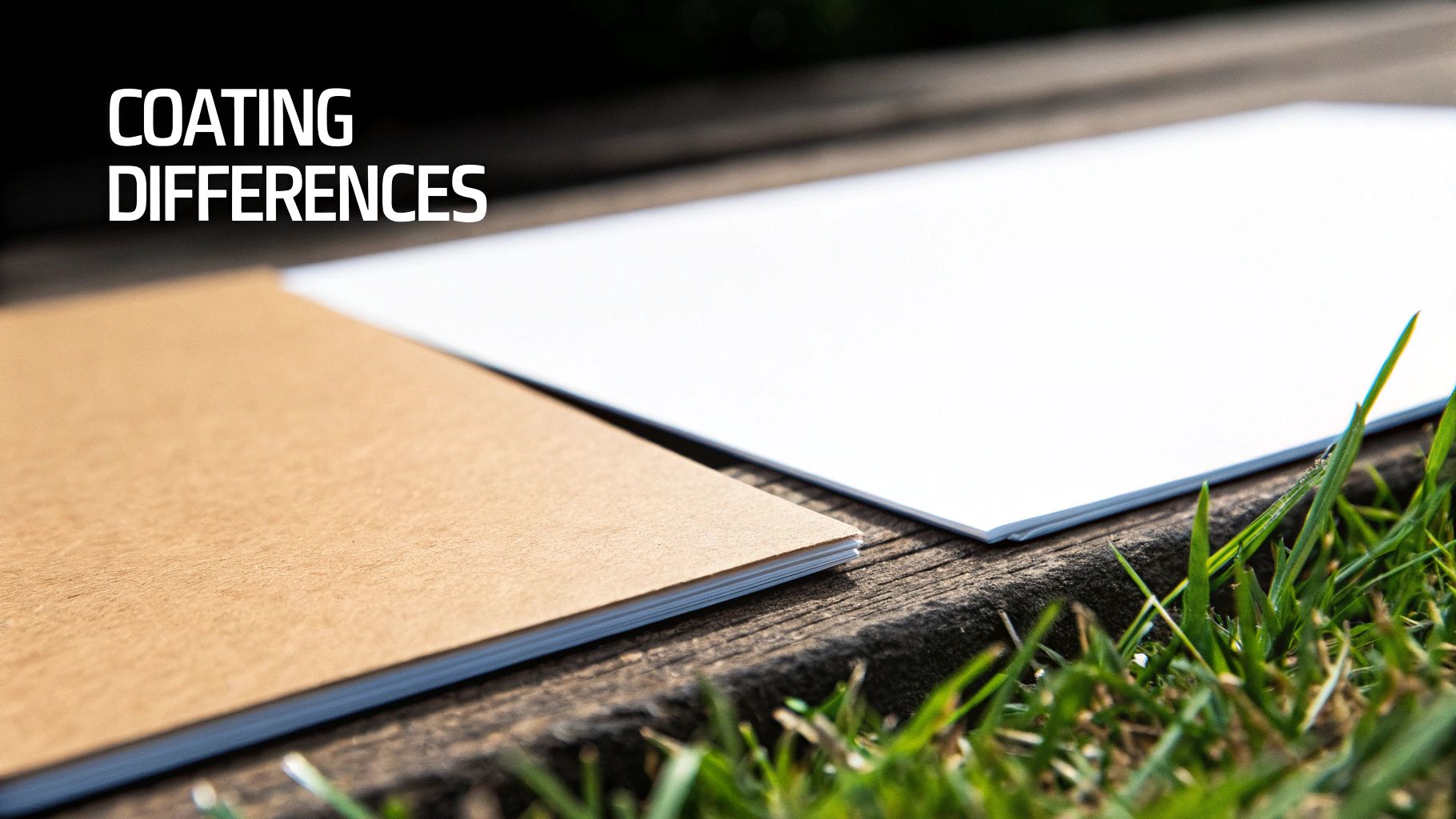
To really nail the choice between a glossy or matte photo, you have to look past the obvious shine and get into the science of the paper itself. The core difference isn't just about looks; it's about the coating technology applied to the paper and how it plays with light. This one factor dictates everything from color vibrancy to the actual feel of the print in your hands.
Think of a glossy finish as a perfectly smooth, resin-coated surface. This coating fills every tiny pore in the paper, creating a uniform, mirror-like layer. When light hits it, it bounces back directly, giving you that classic, high-impact shine and sense of depth.
A matte finish, on the other hand, is created with a coating that has a textured, microporous structure. Instead of reflecting light like a mirror, this surface scatters it in every direction. That's what kills the glare and gives matte prints their signature soft, muted appearance.
The Science of Color and Contrast
How these surfaces handle light directly impacts how our eyes see color and contrast. On a glossy paper, the smooth coating keeps the ink from soaking deep into the paper fibers. The pigment sits right on top, delivering maximum color saturation.
This is exactly why glossy prints are famous for their deep, inky blacks and vibrant, punchy colors. The reflective surface also boosts perceived sharpness, making tiny details pop. It’s no surprise this has been the go-to finish for years.
In fact, glossy photo paper holds a commanding 52% share of the global photographic paper market. Its ability to reproduce stunningly vivid colors and fine details has made it a favorite for everything from family portraits to high-impact commercial prints.
Texture and Tactile Experience
The finish also completely changes how a print feels. A glossy photo has that slick, smooth texture we all associate with professional photo lab prints. It feels polished and modern.
Matte paper offers a completely different experience. Its surface has a subtle, almost velvety texture that feels more natural and refined. This makes it a fantastic choice for prints that are meant to be handled, since its surface is much better at hiding fingerprints and smudges.
Key Takeaway: The choice isn't just aesthetic; it's functional. A glossy finish is all about maximizing visual impact by reflecting light, while a matte finish prioritizes viewability and durability by scattering it. Grasping this simple principle is the key to making the right call.
You can see these same principles at play in other industries, too. For example, decorative products like wall decals are often offered in distinct matte and glossy vinyl finishes, showing how universal this concept is.
Ultimately, knowing the why behind each finish gives you the confidence to choose the right one for the job. You can align the paper's properties with your project's goals, ensuring your final print doesn't just look incredible but also performs perfectly wherever it's displayed or used.
Visual Impact vs. Practical Durability
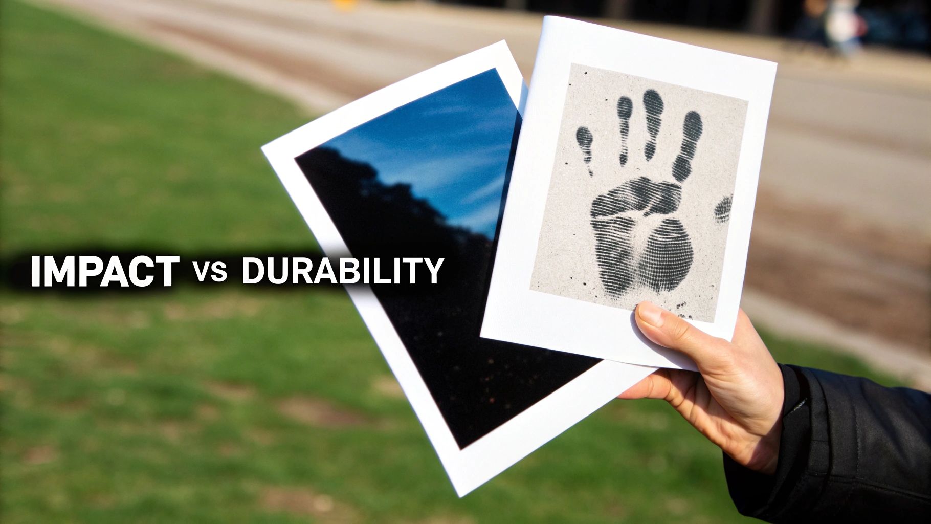
When you’re deciding between glossy or matte photos, it really boils down to two things: how you want the print to look, and how it needs to hold up in the real world. This is where the two finishes diverge the most. A finish that looks incredible in one scenario can be a total flop in another.
There's no denying the immediate "wow" factor of a glossy print. Its ultra-smooth, shiny surface basically acts as an amplifier for color and contrast. Images look sharper, blacks look deeper, and colors just pop off the page. This high-impact quality is fantastic for grabbing attention, making it a go-to for vibrant family photos tucked away in an album or promotional posters that need to stand out.
But that beautiful, reflective surface? It’s also its greatest weakness.
The Problem with Glare
The biggest test for any print is the environment it's displayed in. A glossy photo's mirror-like finish is a magnet for glare, especially under bright or direct light. This can completely wash out the image, with reflections from windows or overhead lights obscuring all the details you wanted to show off.
Think about these common situations:
- Office Spaces: Prints displayed under the harsh glare of overhead fluorescent lighting can become a reflective mess, making any text or fine details impossible to see.
- Framing Behind Glass: When you put a glossy photo behind glass, you get a "double glare" effect. Now you have two surfaces reflecting light back at you, making it a challenge to view from almost any angle.
- Trade Show Booths: The bright, chaotic lighting of a convention hall can turn a glossy banner or sign into an unreadable blur from just a few feet away.
In all these cases, a matte finish is the clear winner. Its non-reflective surface diffuses light instead of bouncing it back. This simple difference means the image stays clear and the colors remain true, no matter the lighting conditions or viewing angle.
A Pro's Insight: Matte is your best friend in brightly lit spaces. If your print is going up in an office, a public area, or behind glass, matte’s anti-glare quality ensures your message is always visible and looks professional.
Durability and Handling
Beyond just looking good, a print needs to be practical—especially if it's going to be handled. Here, the difference between glossy and matte becomes even more stark. That slick, smooth surface of a glossy photo is notorious for collecting fingerprints and smudges.
Every single touch leaves a mark. This can quickly ruin the clean look of a professional portfolio, a restaurant menu, or a business presentation. Sure, you can wipe them off, but constant cleaning is a hassle and can even damage the print's surface over time.
This makes a matte finish the undisputed champion for anything that gets passed around. Its slightly textured, non-reflective surface is incredibly resistant to fingerprints and smudges. It’s a forgiving finish that’s perfect for documents that need to look sharp even after being handled by dozens of people.
Matte is the practical choice for:
- AEC Spec Books and Manuals: These are constantly handled on-site and in meetings. A smudge-free appearance is crucial for maintaining professionalism.
- Restaurant Menus: Touched by countless hands, menus need to resist oils and prints to stay looking clean and appetizing.
- Professional Portfolios: The last thing you want is a potential client being distracted by your own fingerprints on your best work.
- Legal Exhibits: In a courtroom setting, a pristine, professional appearance is non-negotiable.
So, the choice between glossy and matte is a classic battle of aesthetics versus practicality. Glossy delivers that initial visual punch with vibrant, saturated colors. But for professional applications where clarity, versatility, and durability are paramount, the practical benefits of a matte finish almost always come out on top.
Ready to find the perfect finish for your project? The experts at Camelot can guide you. Get a quote and let's create something exceptional.
Matching the Finish to Your Business Application
Choosing between a glossy or matte finish isn't just about looks—it's a strategic decision that shapes how your audience interacts with your materials. The right finish can amplify your message, project professionalism, and make sure your documents work perfectly in the real world. For businesses, getting this choice right is a crucial part of making a powerful first impression.
In a crowded marketplace, a high-impact finish can make all the difference. Marketing materials designed to command attention often need the pop and sizzle of a glossy surface. It’s a choice that says, "look at me," making it perfect for promotional pieces that simply can't afford to blend in.
On the other hand, a matte finish speaks to sophistication and substance. Its understated elegance is perfect for documents where clarity, readability, and a premium feel are the real priorities. Let's break down how this works across different professional fields.
For Marketing and Real Estate Professionals
In marketing, the first job is to get noticed. Think about a real estate agency trying to sell a home—the property photos have to be as enticing as possible. A glossy finish makes a lush lawn look even greener and a swimming pool even more inviting, helping forge an immediate emotional connection with potential buyers.
This is where glossy really shines. The high-contrast, color-rich output makes it the go-to choice for:
- Property Brochures: Glossy prints make interior and exterior shots pop, helping properties move faster.
- Retail Posters: In a store, a shiny poster can effortlessly draw a customer's eye to a new product or a can't-miss sale.
- Trade Show Graphics: When you're competing for attention on a busy convention floor, vibrant, eye-catching visuals are everything.
The demand for this kind of visual punch is undeniable. The glossy photo paper market was valued at USD 1.2 billion in 2023 and is projected to hit USD 2.3 billion by 2032, a surge driven largely by commercial printing needs. This really underscores how vital vibrant, high-quality prints are for businesses today.
For AEC and Legal Professionals
The worlds of Architecture, Engineering, and Construction (AEC) and the legal field might seem different, but they share a deep-seated need for clarity and durability. In these industries, documents aren't just glanced at—they're handled constantly, marked up with notes, and examined under all sorts of lighting. This makes a matte finish the hands-down winner.
An architect presenting plans on a bright, sunny job site can't have glare washing out critical details. Likewise, a legal team needs trial exhibits that a judge and jury can see clearly from any angle in a well-lit courtroom.
Industry Insight: For any document that will be frequently handled or viewed in unpredictable lighting, matte is the default professional standard. Its non-reflective, smudge-resistant surface ensures maximum readability and maintains a pristine appearance.
Matte is the superior choice for these demanding applications:
- AEC Spec Books and Blueprints: Matte paper stops glare on-site and resists smudges from constant handling by the crew.
- Legal Exhibits and Courtroom Documents: A non-reflective surface guarantees that every detail is visible to everyone without distraction.
- Training Manuals and Portfolios: These documents have to stand up to repeated use while still looking sharp and professional.
For Educational and Training Materials
In any educational setting, the name of the game is clear communication. Whether it’s a training manual for new hires or classroom materials for students, the content must be easy to read and digest. Glare from a glossy finish can create eye strain and make it tough to follow text, especially over long reading sessions.
Matte paper offers a soft, non-reflective surface that's easy on the eyes, making it ideal for text-heavy documents. Its ability to be written on without smudging is another huge plus, encouraging notes and active engagement. When you're designing your next training manual or educational handout, think about how a matte finish can fundamentally improve the learning experience. For more ideas on creating effective print collateral, check out our guide on professional brochure printing.
Ultimately, the glossy vs. matte debate comes down to function. By thinking carefully about who will be using your printed materials and where they'll be using them, you can choose a finish that not only looks fantastic but also perfectly serves its purpose.
Ready to create professional, high-impact prints for your business? Get a quote and we’ll help you choose the perfect finish for your project.
Getting Your Print Job Just Right
Choosing between glossy and matte is a big decision, but it's only the first step. To get truly professional results, you need to think about how you're preparing your files. The finish you pick changes how your digital design becomes a physical print, affecting everything from how the colors pop to how sharp the final image looks.
It all comes down to how ink and light play with the paper. A glossy finish is smooth and non-porous, so the ink sits right on top. This is what gives you those sharp details and vibrant, punchy colors. But it also means that any little flaw in your digital file—like low resolution or digital noise—will be on full display.
Matte paper, on the other hand, has a slightly textured surface that absorbs and diffuses the ink. This creates a softer look that can actually be more forgiving if your image isn't perfect. However, you'll need to pay closer attention to your color and contrast settings to keep the final print from looking a bit dull.
Prepping Your Files for a Flawless Finish
To get the best possible print, your digital file has to match your paper choice. A file that’s perfectly set up for a high-impact glossy print might not translate well to a subtle matte surface, and the reverse is also true. There's no one-size-fits-all here.
Here’s what you need to nail down before sending your files to print:
- Resolution is King: The gold standard for any professional print is 300 DPI (dots per inch). This is non-negotiable, especially for glossy prints where the shiny surface highlights every single pixel. A low-resolution image will look blurry and pixelated, a problem that glossy paper will only make worse.
- Get Your Colors Right: Always work in a CMYK (Cyan, Magenta, Yellow, Key/Black) color profile, not RGB. Your screen uses RGB (Red, Green, Blue) to show you images, but printers use CMYK ink. Converting to CMYK yourself gives you a much better idea of how the final colors will look and helps avoid nasty surprises.
- Tweak Your Contrast: Matte paper has a tendency to soften contrast, so you might need to bump up the black levels and overall contrast in your file just a bit. This will stop the finished piece from looking washed out. For glossy prints, what you see on your screen is generally a pretty good representation.
For a deeper dive into making sure your images are sharp enough, check out our guide on understanding DPI for high-quality printing.
Why Pro-Level Equipment Matters
File prep is half the battle. The other half is the equipment—and the expertise—used to bring your design to life. Professional printing gear, like what we use here at Camelot, is precisely calibrated to handle different paper types, guaranteeing consistent color and perfect ink coverage every single time.
Professional printers use sophisticated color management systems. This tech ensures the colors on the page match your digital file as closely as humanly possible, whether you chose glossy or matte. It automatically adjusts for how different paper coatings absorb ink, giving you reliable, top-notch results.
That’s a level of precision that your standard home or office printer just can't touch. Our experience means we can guide you on how to optimize your project from start to finish, making sure your vision comes out exactly as you imagined.
Whether you're creating bold marketing collateral or refined professional documents, matching your file prep to your finish is the key. Ready to make sure your next project looks its absolute best? Get a quote and let our experts take care of the rest.
Your Final Decision Checklist
Making the final call between glossy and matte doesn't have to be complicated. It really just comes down to aligning the finish with what you're trying to achieve. To help you nail it down, let’s walk through a few key questions. Your answers will steer you toward the perfect choice, making sure the final print looks exactly how you envisioned it.
The journey from a digital file to a physical print involves a few critical stages. This graphic gives you a quick look at the core process we follow to ensure top-notch quality.
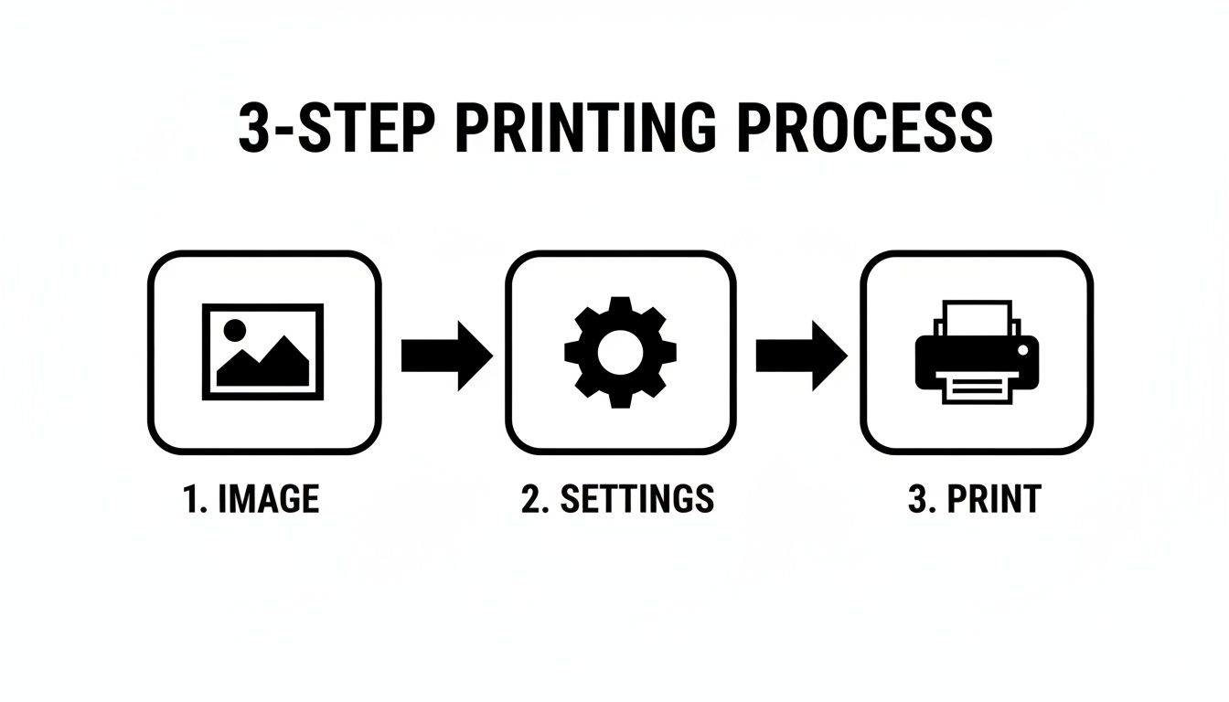
No matter which finish you land on, that middle step—optimizing your file settings—is where the magic happens for professional-grade results.
Guiding Questions for Your Choice
Where will this print be displayed? If it's going into a brightly lit office, a sunny room, or behind a glass frame, matte is your best bet to cut down on distracting glare. But for photo albums or prints in a controlled gallery setting, glossy’s brilliant shine is hard to beat.
How often will people handle it? Think about materials passed around in meetings—portfolios, manuals, or even menus. For these, matte’s fingerprint resistance is a lifesaver. Glossy finishes are better for pieces that are mostly looked at, not touched.
What feeling are you trying to create? Glossy grabs attention with bold, punchy colors that scream excitement. Matte, on the other hand, gives off a more subdued, sophisticated, and artistic vibe. This elegant, glare-free experience is a big reason why matte photo paper now accounts for about 35% of total photo printing sales, according to a 2021 Technavio report on photo printing.
Is it about vibrancy or subtlety? If you need maximum color saturation and razor-sharp contrast to make your image pop, go with glossy. If you're aiming for nuanced tones and a softer, more refined presentation, matte is the clear winner.
Thinking through these points will help you confidently choose between glossy and matte. Each finish has its place, and picking the right one ensures your vision comes through perfectly in print. If you're curious about how these choices play into your budget, you might find our article on understanding color printing costs helpful.
Ready to get your next project off the ground? The team at Camelot Print & Copy Centers lives and breathes this stuff. We know the nuances of every finish and are here to bring your ideas to life.
Get a quote and let's create something exceptional together.
A Few Final Questions
Deciding between glossy and matte can come down to a few practical details. Even after you've weighed the visual and durability factors, you might be wondering about cost, writability, or how each finish handles a classic black and white image. Let's tackle those common questions head-on.
Is There a Big Price Difference?
Honestly, not really. When you’re looking at glossy versus matte, the finish itself is rarely the biggest driver of cost. The final price tag is much more influenced by things like the thickness of the paper stock, the size of your prints, and how many you’re ordering.
For example, a huge run of glossy posters will likely have a lower cost per piece than a small, exclusive batch of high-end matte portfolios. The best way to know for sure is to get a quote based on what you actually need. At Camelot, we can walk you through the options to find a solution that fits your budget, regardless of the finish you choose.
Our Take: Don't let a few pennies sway you. The price difference is usually so small that it's better to choose the finish that makes your project look its best. Focus on the end result, not just the bottom line.
Can I Write on These Photos?
This is a huge one, especially for business materials. If you need to add a signature, a quick note, or a personal message, matte is your best friend. Its surface has a slightly porous, uncoated feel that grabs ink from almost any pen or marker beautifully, without any smudging. It’s built for interaction.
Glossy, on the other hand, is a writer’s nightmare. That slick, shiny coating repels most inks, leading to instant smears and smudges. You’d have to track down a specific type of permanent marker and hope for the best. For anything that needs a signature or annotation, matte is the only reliable choice.
Which Finish Is Better for Black and White?
For black and white photography, we almost always steer people toward a matte finish. There's a reason it's the go-to for fine art prints. The non-reflective surface lets you appreciate the full tonal range—from the deepest blacks to the most subtle grays—without any distracting glare. It brings out the texture and mood of the image.
Now, that’s not to say glossy can’t work. For a really punchy, high-contrast black and white shot with stark whites and inky blacks, a glossy finish can add some modern pop. But for a timeless, sophisticated look that lets the photograph’s composition and emotion shine, matte is the classic and more versatile pick.
Ready to make the perfect choice for your next print project? The experts at Camelot Print & Copy Centers are here to help you select the ideal finish and deliver flawless results. Get a quote to get started.