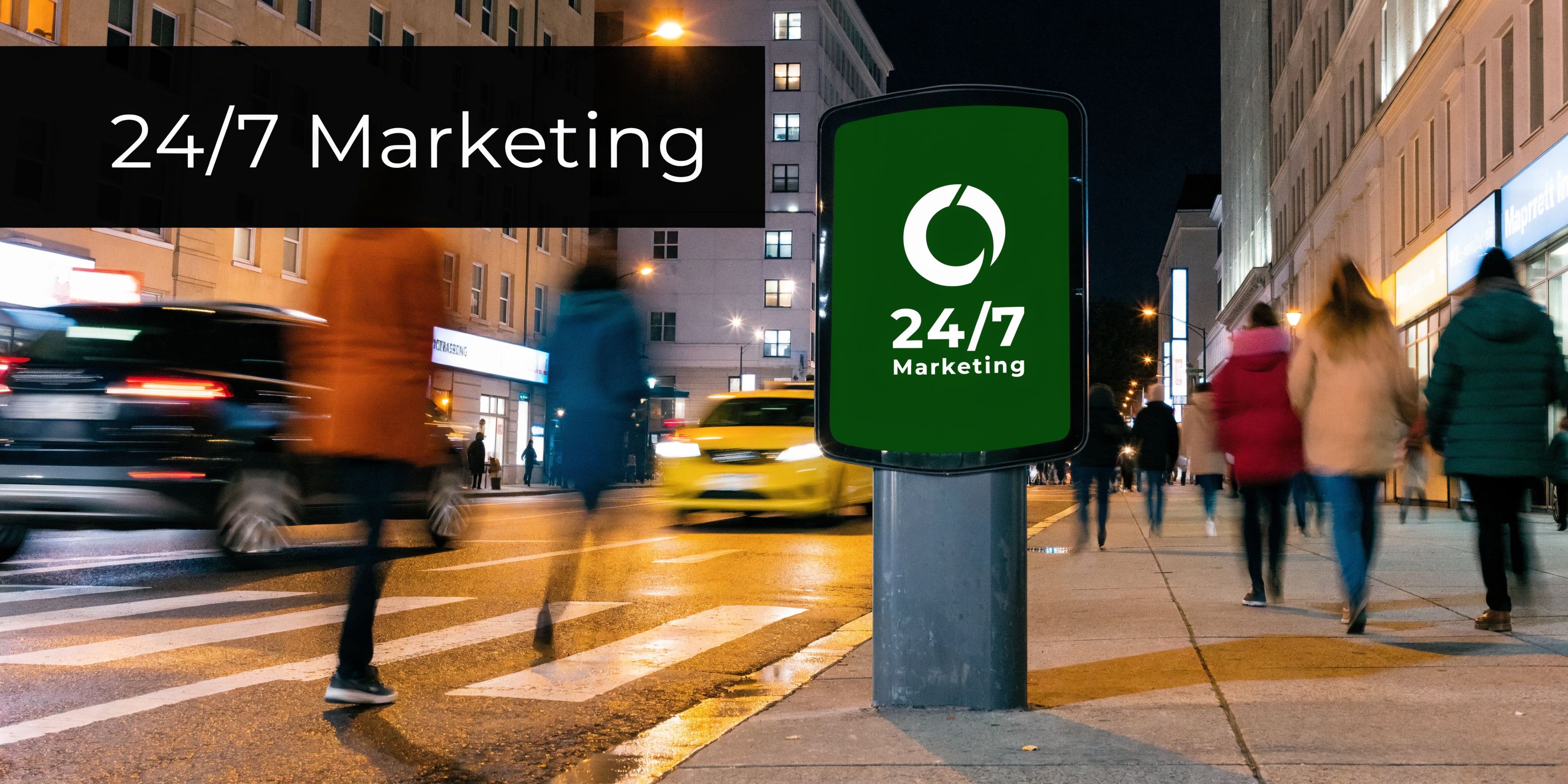
Your sign might be doing less work than you think.
A lot of owners come to this decision at the same point. They have a solid location, good service, and real repeat customers, but walk-in traffic feels inconsistent. People pass the storefront, miss the entrance, or assume the business is newer, smaller, or less established than it really is. In most cases, the problem is not the business. It is the visibility.
Good signs for business solve more than one problem at once. They help people notice you, understand what you do, trust the professionalism of your operation, and find their way without friction. The strongest signs do that before anyone speaks to your staff.
That is why the process matters. The right sign is not just a logo placed on a panel. It is a mix of design, materials, placement, local rules, installation conditions, and budget choices. If any one of those is off, the sign can look fine on a proof and still fail in the field.
Why Your Business Sign Is Your Hardest Working Employee
A weak sign usually fails.
It does not send you an alert when drivers cannot read it in time to turn in. It does not tell you when faded vinyl makes your storefront look dated. It does not explain why people walk in already unsure whether you are open, established, or worth the stop.
A business sign works all day, every day. It sells, reassures, and directs. It also sets expectations before a customer touches the door.
First impressions happen before the first conversation
Customers judge the quality of a business through visible cues. One of the strongest is the sign itself. According to FedEx research, 68% of consumers believe that a business's signage is a reflection of its product or service quality, and over 50% indicate that poor signage actively deters them from entering a place of business (FedEx signage perception research).
That matches what signage professionals see in practice. Clean lettering, strong contrast, proper lighting, and a confident installation make a business look established. Crooked panels, crowded layouts, and bargain materials do the opposite.
For many storefronts, the sign is the first salesperson. It introduces your business without pressure and without downtime.
A sign has to do a job, not just fill space
Owners sometimes focus on whether a sign looks attractive in isolation. The better question is whether it performs in its intended environment.
A sign needs to answer practical questions fast:
- Who are you: Your business name and visual identity should read clearly at a glance.
- What do you do: If the name alone is not obvious, a supporting line or window message can help.
- Where do I go: Entrances, parking, pickup areas, and suites need clear cues.
- Are you active and professional: Condition matters as much as content.
That is why supporting pieces often matter just as much as the main storefront face. Items like outdoor vinyl banners can help during grand openings, seasonal pushes, sidewalk promotions, or temporary directional needs without forcing a permanent change before you are ready.
Tip: If customers regularly call to ask where the entrance is, where to park, or whether you are open, your signage system is already telling you what needs to be fixed.
Signs for business are not an accessory purchase. They are part visibility tool, part credibility signal, and part customer experience infrastructure. When the sign is right, the business feels easier to find and easier to trust.
Decoding Your Signage Options A Practical Overview
Most businesses do not need one sign. They need the right mix of signs.
The easiest way to choose is to stop thinking in product names first and think in functions. Some signs pull attention from the street. Some help people find their way once they arrive. Others handle short-term offers, events, or changing information.
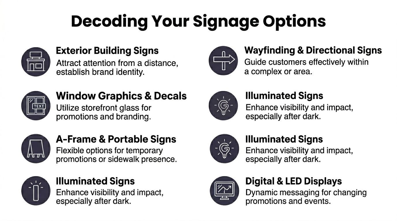
Signs that get you noticed from a distance
These are your visibility signs. Their job is to make sure people know you exist before they have already driven past.
Storefront fascia signs are the standard choice for retail, restaurants, offices, and service businesses. They sit on the face of the building and usually carry the business name, logo, and sometimes a concise descriptor. Channel letters, flat panels, routed letters, and illuminated cabinets all fall into this category.
Monument signs work well for professional offices, medical practices, schools, and multi-tenant properties. They sit lower to the ground and often feel more permanent and architectural.
Pole and pylon signs are built for roadside visibility where traffic moves fast and sightlines are longer. If your business sits back from the road or shares a center with other tenants, this type can do a lot of heavy lifting.
The payoff can be direct. Research from the University of Cincinnati shows how powerful the right sign type can be: 76% of consumers have entered a store they had never visited before based solely on its signage (University of Cincinnati signage finding).
Signs that work at eye level
Once someone gets close, the sign system changes jobs. Now it has to inform.
Window graphics are often underused. They can display hours, services, promotions, privacy treatments, and brand elements without taking up floor space. In many storefronts, the glass is some of the most valuable signage real estate you have.
A-frame signs belong in this category too. They are practical for sidewalks, daily specials, directional cues, and temporary messaging. They are not a substitute for the main sign, but they are useful when placement rules allow them.
Vinyl-based products also give owners flexibility here. Vinyl printing is often a strong fit for window decals, temporary promotions, cut lettering, wall graphics, and branded surfaces that need speed and customization.
Signs that guide people once they are inside
Interior signage often gets pushed to the end of the project, but that is usually a mistake.
A sharp exterior sign can get the customer through the door. Poor interior wayfinding can still create a bad experience. This matters even more in medical offices, schools, legal suites, and multi-room businesses where people already feel rushed or uncertain.
Useful interior categories include:
- Lobby signs: These establish identity and reinforce professionalism at reception.
- Wayfinding signs: Arrows, room labels, and directional markers reduce hesitation.
- Department or service labels: Helpful in shared buildings or larger facilities.
- Regulatory and accessibility signs: Required in many environments and often tied to placement and design standards.
Signs that move with the business
Not every sign stays fixed to a wall.
Vehicle graphics turn service vans, delivery vehicles, and company cars into moving brand markers. Retractable displays and trade show systems work for expos, pop-ups, school events, hiring fairs, and temporary outreach. Banners help with launches, construction notices, seasonal promotions, and event sponsorships.
Here is a simple way to match sign type to business goal:
| Business goal | Sign types that usually fit |
|---|
| Be seen from the road | Storefront signs, monument signs, pylon signs |
| Use glass better | Window graphics, cut vinyl, perforated film |
| Capture foot traffic nearby | A-frames, banners, window promotions |
| Improve navigation | Wayfinding, suite signs, ADA-compliant interior signs |
| Promote off-site | Vehicle graphics, retractables, event displays |
Key takeaway: The best signs for business work as a system. A main exterior sign creates awareness. Secondary signs remove friction. Temporary signs give you flexibility without redoing the whole package.
Navigating Permits and Compliance Requirements
A sign can look approved in a proof and still stall the project once the city, landlord, or inspector reviews the details. I see this happen most often when owners choose colors and layout first, then discover the sign size, lighting, placement, or mounting method does not fit the property rules.
Permit work affects more than paperwork. It changes production choices, install sequencing, and sometimes the design itself.
Most local reviews focus on a practical set of items: sign area, height, projection, illumination, attachment method, and distance from property lines or public walkways. In a shopping center or office complex, the landlord's criteria often carry as much weight as municipal code. If those two standards conflict, the revision usually lands on the sign company and the client, not the reviewer.
A cleaner submittal package helps avoid that back-and-forth. For larger signs, scaled layouts and file setup matter, especially if the artwork will move into large format printing for full-size production. Artwork should also be built for actual output, not just for screen approval. A practical reference on matching pixel dimensions to the final print size helps prevent soft prints, rebuilt files, and last-minute resizing problems.
Generic signage advice often stops at "check local codes." That is not enough for regulated businesses. A medical office may need room IDs, directional signs, and privacy-aware labeling that fit accessibility requirements. A law office may need formal suite identification and interior naming that stays consistent across directories, doors, and document areas. AEC firms often need field signage, office wayfinding, and project-related labels that match drawing sets, bid rooms, or facility standards.
That is where a local partner like Camelot helps in practical terms. The job is not just to print the sign. The job is to catch the conflicts early, before fabrication starts.
Common compliance pressure points include:
- ADA interior signs: Tactile copy, Braille, contrast, mounting height, and placement beside the door all need to be correct.
- Illuminated exterior signs: Electrical scope, raceway details, and local sign ordinances often trigger extra review.
- Window graphics: Coverage limits can affect visibility, code compliance, or lease approval.
- Healthcare and professional offices: Terminology, room naming, and directional clarity matter as much as the finish.
- Multi-tenant properties: Landlord standards may limit letter height, colors, logo position, or lighting style.
One mistake causes a lot of avoidable rework. Owners approve a design without tying it to a sign schedule. Then the lobby sign, suite plaque, window hours, ADA room IDs, and exterior panel all drift apart in size, wording, or branding. A resource on consistent branding through a brand style guide can help keep names, fonts, colors, and approved logo use aligned before files go to production.
Use this checklist before giving final approval:
- Has the landlord or property manager approved the sign concept and location
- Does the municipality require a permit for this sign type
- Do ADA rules apply to any part of the package
- Will lighting, window coverage, or sidewalk placement trigger added review
- Does your industry require naming, labeling, or documentation standards beyond basic branding
Small details create the biggest delays. Door plaques, directional arrows, window vinyl coverage, and mounting location notes are easy to overlook and expensive to correct after fabrication.
Budgeting for Your Business Signs Cost and ROI
The price of a sign is never just the square footage.
Two signs can look similar in a mockup and land in very different budget ranges once you factor in material choice, illumination, mounting conditions, permit handling, and installation access. A simple panel sign on an easy wall is one kind of project. Routed letters on a difficult facade with electrical work are another.
What pushes cost up or down
A few variables do most of the work in signage budgeting.
Size matters, but so does complexity. Custom shapes, internal lighting, layered materials, specialty finishes, reinforced hardware, and difficult installation conditions all add labor or production steps. Temporary graphics and basic panels are usually more economical. Permanent exterior signs cost more because they have to survive weather, UV exposure, and years of use.
The timeline affects budget too. Rush production can narrow material choices or add scheduling pressure, especially if permits and installation crews are part of the job.
Think in lifespan, not just invoice total
The lowest upfront quote is not always the lowest total cost.
If a sign needs to be replaced early, fades too quickly, or fails to match the business image you need, the cheaper choice can become the expensive one. On the other hand, not every business needs illuminated signage or premium fabrication. Some locations perform better with simple, readable, non-illuminated formats that are easier to maintain.
That is supported by current data. A Sign Research Foundation study from 2025 found that non-illuminated signs can yield a 20% higher long-term ROI for budget-conscious small and mid-sized businesses compared to high-maintenance alternatives (Sign Research Foundation ROI finding).
A practical budgeting mindset
Use this lens when planning signs for business:
- Spend where permanence matters: Main identification signs, entry signs, and required interior compliance pieces should be built to last.
- Save where messaging changes: Promotions, events, seasonal pushes, and temporary directional needs often fit flexible materials better.
- Protect readability first: Clean design and proper placement usually matter more than extra decorative features.
- Ask about maintenance: Lighting, cleaning, repairs, and update cycles affect the full value of the purchase.
A sign budget works best when it is tied to the job the sign needs to do. Visibility, trust, and durability are worth paying for. Features that do not support those outcomes are often where overbuying happens.
The Camelot Process From Design to Installation
Most sign projects start with a simple problem.
A business has a location that needs better visibility, an outdated storefront face, a new suite to mark, or an event deadline that is getting close. The sign itself is only part of the issue. The owner also needs someone to sort out artwork, materials, production, and installation without losing time to guesswork.

How a typical project moves
The process usually begins with a quote request, a conversation about where the sign will live, and a review of what the sign needs to accomplish. A storefront sign has one set of constraints. A medical wayfinding package or an AEC graphics set has another.
From there, the project gets more concrete:
Scope the job clearly
The sign type, size, environment, and deadline shape everything that follows.
Build the artwork for practical use
Layout, readability, and brand consistency need to hold up at the final production size.
Choose materials that fit the application
Permanent exterior signage, temporary displays, cut vinyl, and mounted panels each call for different construction choices.
Produce and prepare for install
Files, finishing, hardware, and scheduling all need to align before the install date.
In practical terms, a provider such as Camelot Print & Copy Centers can be useful. The company handles in-house graphic design along with banners, retractable displays, cut vinyl, large-format work, AEC document support, legal document services, and print production for healthcare, education, and other business uses.
Why execution matters as much as concept
A sign that looks right in a PDF can still underperform if the install is off, the material is mismatched to the location, or the layout was never tested against real viewing conditions.
Well-executed sign changes can significantly increase sales, demonstrating the value of getting the design and installation right the first time.
For a quick visual look at sign planning in action, this short video gives useful context:
Key takeaway: The smoothest sign projects are not the ones with the fanciest concepts. They are the ones where design, compliance, production, and installation were treated as one connected job.
Get a Quote for Your High-Impact Business Sign
The right signs for business do three jobs at once. They make you easier to find, easier to trust, and simpler to move through.
That result rarely comes from picking a sign type in isolation. It comes from choosing the right combination of format, material, design, placement, and compliance support for your location and your customers. When those parts line up, the sign stops being decoration and starts working like part of the business.
If your current signage is outdated, hard to read, inconsistent, or missing key directional and branding elements, it is worth fixing now instead of letting it keep underperforming. A better sign package can improve visibility immediately and remove small points of friction that cost you walk-ins every day.
You can request a quote here: https://www.camelotprintandcopy.us/contact-us
Need signs that fit your storefront, office, facility, or project requirements? Contact Camelot Print & Copy Centers to discuss your business signage needs and request a quote.